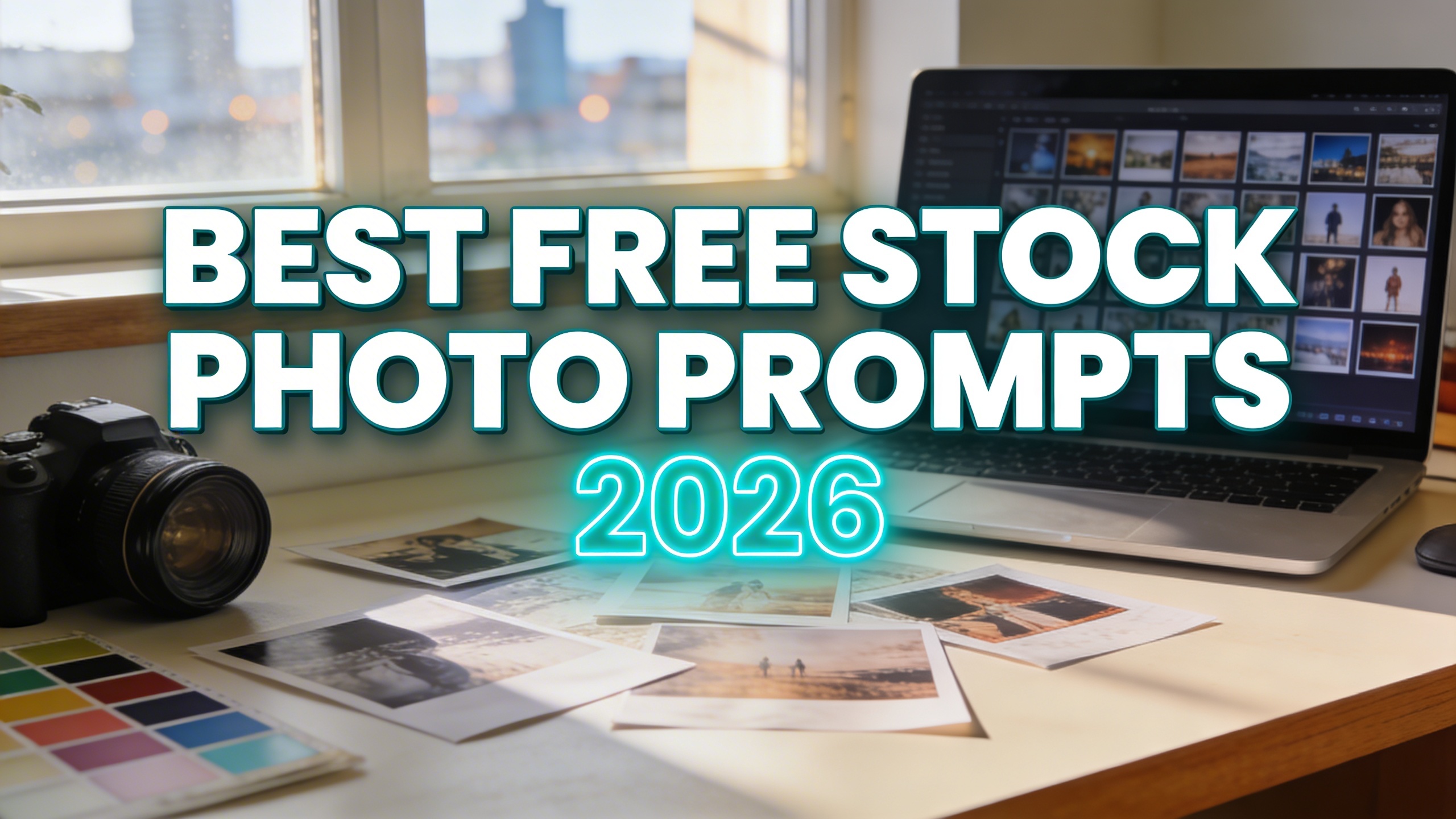
At Stockimg AI, we’ve been working for a long time on how to make the best stock photos using ai and how to write the best prompts.
Stock photos are either a lifesaver or a tiny embarrassment, and there is rarely an in-between. You grab a “team meeting” image because you need a header in five minutes, and suddenly your website looks like it’s cosplaying as a PowerPoint from 2014.
This post is basically my prompt stash, with the bits I wish someone told me sooner. You will get 25 creative stock photo prompts (with images), plus practical notes on how to make them feel like real photography, and where I still go for the best free stock photos when I just need something boring that does its job.
25 stock photo prompts you can copy (with examples)
These are written as “stock photo prompts,” not art prompts. They bake in camera language, lighting, and composition so you’re more likely to get something that fits blogs, ads, landing pages, and social posts.
A note on usage: you can run these as-is, but the fastest win is to swap one specific detail (phone model, mug color, background location, season, wardrobe). That makes it feel bespoke without rewriting your whole brain.
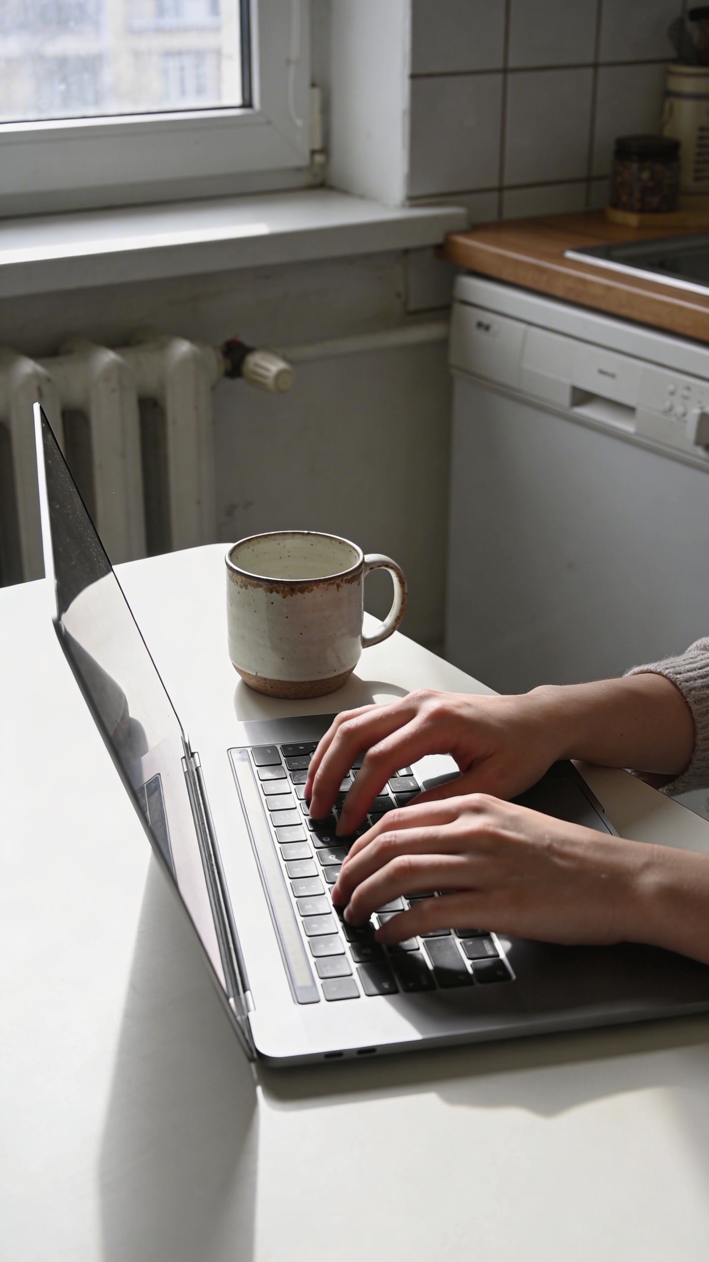
Remote work that doesn’t look like a cliché
Prompt: "realistic stock photo, candid remote work scene at a small apartment kitchen table, person’s hands typing on laptop next to a chipped ceramic mug, morning window light, soft shadows, 35mm lens, shallow depth of field, subtle film grain, plenty of negative space on left, no text"
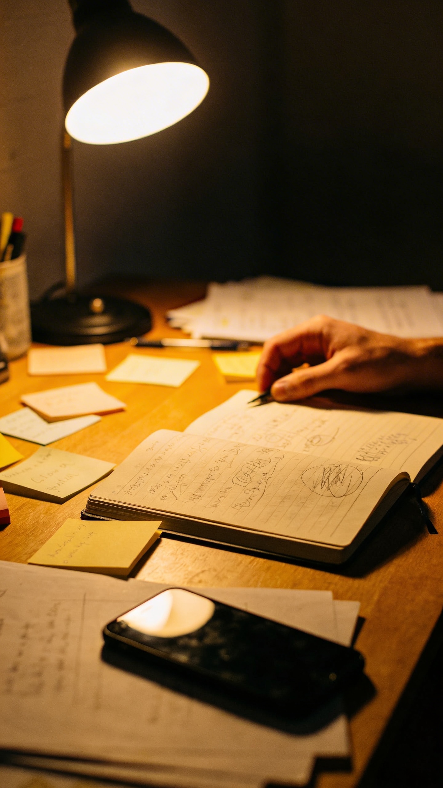
Prompt: "documentary style stock photo, late-night freelancer desk with warm lamp light, sticky notes, half-finished notebook, phone face down, slight clutter, 50mm lens, natural grain, realistic skin tones, no text"
Prompt: "realistic editorial stock photo, coworking space interior with a person in the background out of focus, foreground: open notebook and pen, iced coffee condensation on glass, bright overcast daylight through big windows, 35mm lens, neutral tones, negative space on top"
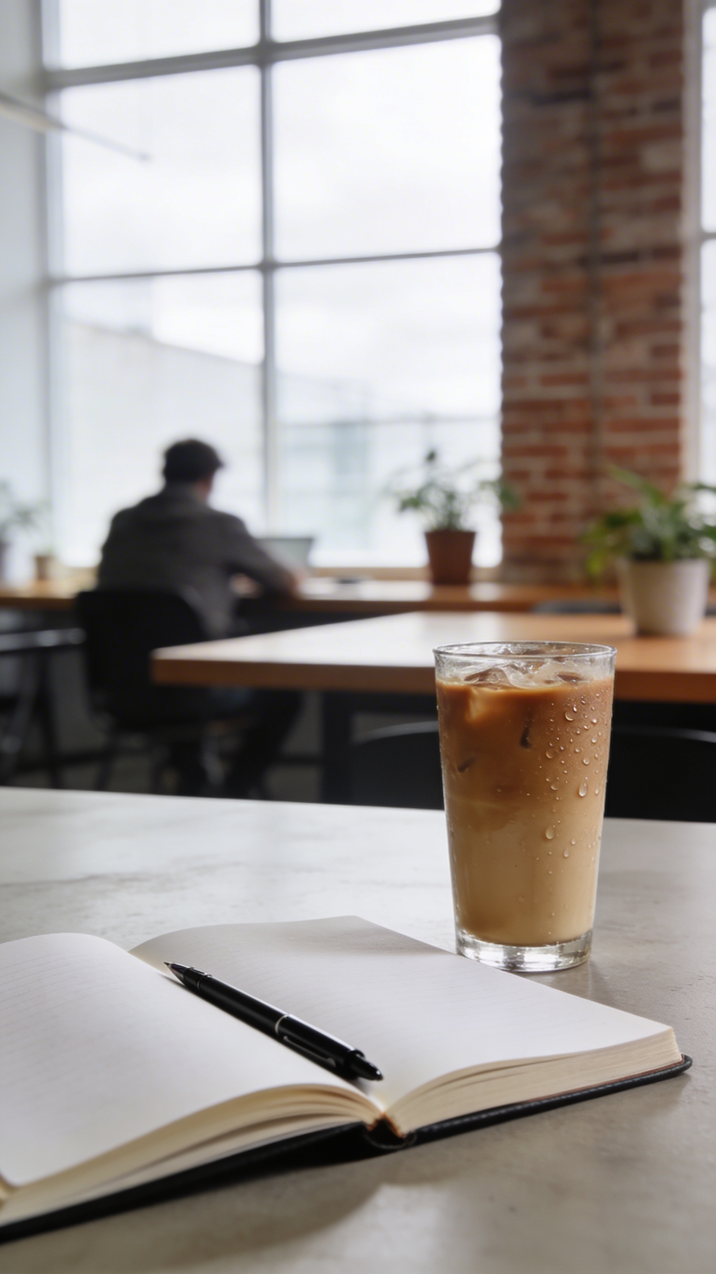
I like these because they’re useful without being loud. They also crop well. If you do any content marketing at all, you will crop images in ways that would make a photographer sigh dramatically, so you might as well plan for it.
Product-adjacent shots (without showing your exact product)
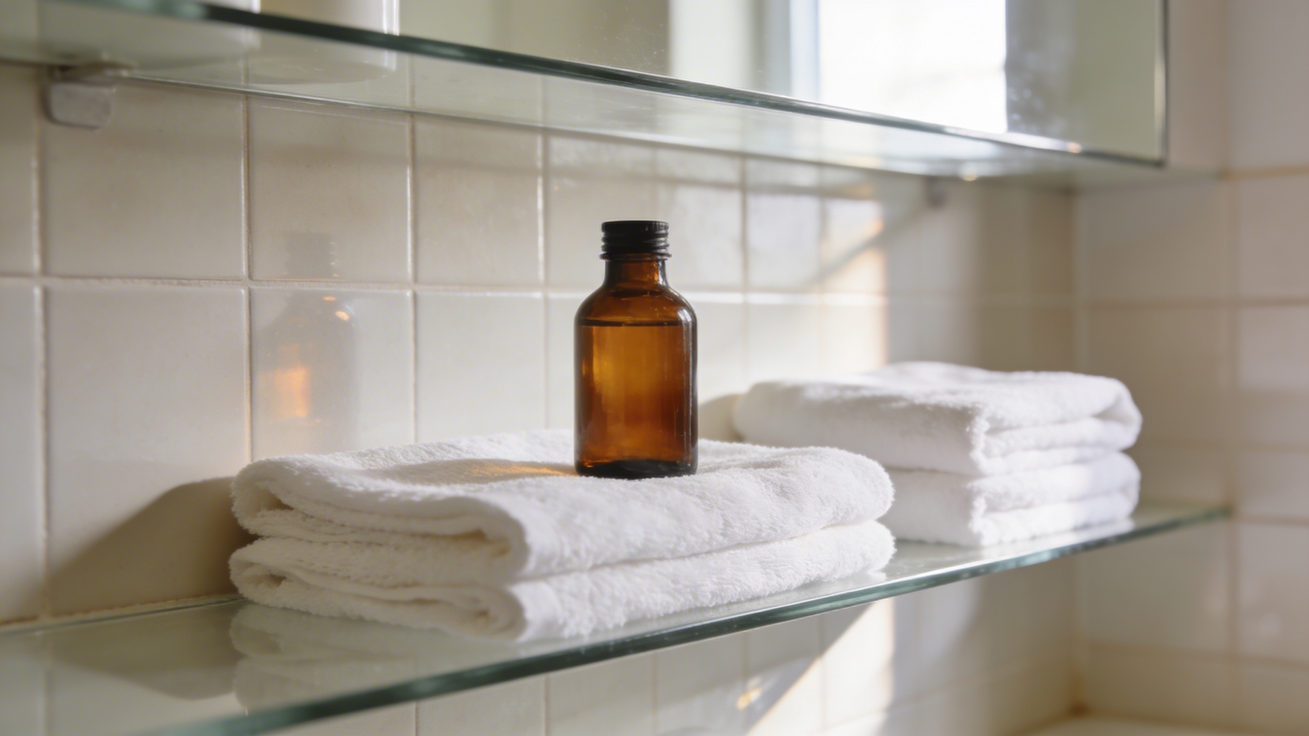
Prompt: "realistic stock photo, minimalist skincare bathroom shelf scene, unlabeled amber glass bottles and white towels, soft daylight, clean tiles, 85mm lens look, gentle highlights and realistic reflections, muted beige and white palette, no text"
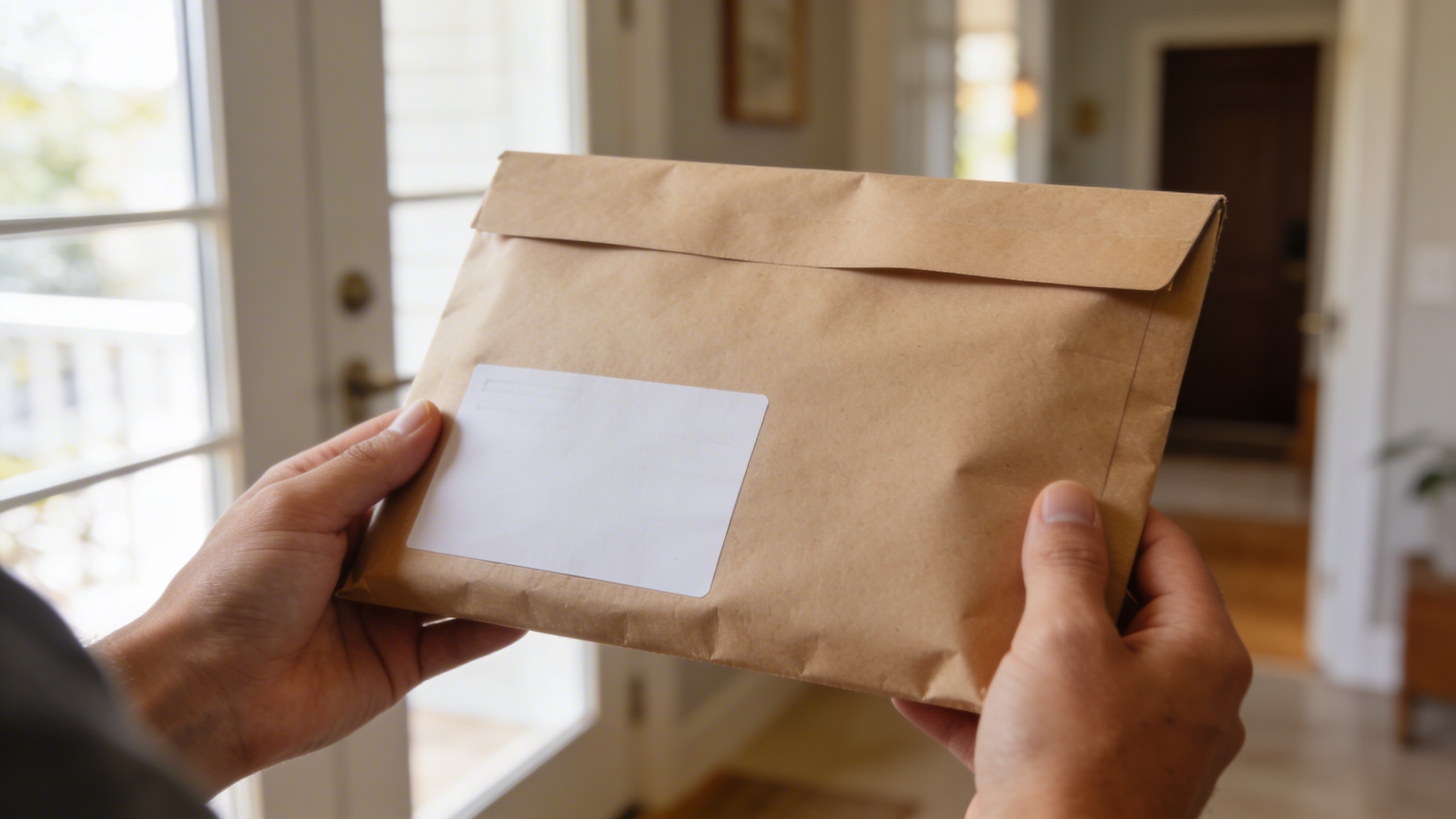
Prompt: "realistic stock photo, close-up of hands holding a plain kraft package mailer with blank label area, modern entryway background, natural window light, 50mm lens, shallow depth of field, realistic paper texture, no text"
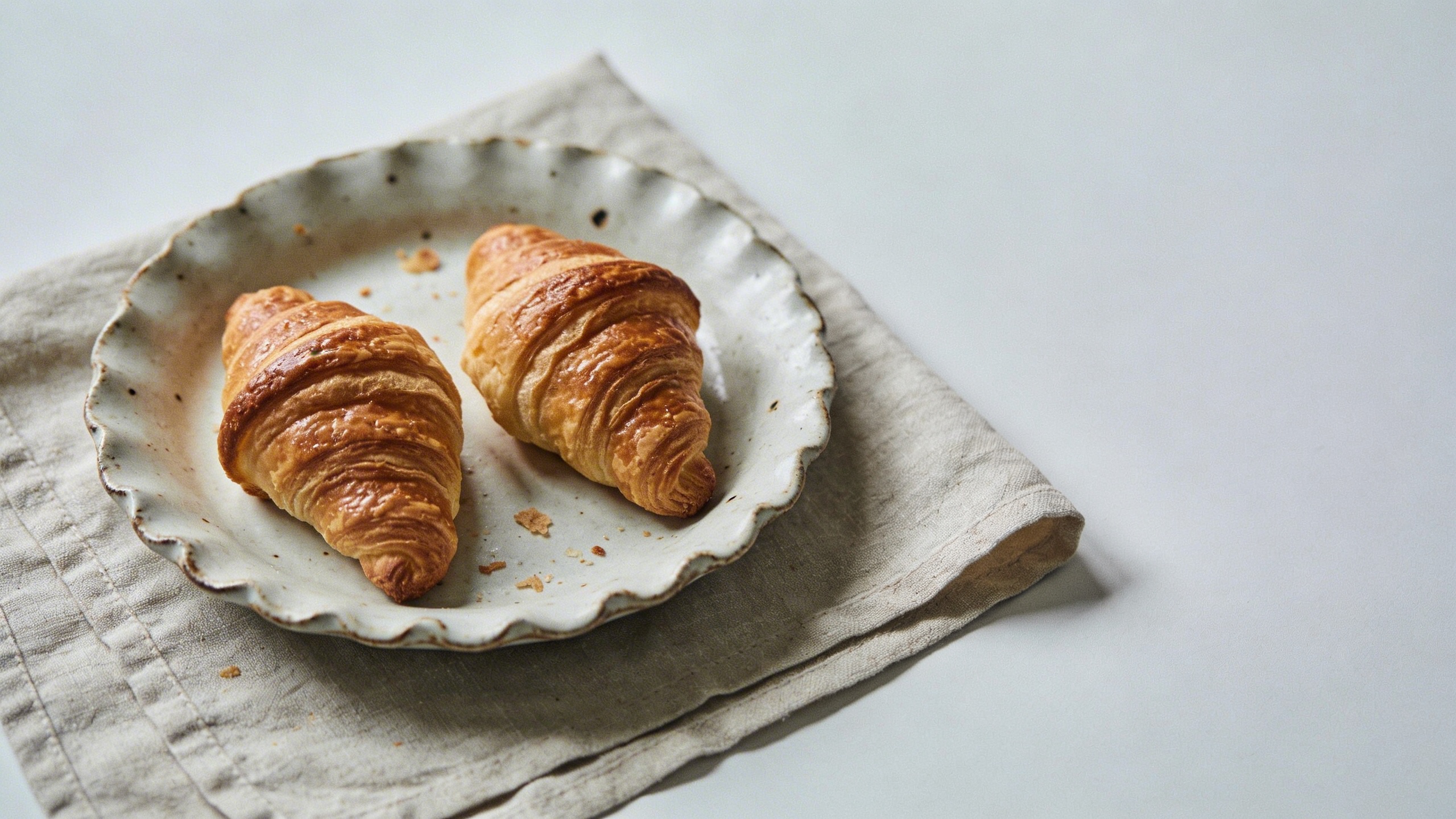
Prompt: "realistic editorial product background, handmade ceramic plate with fresh pastries on linen cloth, soft side light, muted pastel tones, 35mm lens, natural crumbs and imperfections, negative space on right, no text"
This is the category where I most often generate instead of search. Traditional libraries have a lot of “perfect” product shots, but if you want “premium but human,” you need micro-imperfections: a wrinkle in the cloth, a smudge on the counter, crumbs that look like they fell accidentally (even if you staged them).
Travel and city vibes without “tourist brochure”
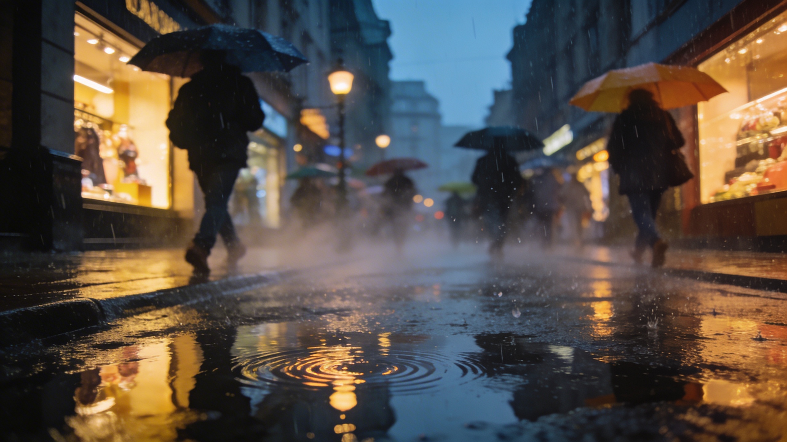
Prompt: "realistic travel stock photo, rainy city street at dusk with reflections on pavement, pedestrians with umbrellas slightly motion-blurred, warm shop lights, 35mm lens, cinematic but natural, no recognizable logos, no text"
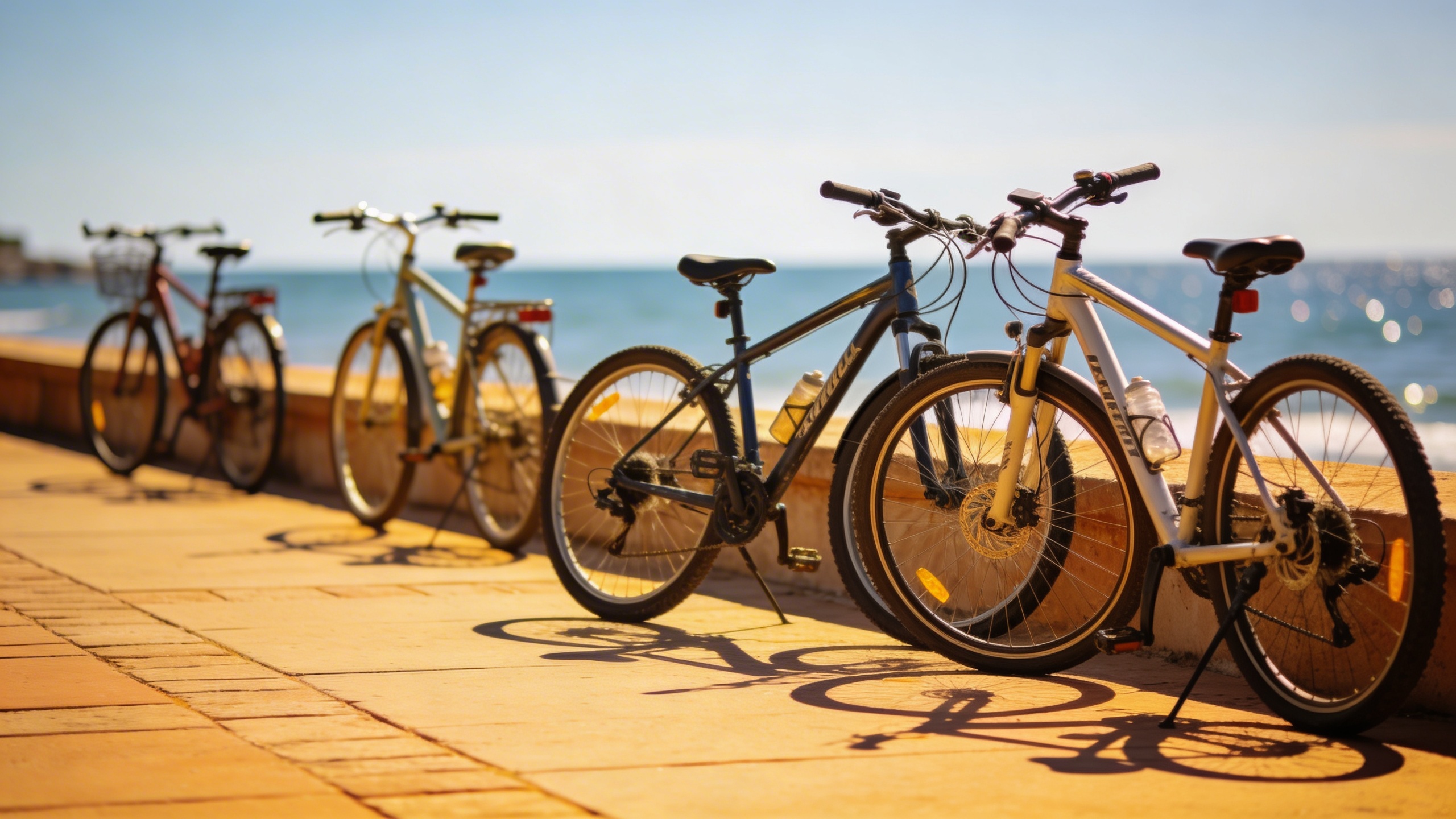
Prompt: "realistic stock photo, sunny coastal walkway with bicycles parked, sea in background out of focus, bright midday light, 50mm lens, natural colors, relaxed lifestyle vibe, no text"
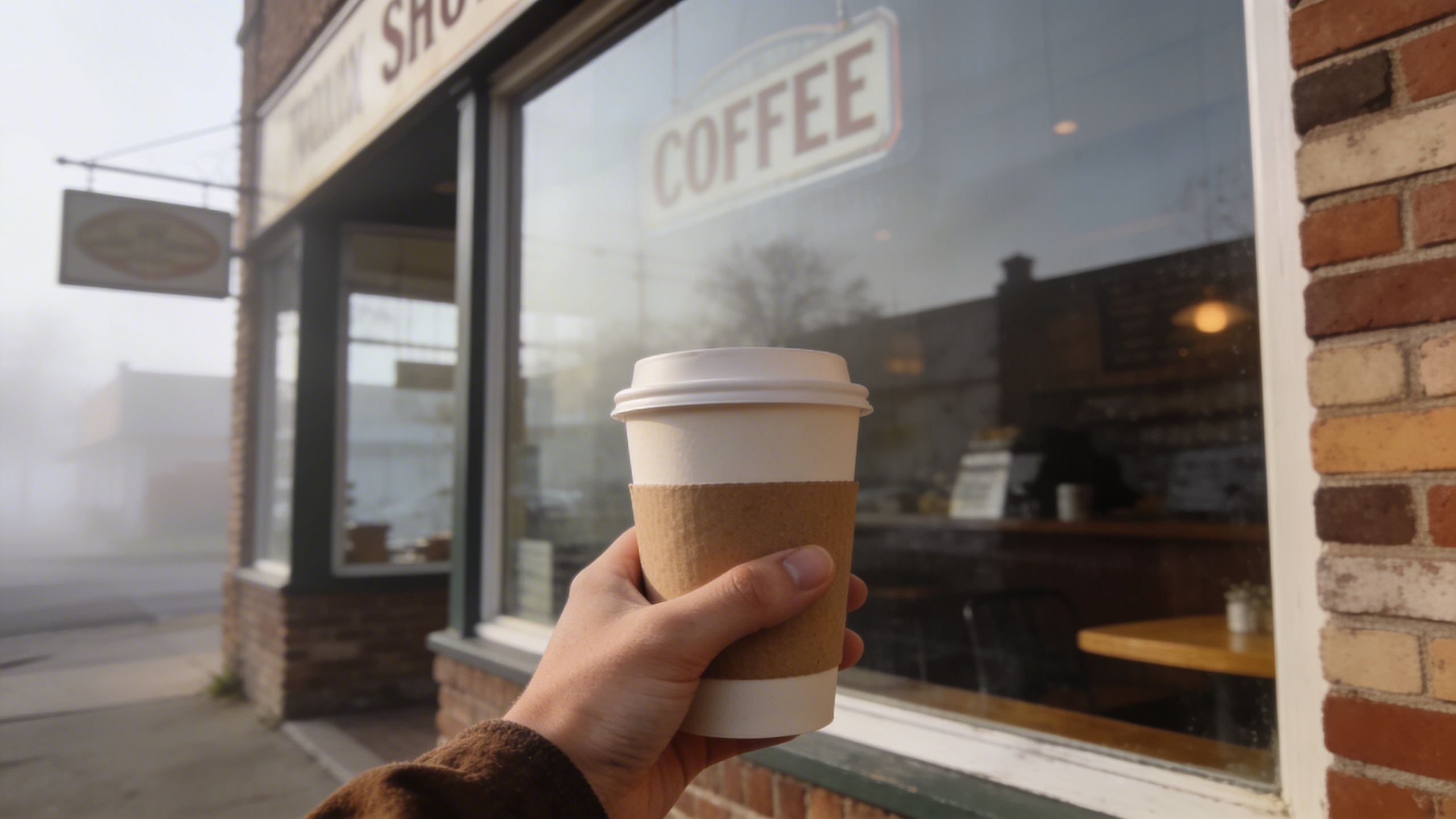
Prompt: "realistic editorial stock photo, small-town main street coffee window exterior, hand holding paper cup, soft morning haze, 35mm lens, muted colors, authentic signage blurred and unreadable, no text"
I used to overdo travel imagery because it’s fun, then I realized most “travel” visuals are used for anything but travel. People slap them on SaaS landing pages and call it “freedom.” If that’s your use case, aim for mood, not landmarks.
Food that looks like a human made it
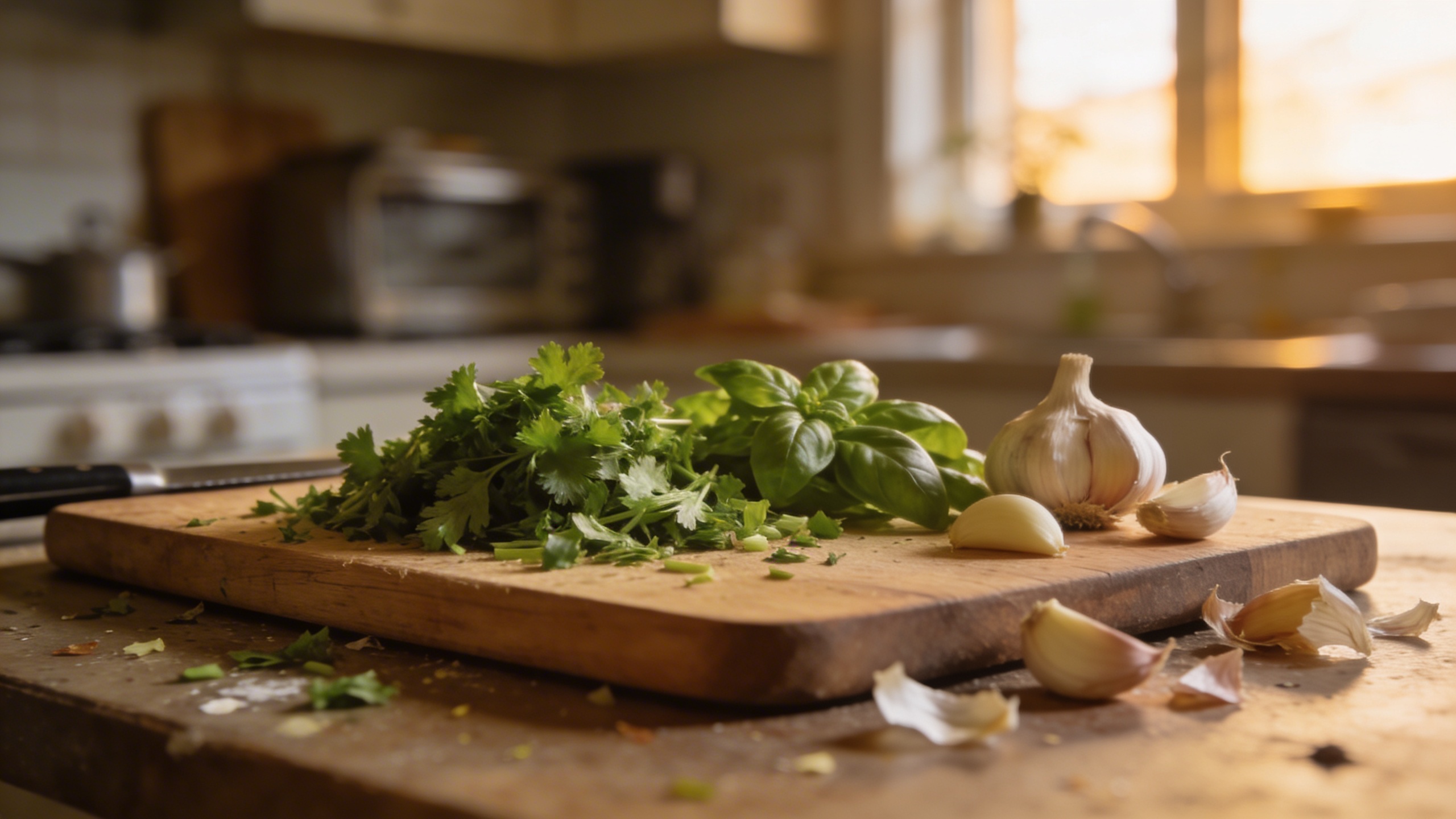
Prompt: "realistic stock photo, home kitchen scene with a cutting board, chopped herbs, garlic cloves, slightly messy counter, soft window light, 35mm lens, natural colors, no text"
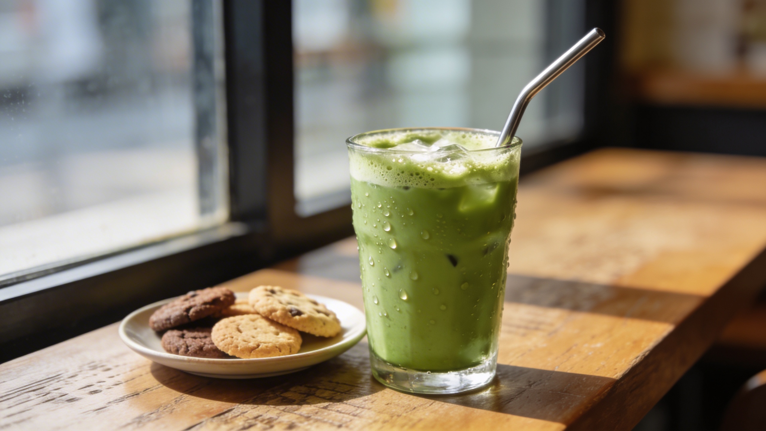
Prompt: "realistic editorial food stock photo, iced matcha in a glass with condensation, metal straw, small plate of cookies slightly out of focus, café table near window, 50mm lens, soft shadows, no text"
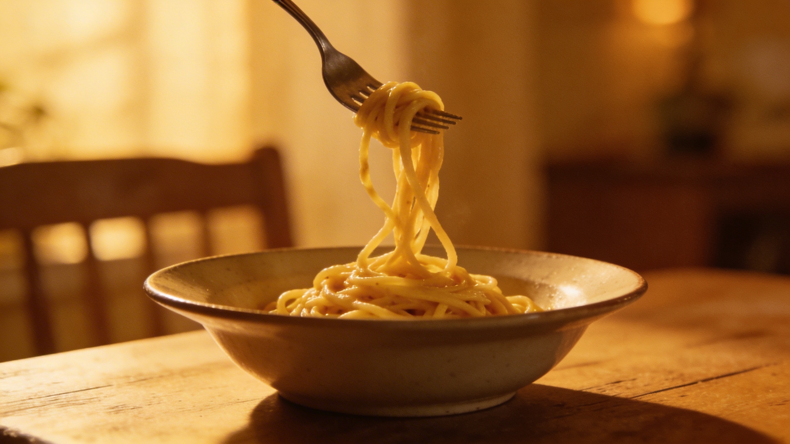
Prompt: "realistic stock photo, cozy dinner table with simple pasta bowl, fork twirl mid-air, warm tungsten lighting, shallow depth of field, grain, intimate atmosphere, no text"
The “food” section is where AI can get weird if you push it. Keep it simple. Avoid prompts that require perfect counting (like “exactly 12 blueberries”) because it can drift, and drift looks fake.
Health, wellness, and “not a medical brochure”
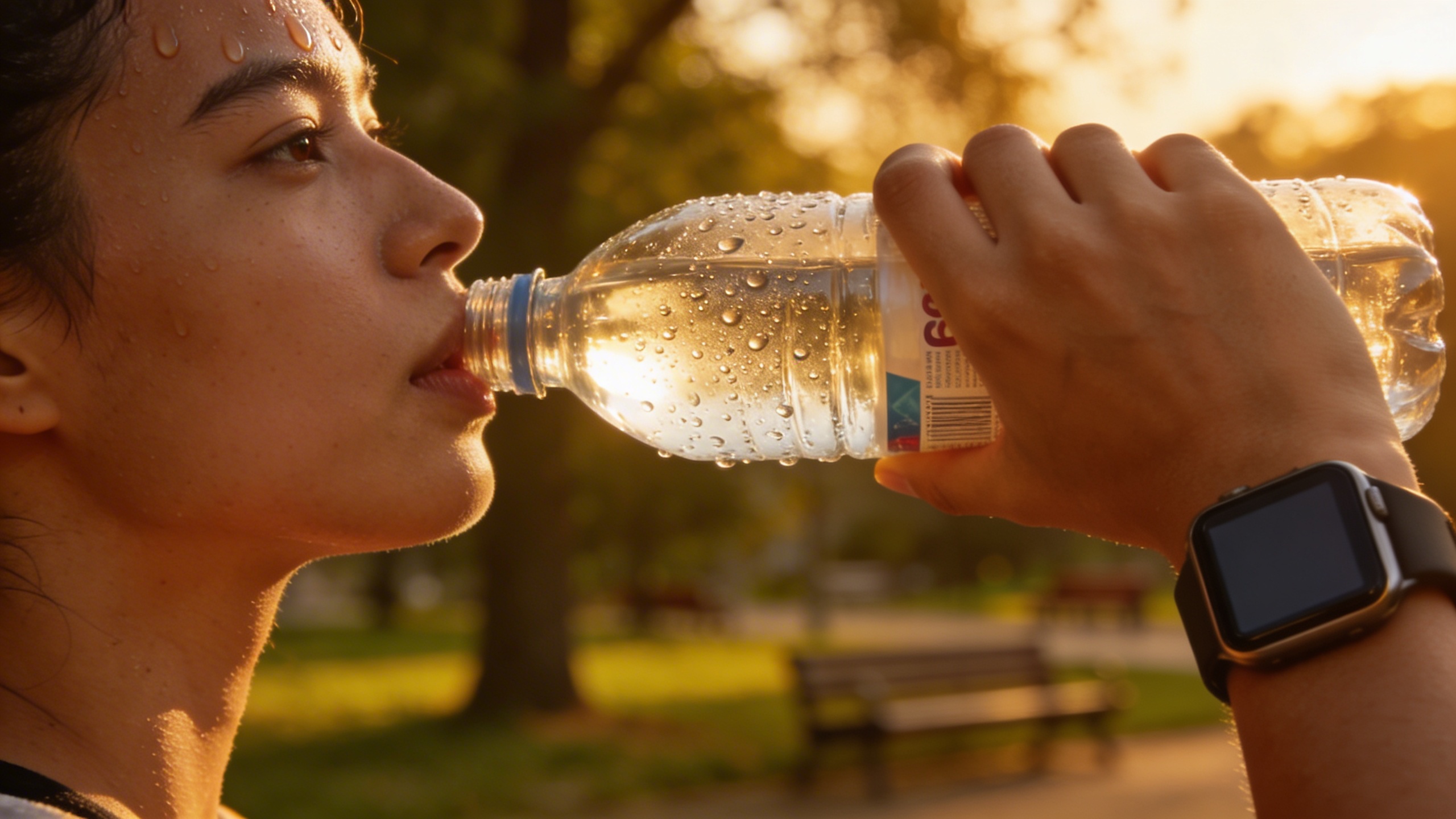
Prompt: "realistic editorial stock photo, hands holding a water bottle after a walk, smartwatch visible but with blank screen, blurred park background, late afternoon golden light, 85mm lens, no text"
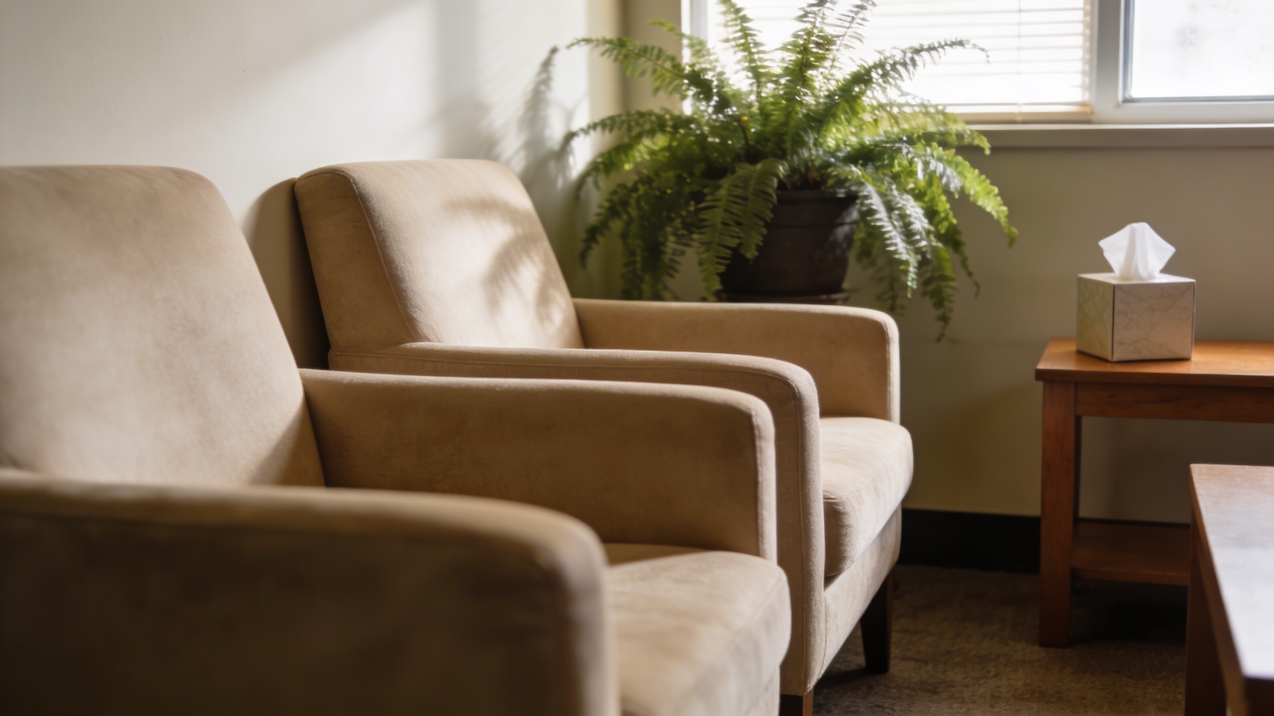
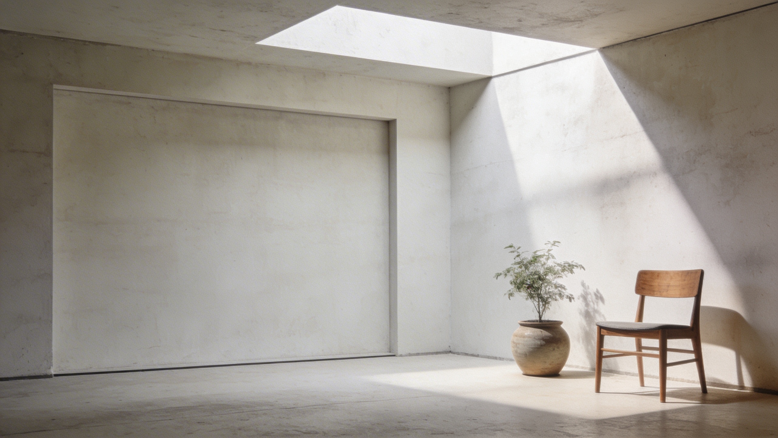
Prompt: "realistic stock photo, therapy office waiting room vibe with soft chairs, plant, tissue box, warm neutral palette, gentle daylight, 35mm lens, calm mood, no text"
This category tends to go sterile fast. Add warmth. Add texture. Remove anything that looks like a hospital unless you’re actually illustrating healthcare.
Money, admin, and “adulting” visuals that feel current
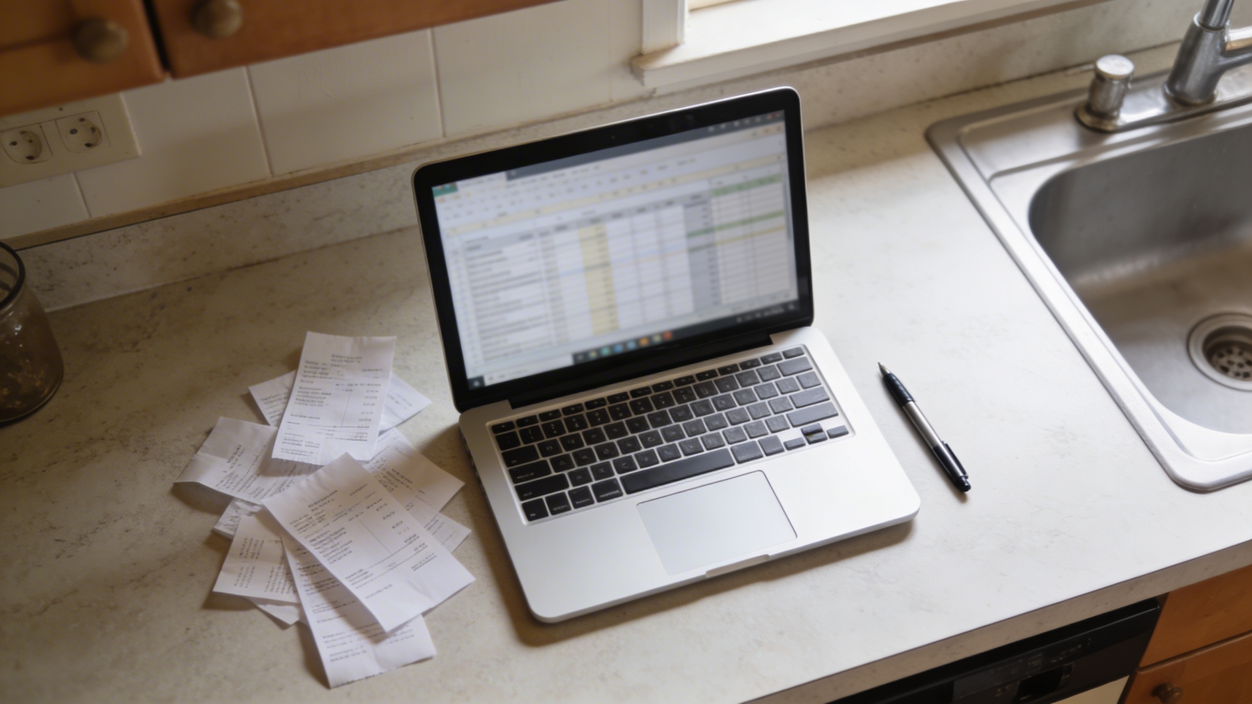
Prompt: "realistic stock photo, kitchen counter with open laptop showing blurred spreadsheet, receipts scattered, pen, realistic overhead daylight, 35mm lens, casual home budgeting vibe, no text"
Prompt: "realistic editorial stock photo, close-up of tapping contactless payment on a card reader, hands only, cozy café background bokeh, 50mm lens, natural colors, no visible brand names, no text"

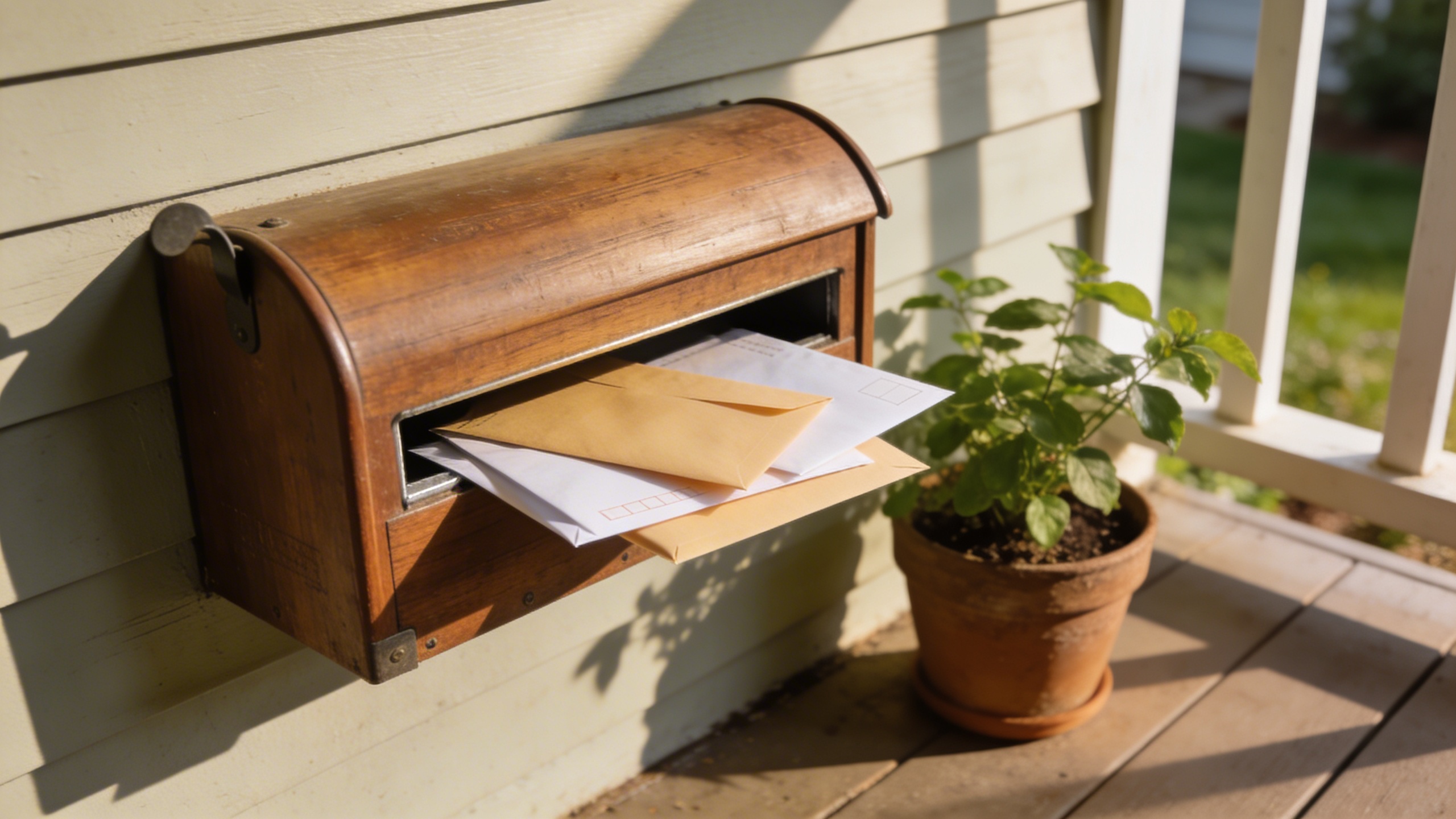
Prompt: "realistic stock photo, mailbox with envelopes and a small plant nearby, suburban porch scene, soft morning light, 35mm lens, gentle shadows, no text"
Not glamorous, extremely useful. Also: these kinds of images are where you want real negative space because someone is going to slap copy on it. It might be you.
Modern “teamwork” without the forced smiles
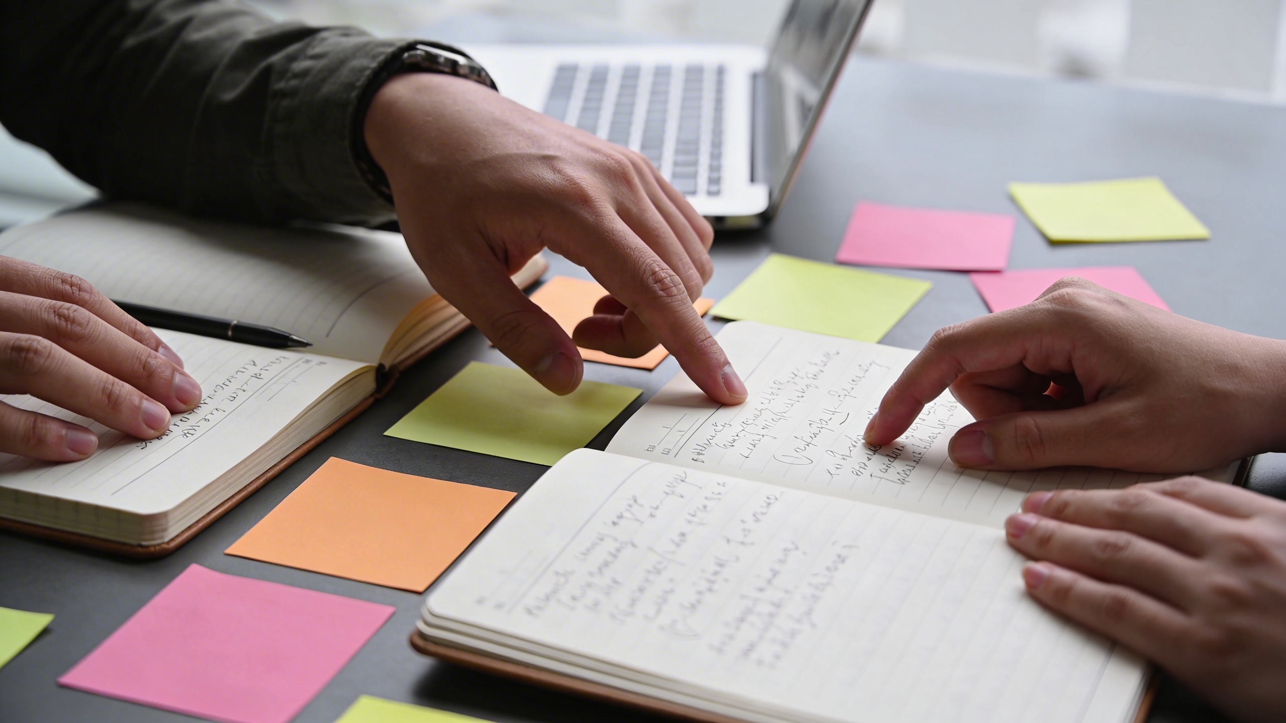
Prompt: "realistic editorial stock photo, two coworkers collaborating at a table, only hands and notebooks visible, sticky notes, laptop edge, bright overcast office light, 35mm lens, candid, no text"
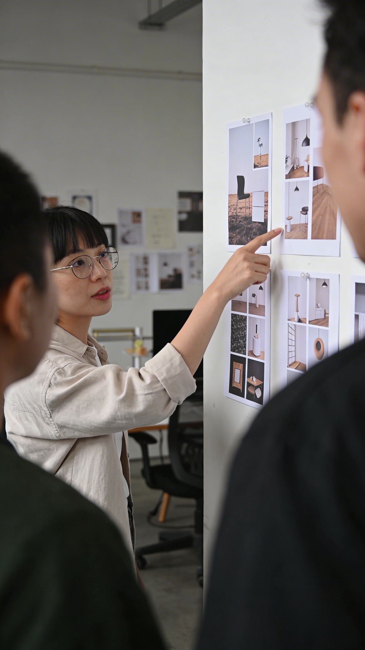
Prompt: "realistic stock photo, small creative studio meeting, person pointing at printed mockups on wall, shallow depth of field, 50mm lens, natural light, muted colors, no visible logos, no text"
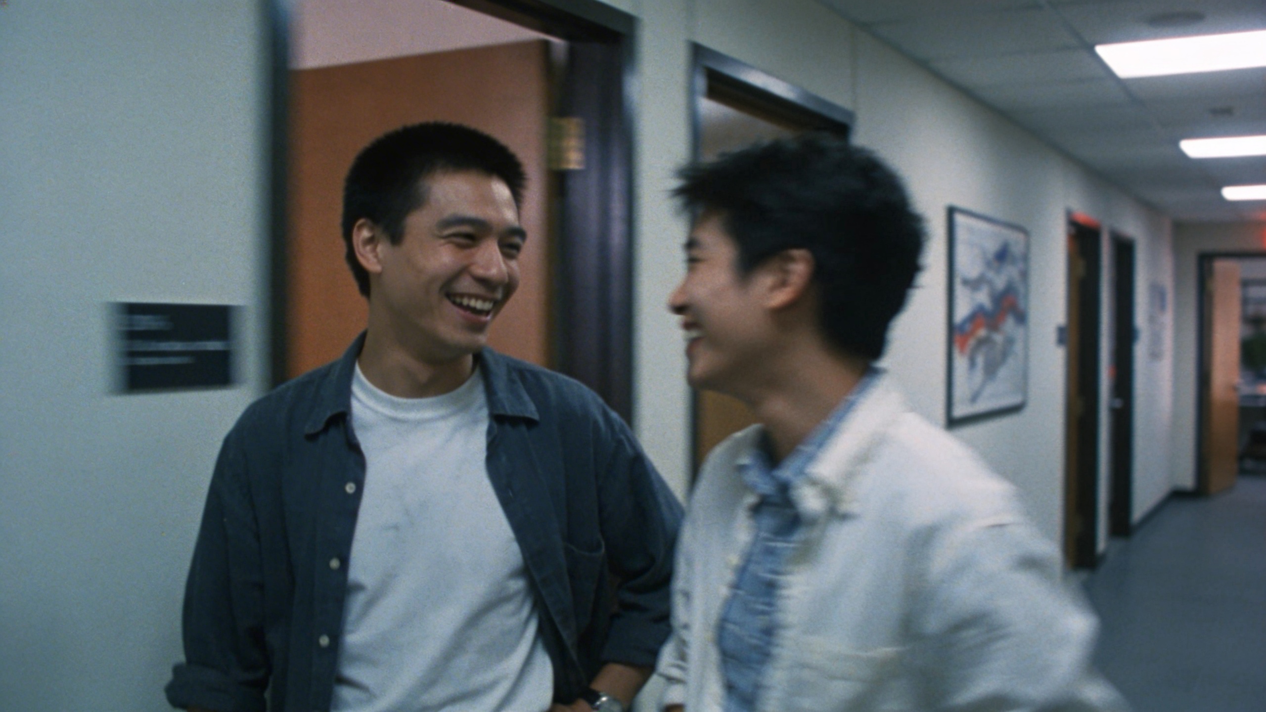
Prompt: "realistic documentary stock photo, hallway conversation outside office, candid laughter, slightly imperfect framing, motion blur, 35mm lens, natural fluorescent mixed lighting, no text"
If you do one thing to make “team” photos better, do this: don’t show faces. Or at least don’t center them. When you crop for a homepage, faces become awkward. Hands, gestures, and objects survive brutal cropping.
Creator economy and “making stuff” shots
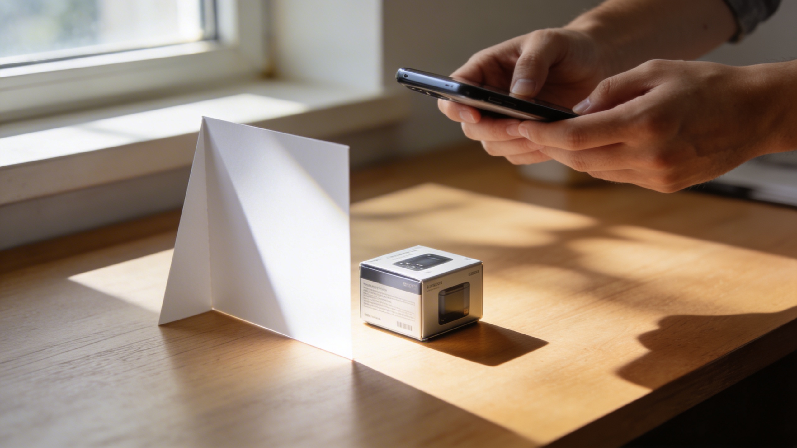
Prompt: "realistic stock photo, hands photographing a small product on a desk with a smartphone, DIY light from a window, simple reflector card, 35mm lens, natural shadows, no text"
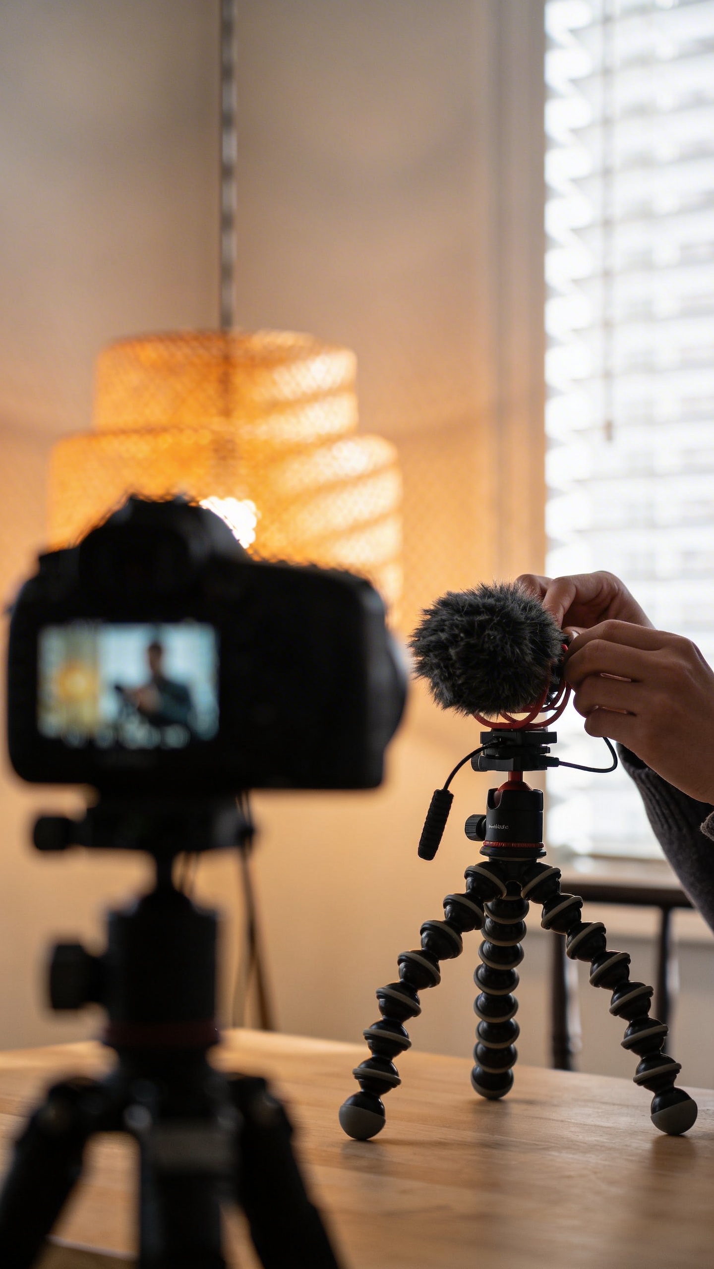
Prompt: "realistic editorial stock photo, content creator filming at home, camera on tripod slightly out of focus in foreground, person’s hands adjusting microphone, warm lamp mixed with daylight, 50mm lens, no text"
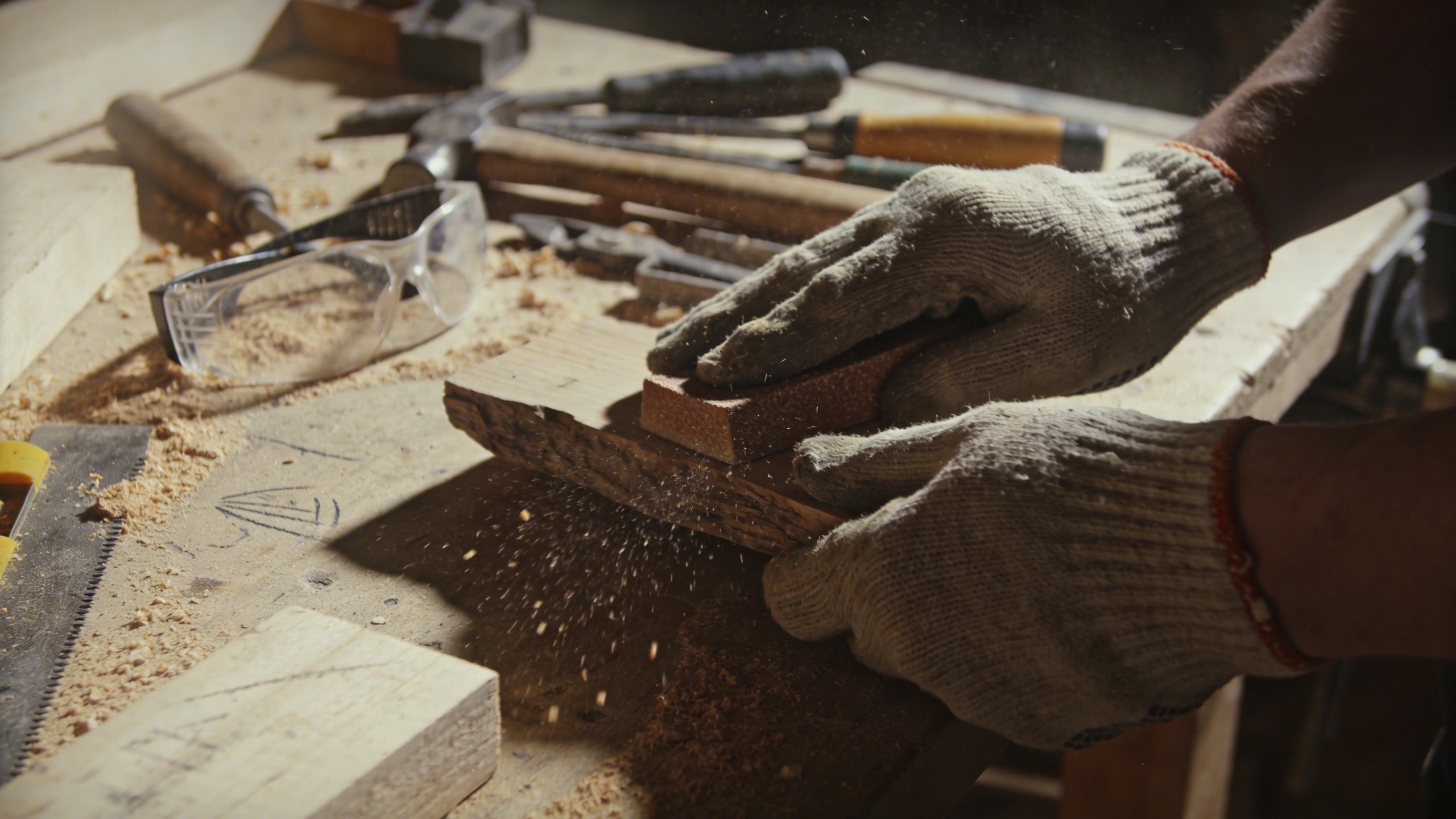
Prompt: "realistic stock photo, small workshop table with tools, sawdust, protective glasses, hands sanding a wooden piece, harsh overhead light, 35mm lens, gritty texture, no text"
Creator shots are everywhere because everyone is a creator now, even if it’s just a Google Doc and a capo on a guitar you never learned. The “workshop” style images are also really useful for newsletters and “behind the scenes” pages because they feel honest, even when they’re staged.
Nature and “mental reset” imagery that isn’t wallpaper-y
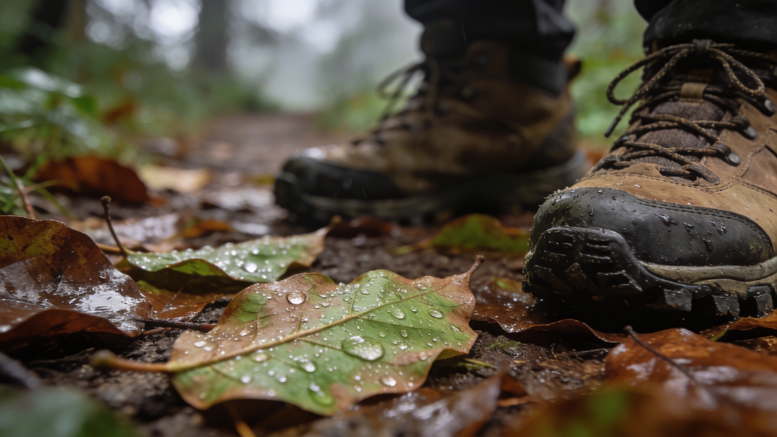
Prompt: "realistic stock photo, close-up of hiking boots on a forest trail with wet leaves, shallow depth of field, cloudy daylight, 50mm lens, earthy tones, no text"
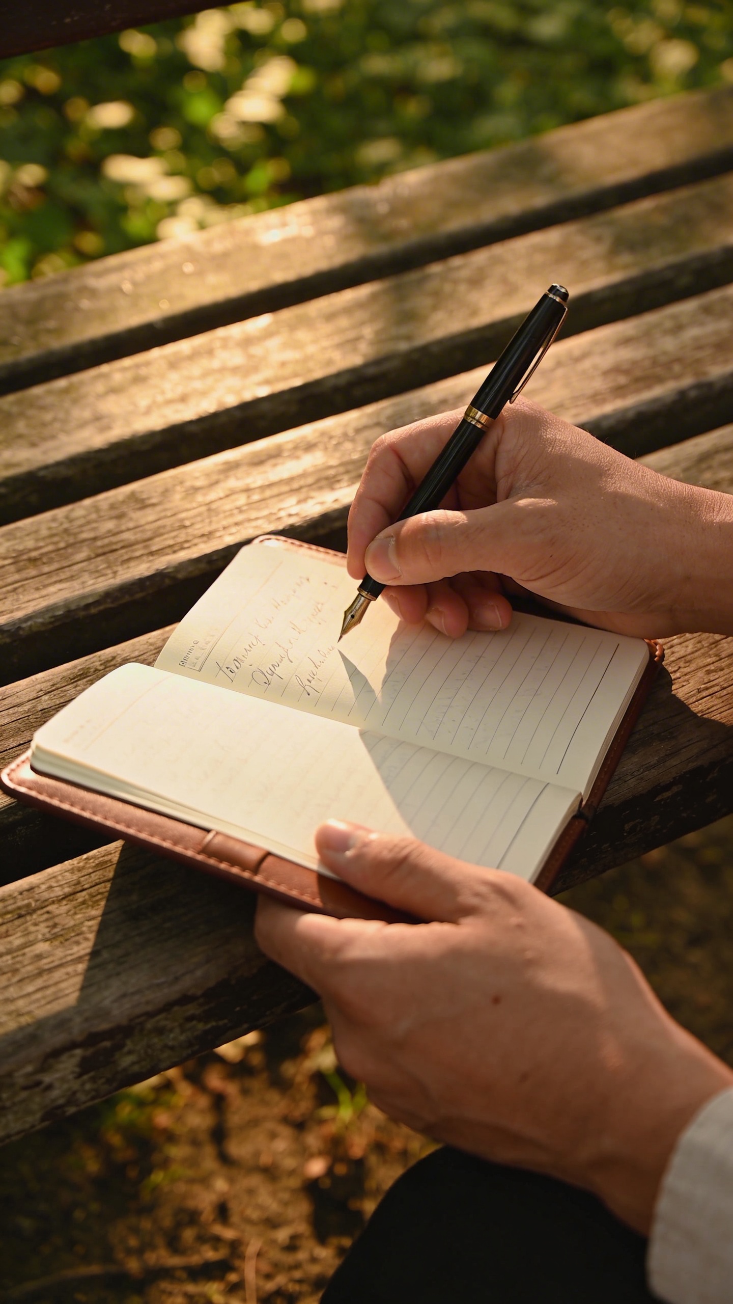
Prompt: "realistic editorial stock photo, person journal writing on a bench in a park, only hands and notebook visible, soft golden hour light, 85mm lens, calm mood, no text"
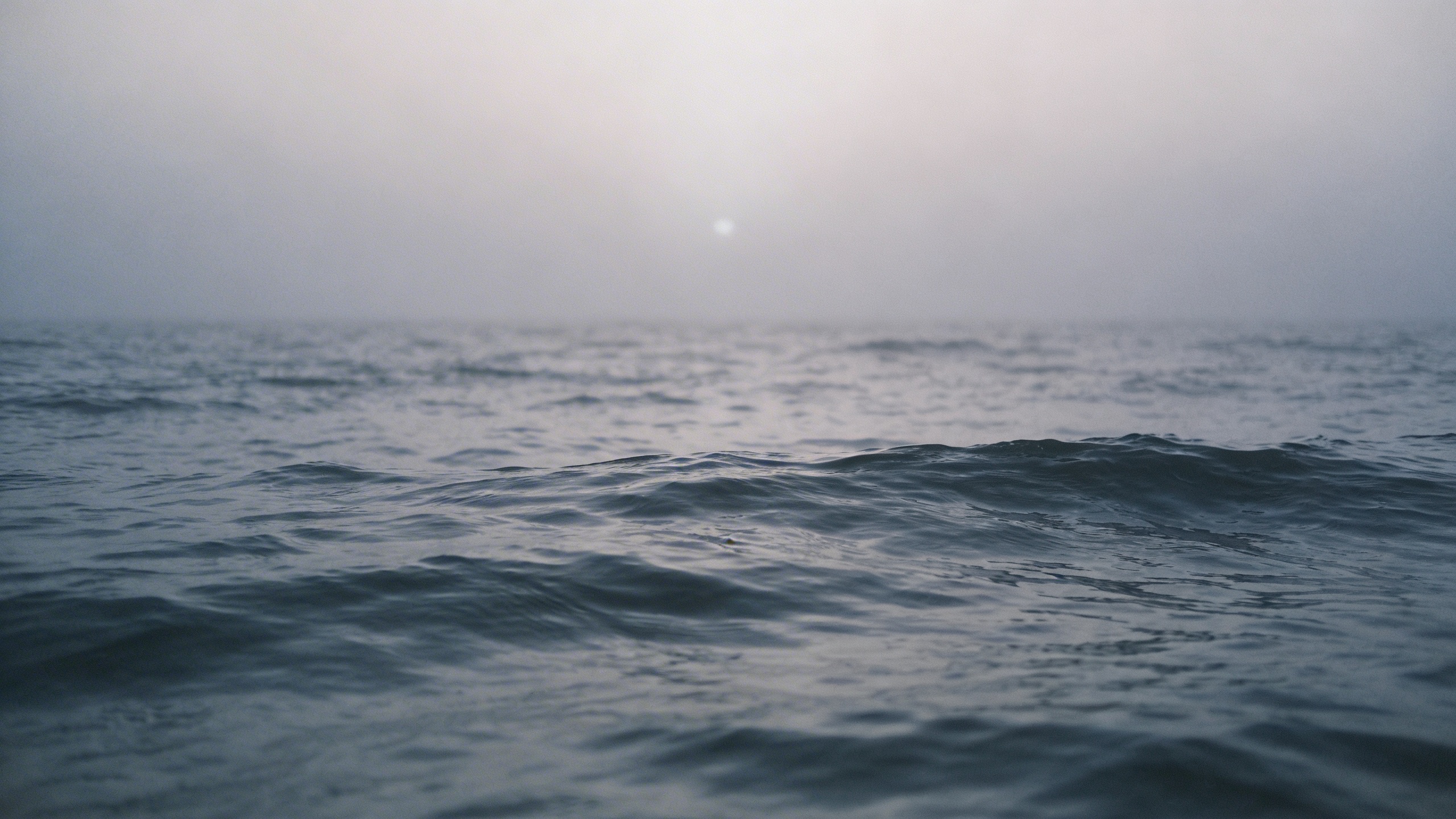
Prompt: "realistic stock photo, moody ocean horizon with gentle waves, foggy morning, minimal composition, plenty of negative space, 35mm lens, cool gray-blue palette, no text"
Nature images become generic fast. The moment you add one human detail (boots, notebook, hand holding a thermos), it’s suddenly a story instead of a wallpaper. That is often what you need for website headers.
How I tweak a prompt when the image looks “almost right”
This part is frustratingly manual. I still do it every time. Also, the smallest changes can fix the uncanny feeling.
Add imperfections, but don’t make it “grunge”
If your image looks too clean, add:
- “slight clutter”
- “tiny stain ring”
- “wrinkled linen”
- “subtle film grain”
- “slight motion blur”
Not all of them at once. One or two is enough. If you stack ten “realism” modifiers, you get a weird sludge of conflicting instructions, and the image starts looking like an over-processed HDR photo from a phone that desperately wants to impress you.
Use the language of photography (sparingly)
When you add “35mm lens” or “shallow depth of field,” you’re basically telling the model to mimic a photographic aesthetic, which is helpful for stock. But you can overdo it. I’ve seen prompts that read like someone swallowed a camera manual and panicked.
My personal default: 35mm for environment, 50mm for general lifestyle, 85mm for details.
Negative space is not optional if you do marketing
If you need a header, say it. Literally say “negative space on left” or “empty area in upper third.” You will thank yourself later when you’re trying to fit a headline and a button without covering the only interesting part of the photo.
I’ve generated images in Stockimg.ai where I loved the subject, but the composition had zero breathing room, and I ended up abandoning it even though it was gorgeous. Gorgeous is not the assignment.
If hands look weird, change the framing
This sounds obvious until it isn’t. If fingers are doing something cursed, don’t fight it by insisting “perfect hands.” Reframe the shot:
- “hands partially out of frame”
- “hands out of focus in foreground”
- “hands behind object”
- “back of hands only”
A lot of the best stock photos are basically compositions that hide the hard stuff while still reading clearly.
Where I still find the best ai stock photos
I generate images in Stockimg.ai to nail the vibe and palette, then I grab two supporting real photos from free stock photography websites to make the page feel grounded. Mixing sources can hide the fact that you are mixing sources, if you keep color and lighting consistent.
Frequently Asked Questions (FAQs)
Can I use AI-generated images as “free stock photos” for commercial projects?
Usually yes, but “can” depends on the tool’s license and your risk tolerance. Treat AI images like you would any asset: read the usage terms, avoid recognizable logos, and be careful with anything that looks like a real person.
What file format should I use for blog headers and website hero images?
Export as JPG for photos most of the time, and aim for around 2000-3000px wide so it stays sharp on modern screens. Use WebP if your site supports it and you care about performance.
How do I make sure my prompt results have enough negative space for text?
Say it directly in the prompt: “negative space on left,” “empty upper third,” or “minimal background with open wall area.” If it still crowds the subject, regenerate with a wider lens look like 35mm and describe the scene as “wide shot.”
Why do my “stock photo prompts” sometimes produce images that look too perfect?
Because “clean” is the default bias. Add one imperfection (wrinkled linen, slight clutter, subtle film grain) and specify natural lighting like “overcast daylight” or “morning window light.”
What are the best free stock photography websites for real photos (not AI)?
Use the big, reputable libraries for broad coverage, then dig by photographer profile once you find a style you like. The main win is consistency, not just price.
How do I avoid accidentally generating images with brand logos or copyrighted elements?
Tell the model “no logos, no brand names, blank labels,” and keep packaging generic (kraft paper, unlabeled bottles). If you still see something recognizable, do not use that image for client work.
Can I keep the same visual style across 10-20 images for a brand kit?
Yes. Reuse the same lighting, lens, color palette, and environment in your prompts, and only swap the subject. This is one of the situations where Stockimg.ai is genuinely handy because you can iterate quickly without reinventing the whole look each time.
What’s the simplest way to upscale a low-res image for print?
Start with the highest resolution you can export, then upscale with a dedicated upscaler and test print a small crop first, because “looks sharp on screen” and “prints clean” are not the same thing.