’m going to give you prompts you can paste and run. But I’m also going to tell you the part that annoyed me when I tried to build a consistent set: one-off images are easy, sets are hard. Stock photos are not about one banger. They’re about 12 coordinated images where the lighting, focal length, styling, and negative space make sense together.
If you want to generate nanobanana stock photos that actually behave like stock photography (space for headlines, consistent colors, predictable props, repeatable angles), you need prompts that are a little boring on purpose, plus a few “unique photo concepts” that still slot into ad creative without making the brand team panic.
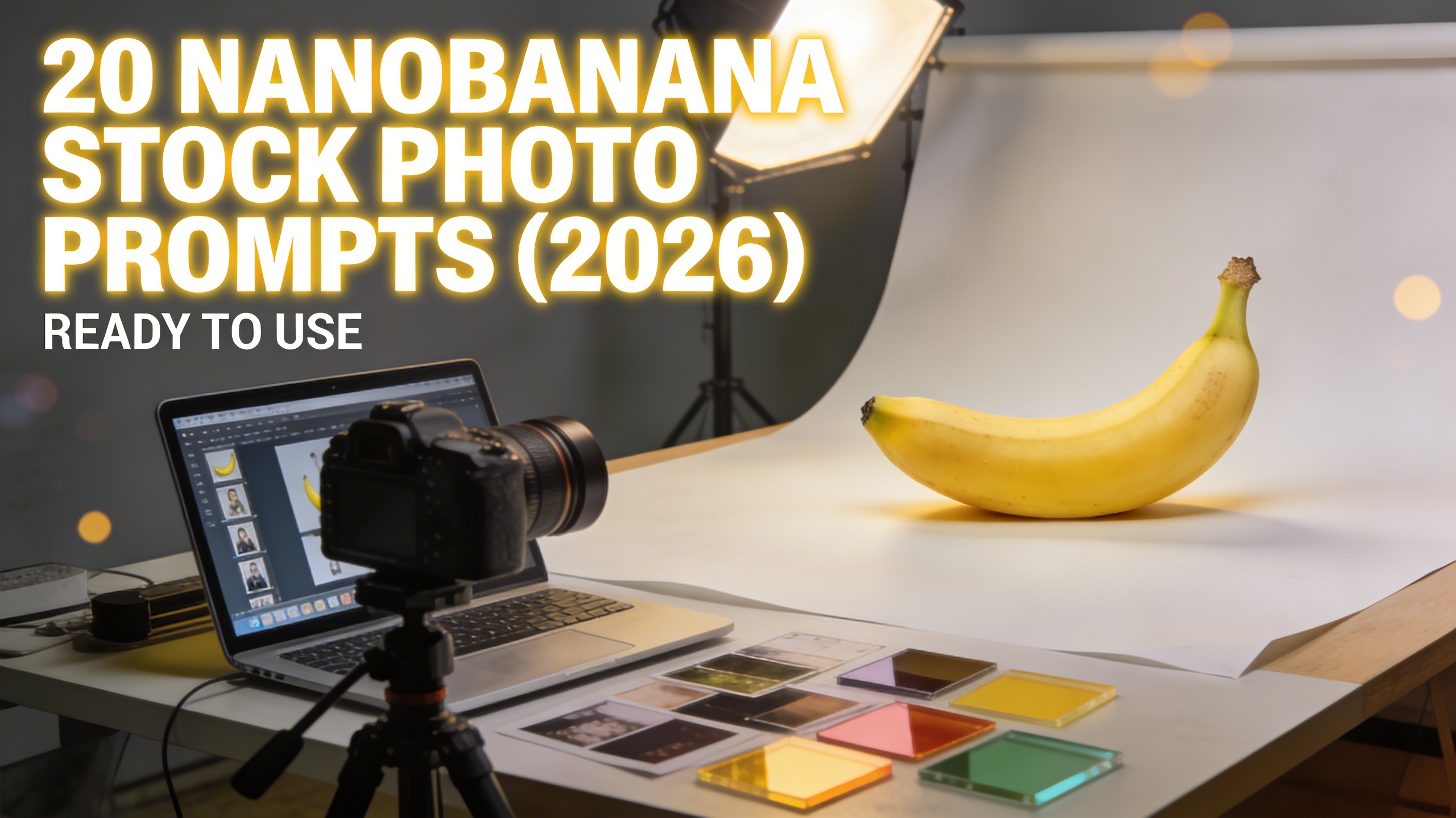
20 ready-to-use Nanobanana stock photo prompts (with images)
I’m grouping these into four mini-buckets because that’s how I actually work: I generate a clean “safe” set first (the stuff that will definitely be useful), then I add a few odd ones to make the collection memorable.
Important: every prompt assumes you want photorealistic stock photography. If you want illustration, you can swap “photo” for “clean vector,” but that’s not the vibe here.
Minimal studio shots (the boring money stuff)
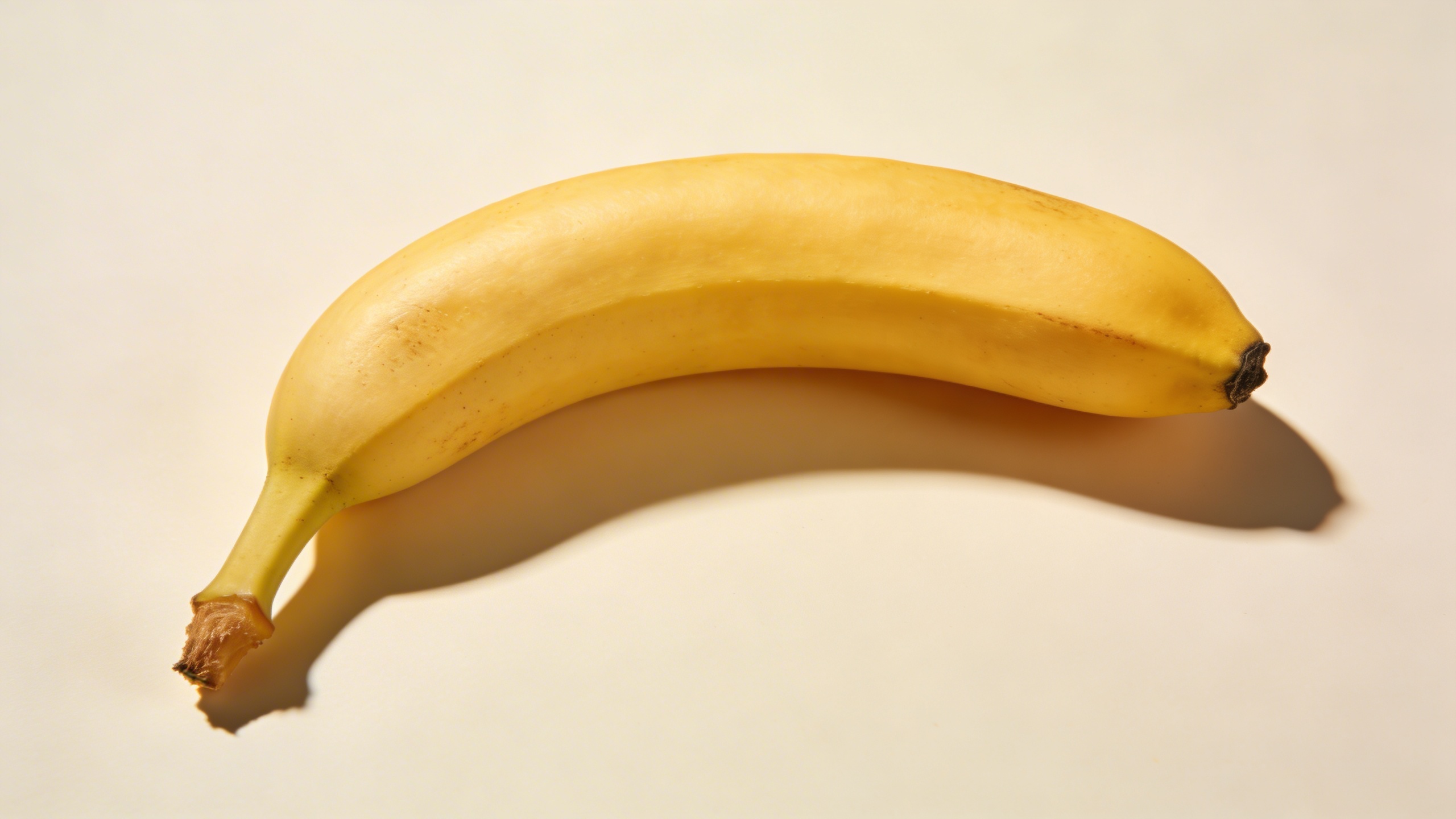
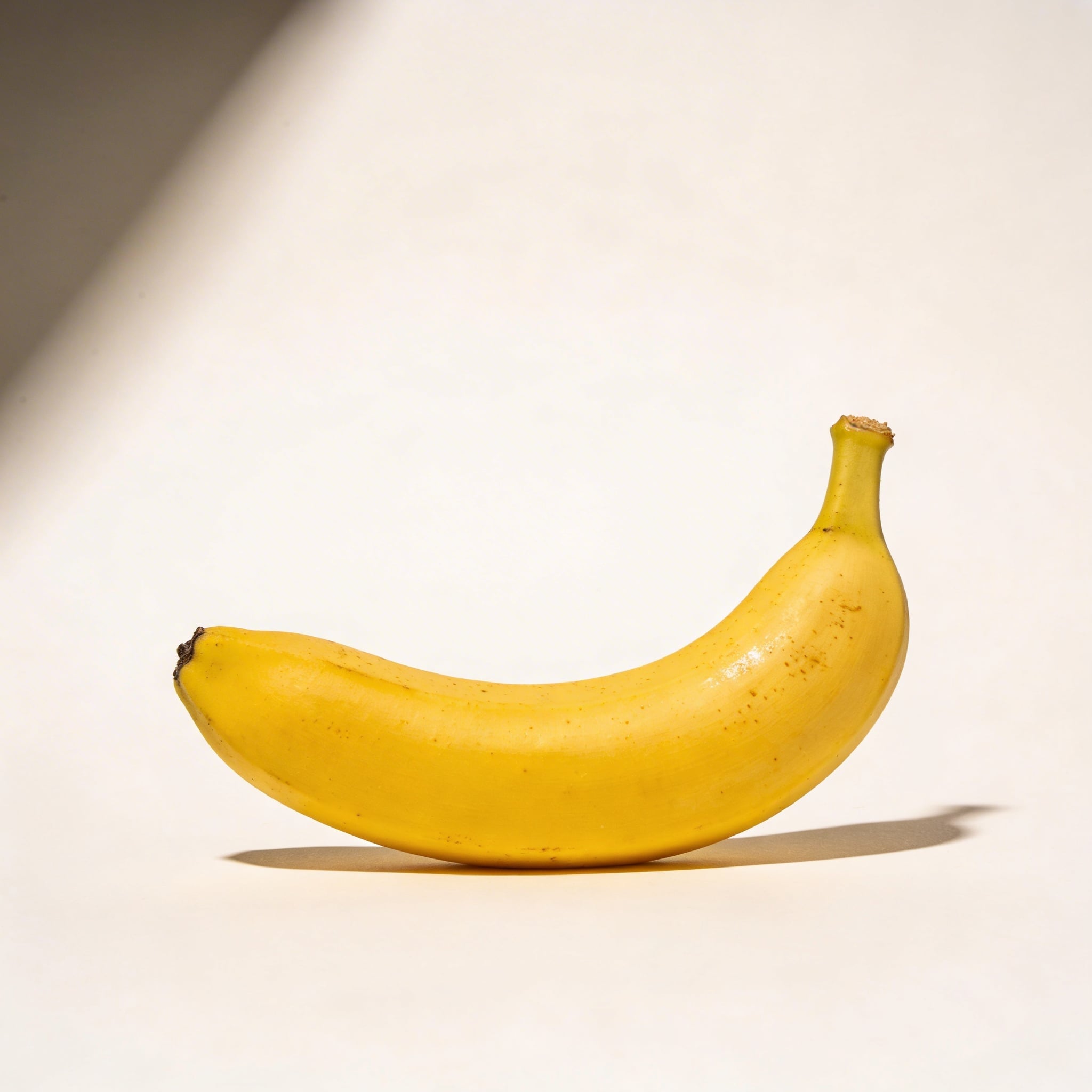
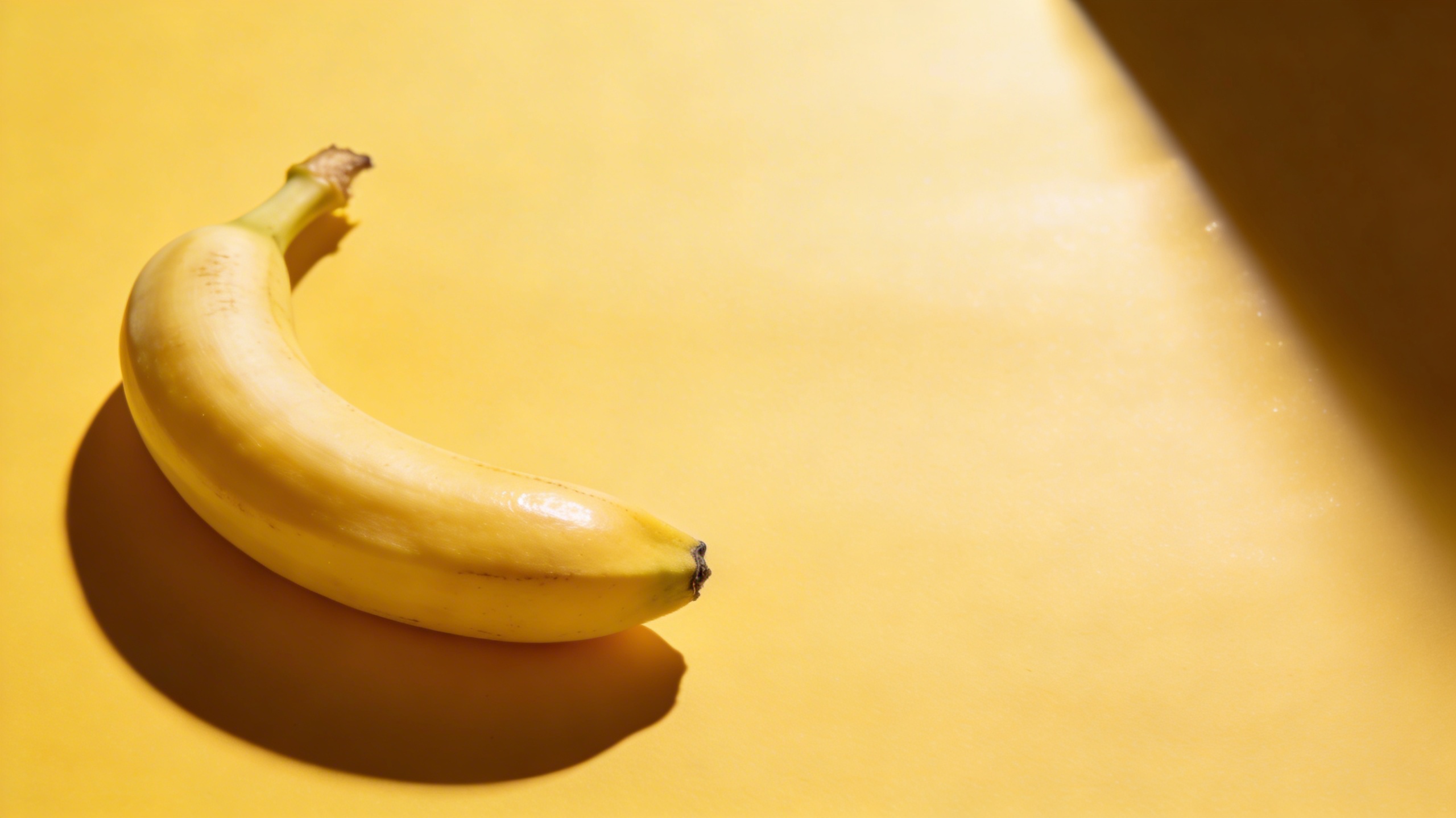
Prompt: "high-end commercial stock photo of a single ripe banana on a warm white seamless paper background, softbox lighting from upper left, gentle realistic shadow, 50mm lens look, true-to-life texture with tiny banana speckles, centered subject with generous copy space above, ultra sharp, no text, no watermark, no logo"
This is the one you think you don’t need until you’re laying out a hero banner and you realize the “funny” images have nowhere for the headline to go.
Prompt: "commercial product photography, peeled banana half-open resting on pale beige seamless background, soft diffused studio lighting, subtle shadow, crisp realistic fiber texture on peel, close-up with shallow depth of field, composition bottom-right with large negative space on left, no text, no watermark"
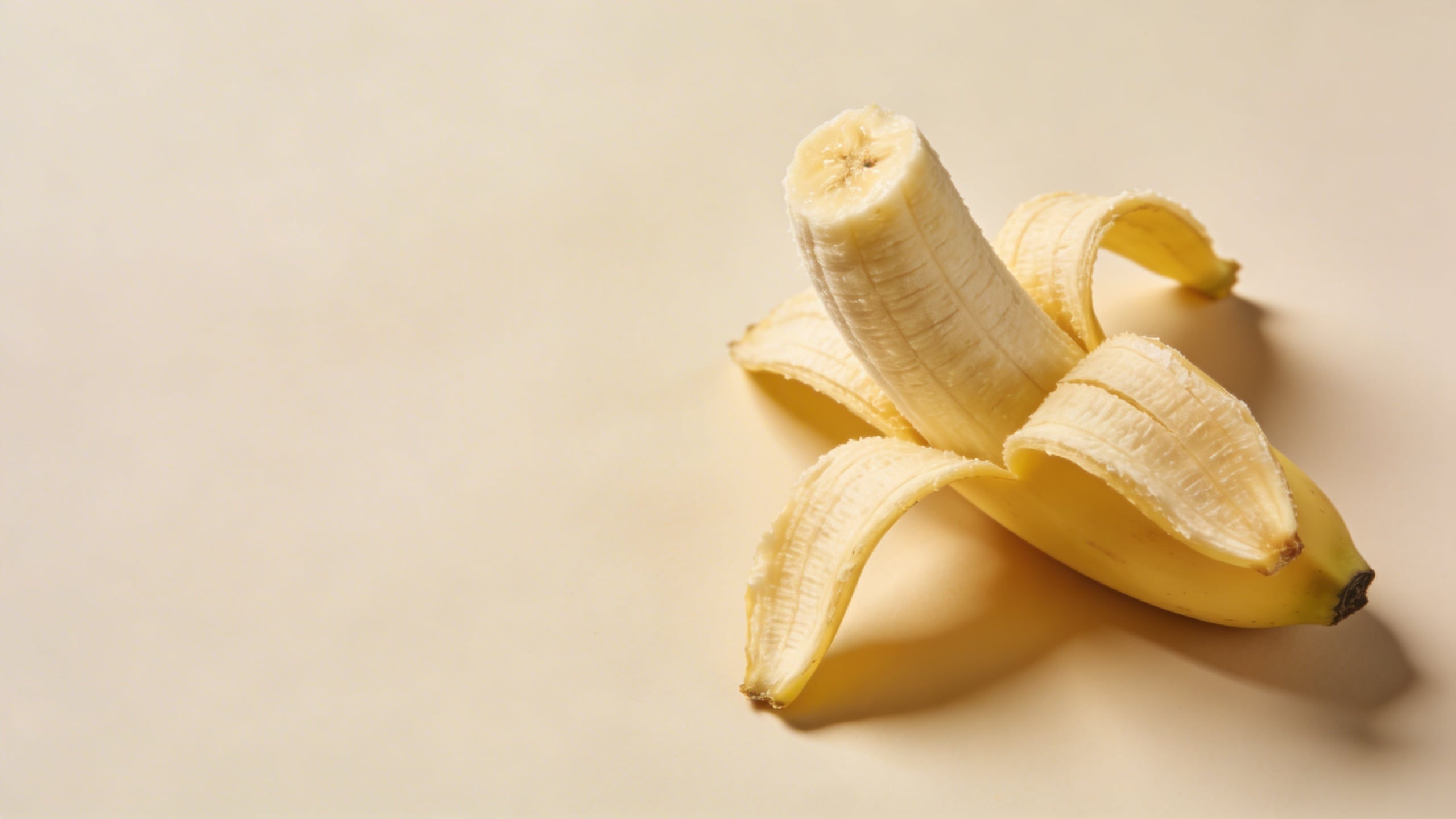
Peeled bananas are risky because AI sometimes turns the peel into something biological-looking in a way you did not ask for. If you get that, tighten your prompt with “clean peel edges, natural peel anatomy, no melting” and rerun.
Prompt: "editorial stock photo, banana slice arrangement in a neat line on matte white acrylic surface, top-down flat lay, soft shadow, bright airy studio lighting, minimal props, 35mm overhead lens look, copy space at top, photoreal, no text"
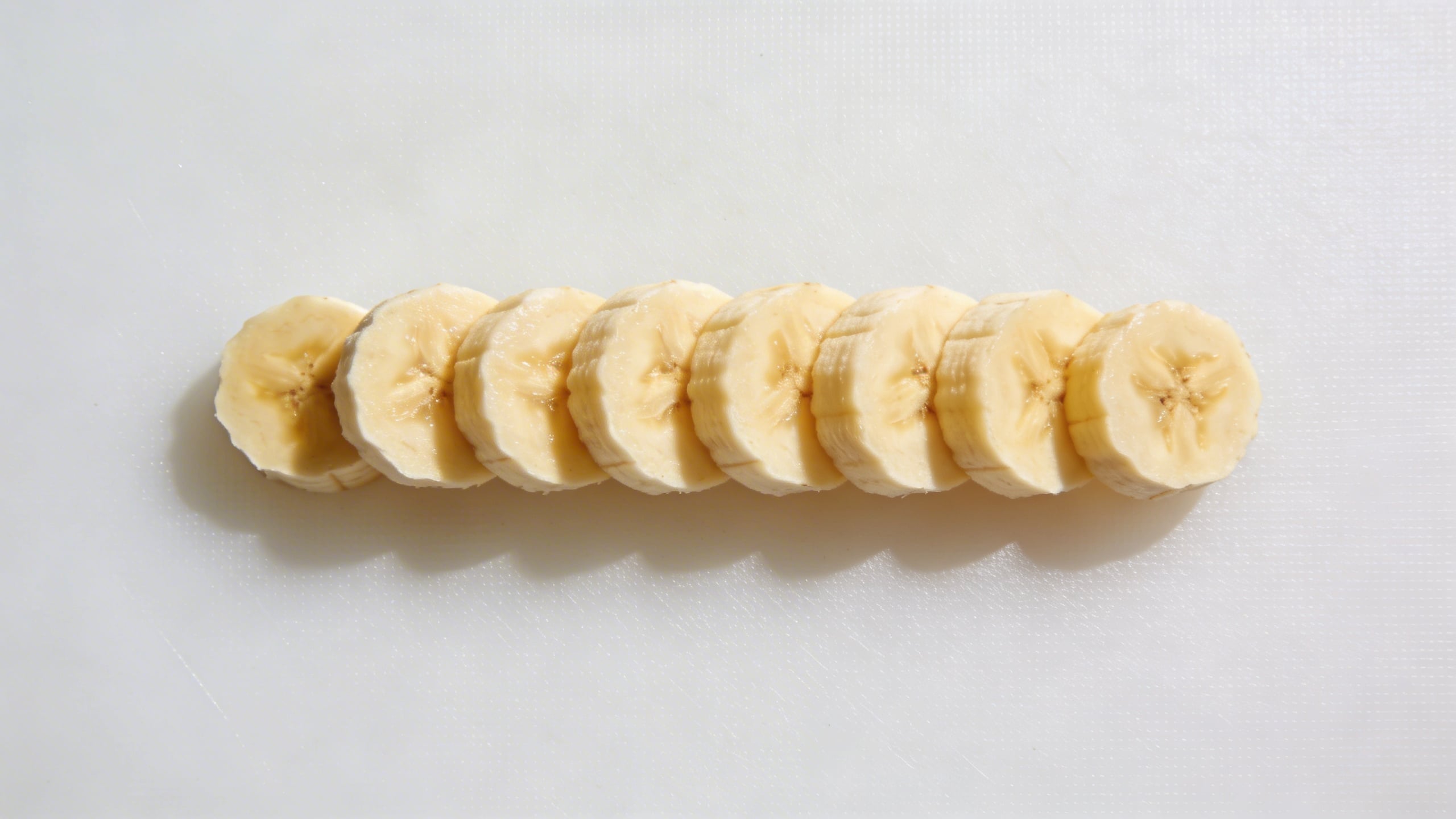
Flat lays sell because they’re easy to design on top of. They’re also easy to mess up because the model wants to scatter crumbs everywhere. “neat line” helps.
Prompt: "commercial stock photo of banana on pastel yellow seamless background, hard flash on camera right for a crisp shadow edge, glossy highlight on peel, modern editorial aesthetic, subject placed left third with negative space on right, 85mm lens look, no text, no watermark"
Hard flash looks modern when it’s controlled. And when it isn’t controlled, it looks like a crime scene photo of fruit. You’ll know which one you got immediately.
Prompt: "macro product photo, close-up of banana peel texture with tiny brown speckles, ultra detailed, soft studio lighting, shallow depth of field, abstract background blur, high-end stock photography, no text, no watermark"
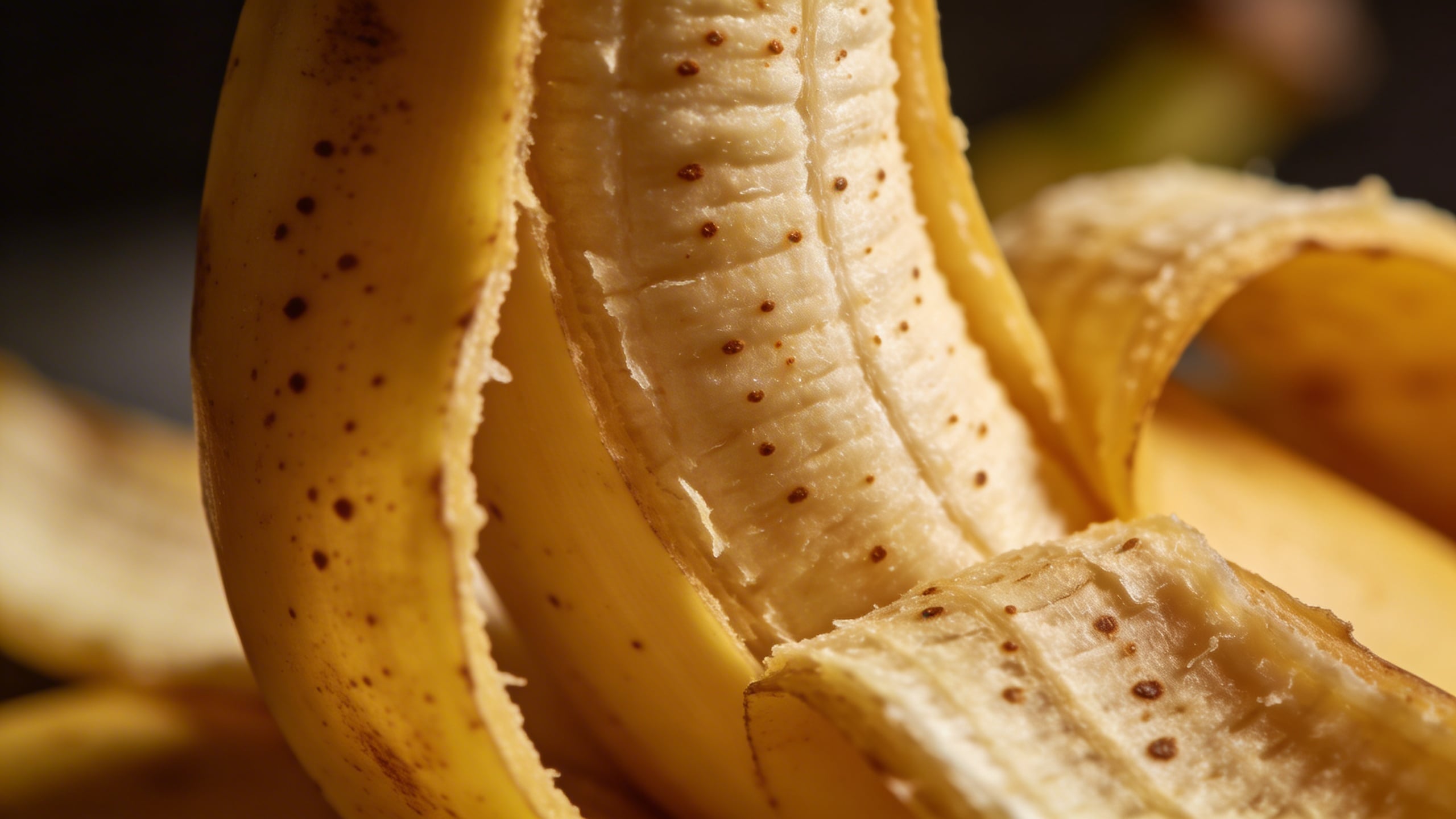
Texture shots are sneaky useful for backgrounds in web design. You’ll crop them anyway, so they don’t have to be conceptually loud.
Breakfast-but-make-it-clean (lifestyle that doesn’t feel like a soap ad)
Prompt: "bright lifestyle stock photo, banana and oatmeal bowl on a light oak kitchen table, morning window light, soft shadows, minimal Scandinavian kitchen background softly blurred, 35mm lens look, natural color grading, copy space in upper left, no text, no watermark"
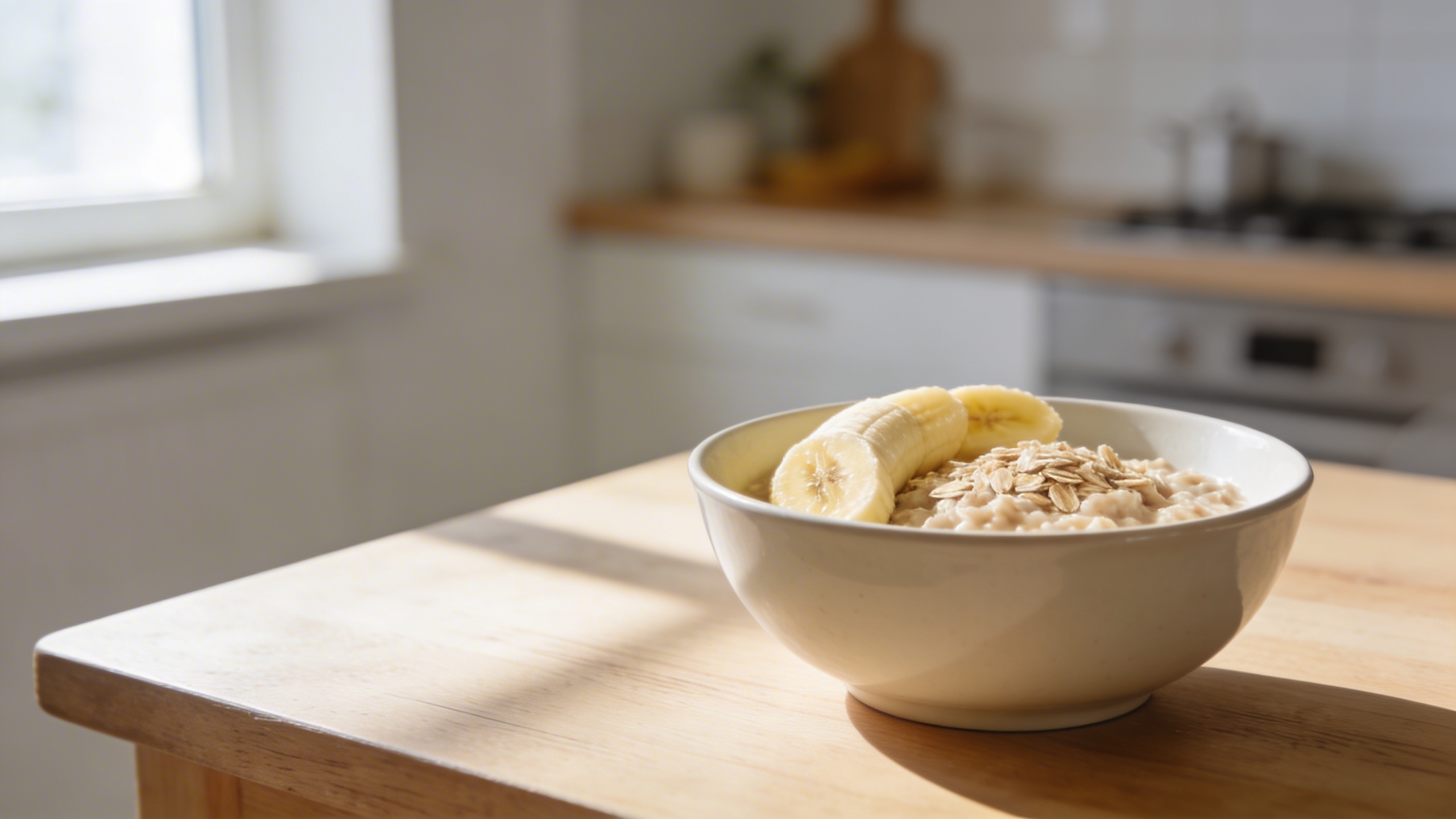
This kind of scene is everywhere, which is exactly why you need it. If you’re generating ready to use stock photos, you need bland winners in the set.
Prompt: "editorial stock photo, banana smoothie in clear glass with condensation, simple white linen napkin, neutral stone countertop, soft daylight, realistic reflections and refraction, shallow depth of field, copy space on right, no branding, no text"
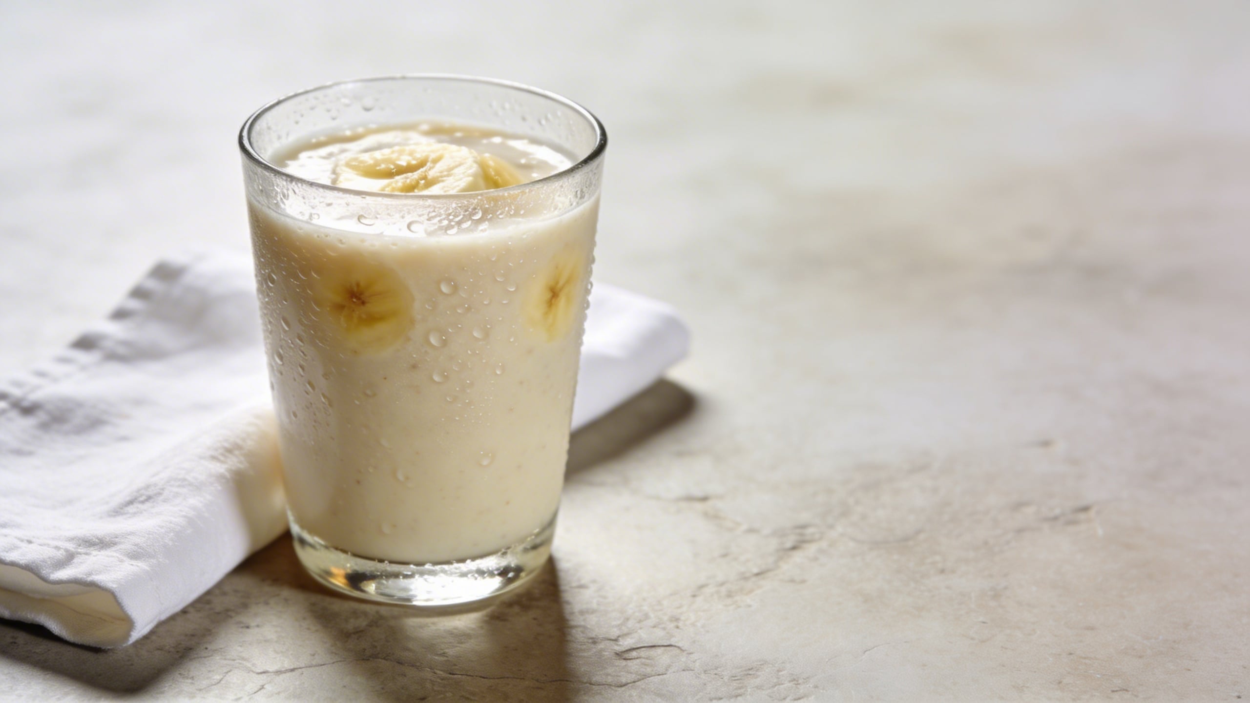
The condensation detail matters. Without it, AI drinks often look like plastic.
Prompt: "top-down flat lay, banana pancakes on a matte ceramic plate, fork and knife aligned neatly, minimal crumbs, bright natural daylight, clean editorial food photography, muted warm palette, copy space at top, no text, no watermark"
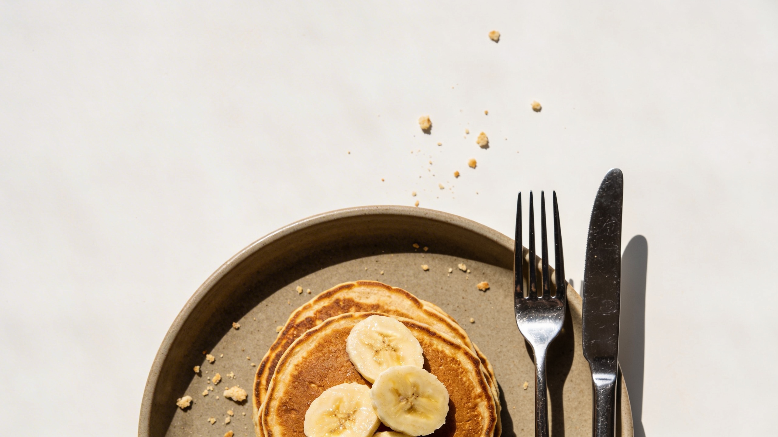
AI loves to add chaos (drips, smears, syrup rivers). Sometimes that’s appetizing, sometimes it’s just busy. “minimal crumbs” and “clean” push it the right way.
Prompt: "lifestyle stock photography, hand holding a banana over a gym bag with a water bottle, neutral locker room bench background, soft diffused light, realistic skin texture, no weird fingers, 50mm lens look, copy space to the left, no brand logos"
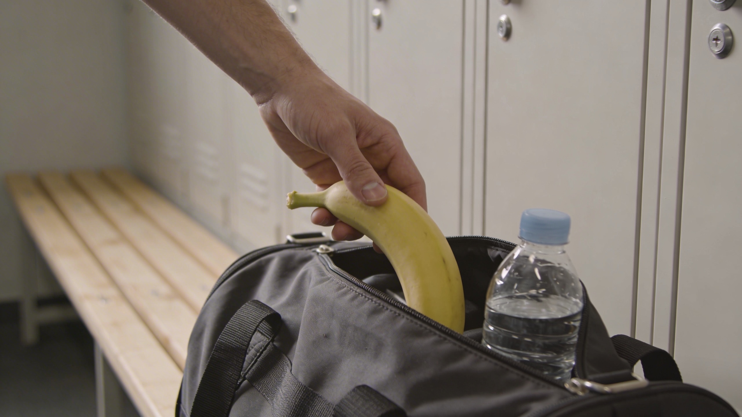
Hands are always a gamble. If you get hand horror, regenerate or remove the hand entirely and shoot the banana next to the gym bag instead. Nobody will miss the hand.
Prompt: "editorial food stock photo, banana and peanut butter toast on rustic sourdough, neutral ceramic plate, natural daylight, shallow depth, minimal styling, warm clean color grade, copy space in background, no text, no watermark"
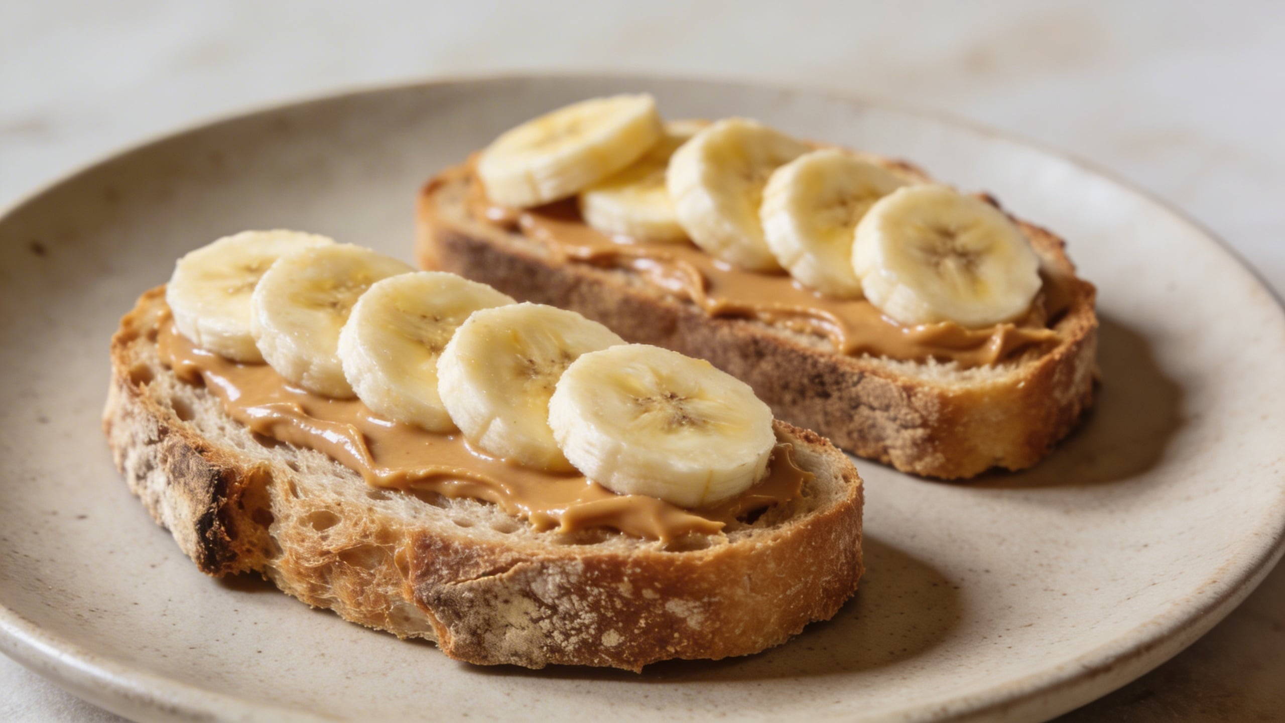
This prompt is one of those “it will be used” shots if you generate a clean version. It’s not exciting, but it’s dependable, which is the entire point.
“Nanobanana” concept shots (weird enough to remember, still usable)
Now the fun stuff, but I’m keeping it commercial. The goal is “unique photo concepts,” not “banana nightmare fuel.”
Prompt: "commercial conceptual stock photo, banana wrapped in a transparent minimal plastic film with a small recycle symbol shape implied (no readable text), on clean white seamless background, softbox lighting, crisp shadows, modern sustainability concept, subject centered with copy space above, photoreal"
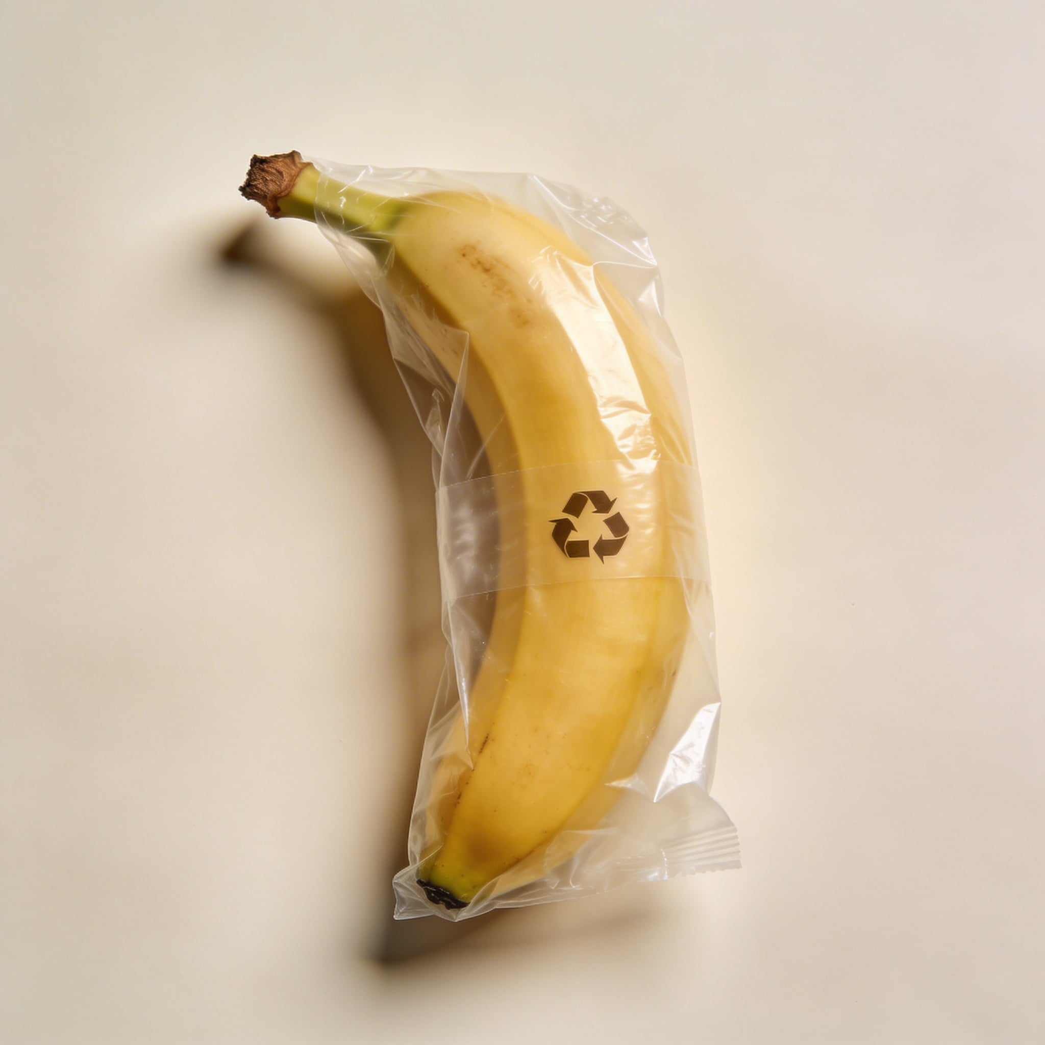
This one works for “packaging,” “sustainability,” “waste,” and a bunch of boring business blog headers. It’s also the kind of image you can sell (or use) without explaining the joke.
Prompt: "surreal but clean editorial stock photo, banana floating slightly above a pale blue seamless background, soft shadow beneath as if suspended, studio lighting, crisp realistic peel texture, minimal composition with large negative space on left, photoreal, no text"
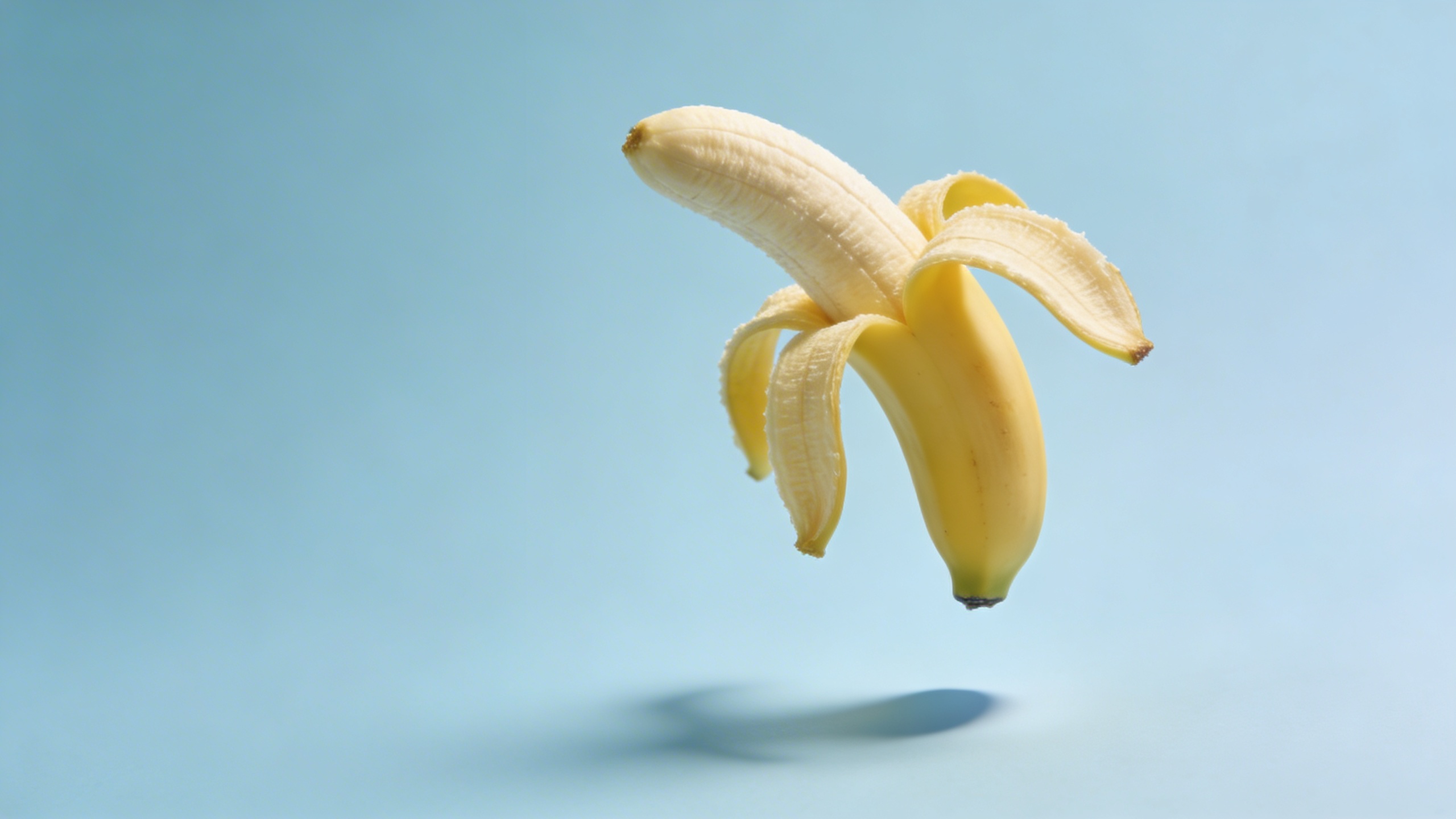
“Floating” is a classic. The trick is still having a believable shadow or your brain rejects it instantly.
Prompt: "conceptual stock photo, banana with a small stitched bandage on peel (no text), on warm gray seamless background, softbox lighting, gentle shadow, healthcare or recovery metaphor, realistic detail, minimal composition, copy space top right"
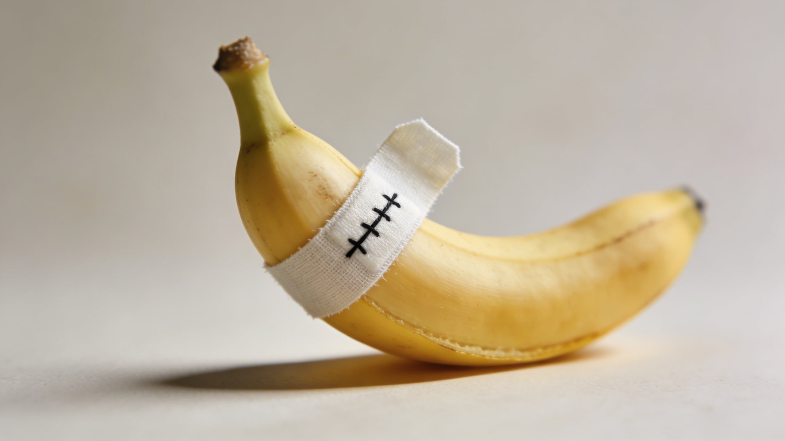
This is a reliable metaphor image. Weird enough to stop a scroll, not so weird it ruins the layout.
Prompt: "commercial conceptual photo, banana balanced perfectly upright on its tip using a hidden support look, pale cream background, studio lighting, sharp defined shadow, minimal modern composition, 85mm lens look, lots of copy space, photoreal"
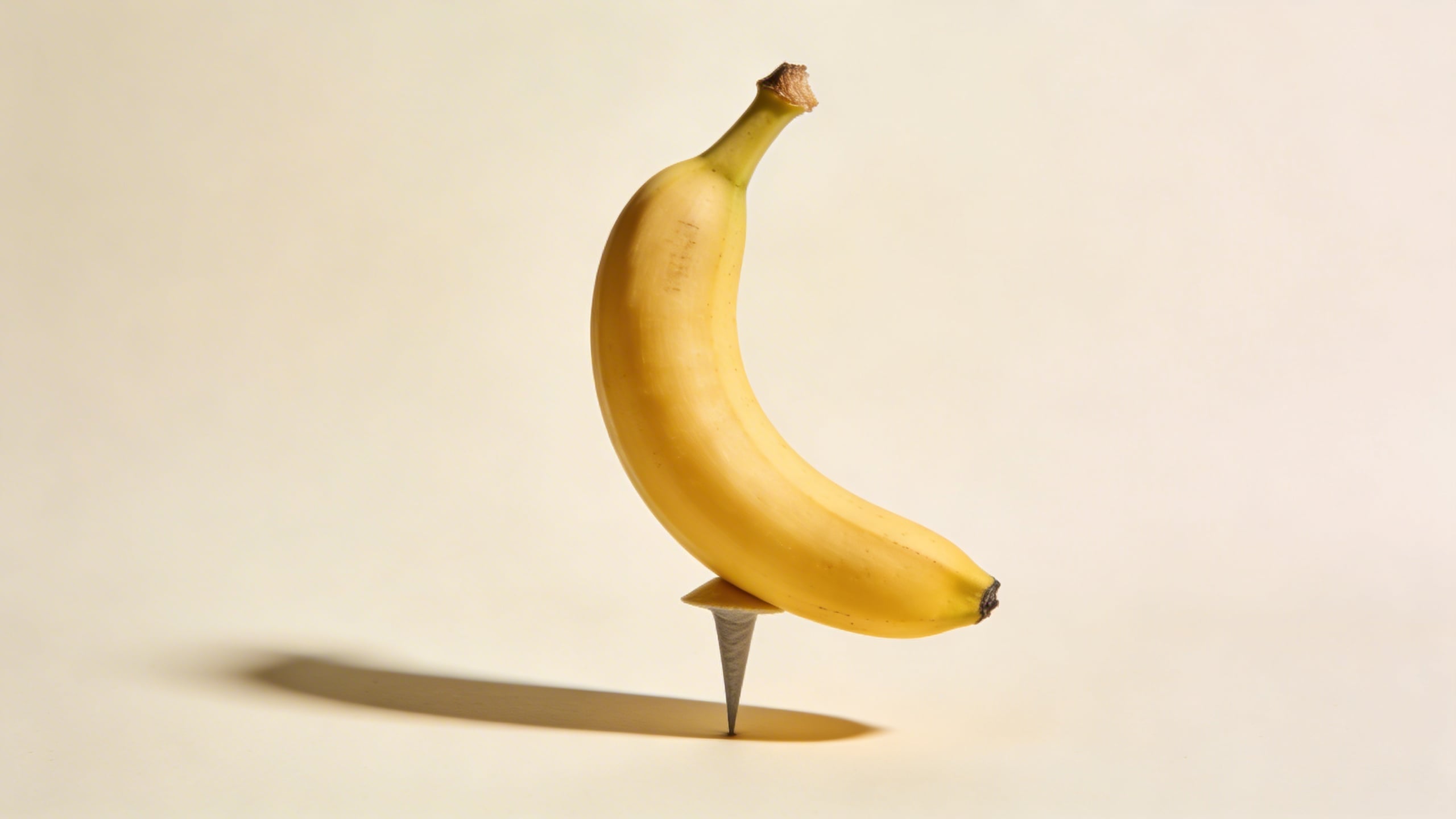
Balancing images are good for “stability,” “risk,” “precision,” “balance your budget,” all that corporate stuff… even if you personally hate it.
Prompt: "editorial stock photo concept, banana in a clear acrylic display cube, museum-like presentation, dramatic but soft studio lighting, gentle reflections, minimalist gray background, high-end product photography style, copy space on left, photoreal, no text"
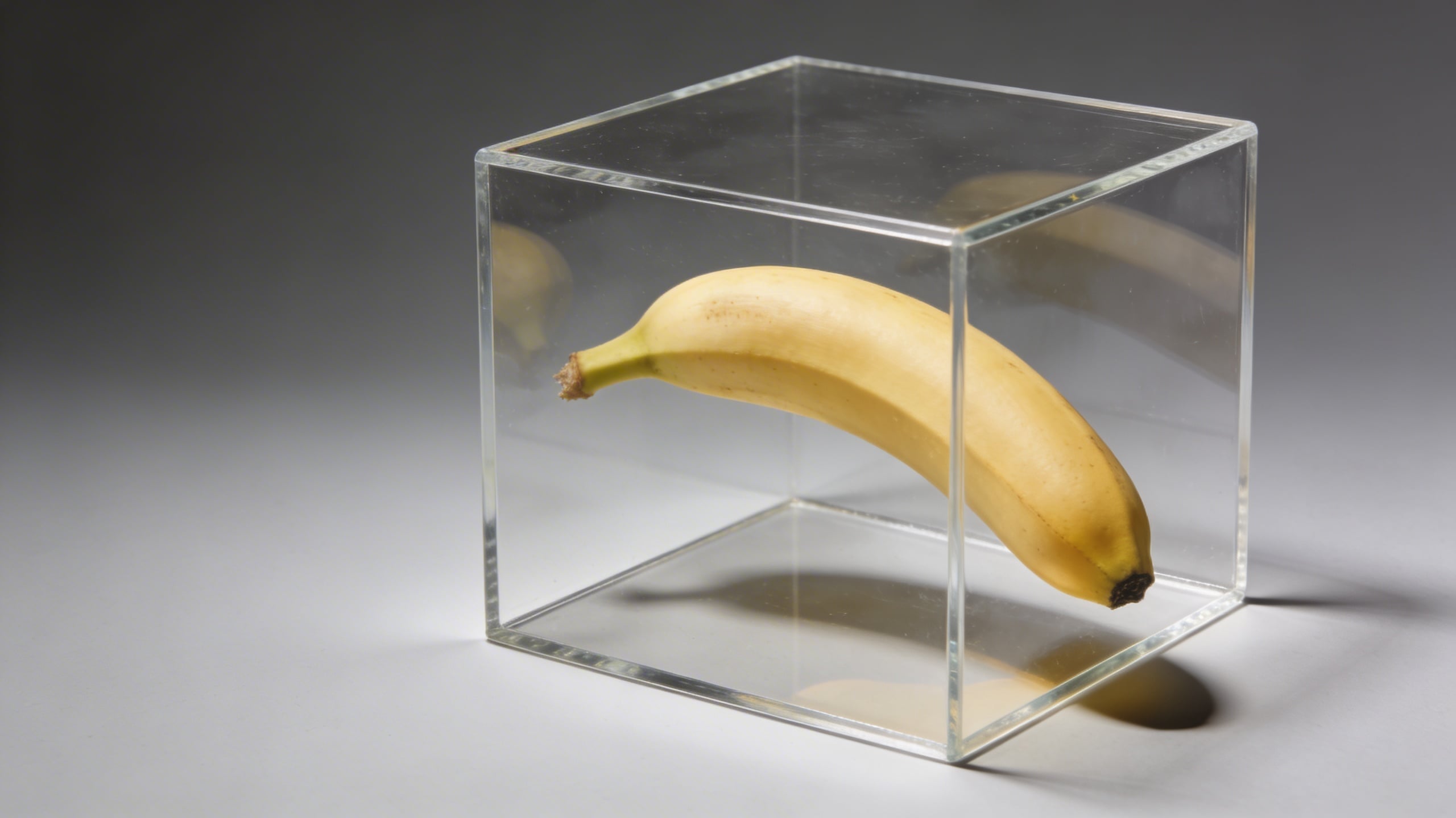
The acrylic cube is my favorite shortcut for “premium.” It makes the banana look like it’s being sold at an art fair, which is both ridiculous and useful.
Work, tech, and brand-adjacent shots (the ones that end up in decks)
These are the nanobanana images that get dropped into startup websites and internal presentations. Whether that’s good for society is another question.
Prompt: "modern office lifestyle stock photo, banana next to a closed laptop and a minimal notebook on a clean desk, soft window light, neutral gray and warm wood palette, shallow depth of field, copy space in upper right, no visible logos, photoreal"

This is the kind of image you’ll think is cheesy until you need “healthy work snack” for a real slide.
Prompt: "editorial stock photo, banana with a small sticky note blank (no text) on a pastel mint background, softbox lighting, gentle shadow, minimal composition, copy space on top, photoreal"
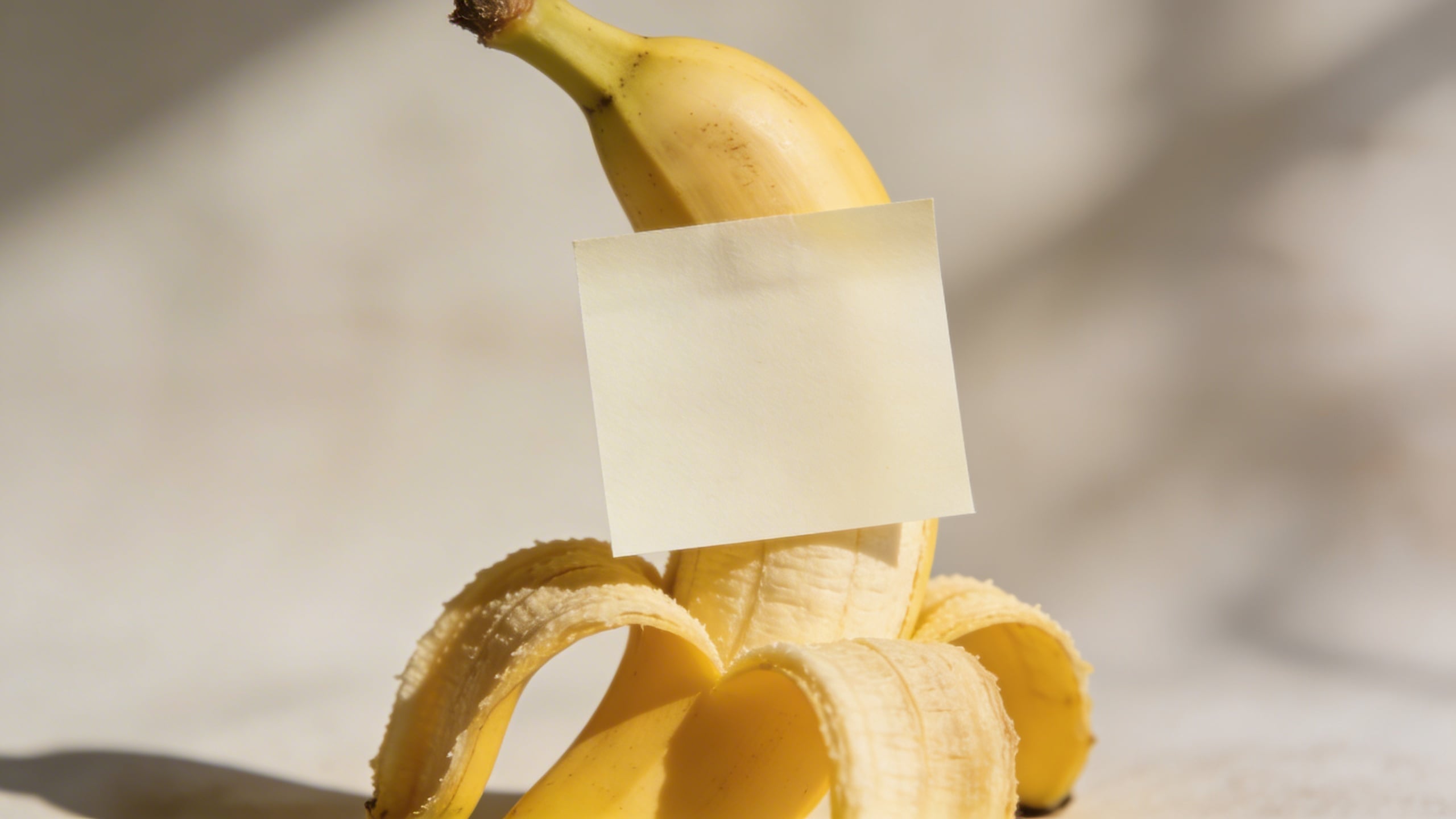
A blank sticky note is basically permission for designers to add whatever they want later. It’s a stock-photo cheat code.
Prompt: "conceptual stock photo, banana next to a simple credit card-shaped blank object (no logos, no numbers), on clean white surface, studio lighting, minimal finance metaphor, subject on right third with copy space left, photoreal"
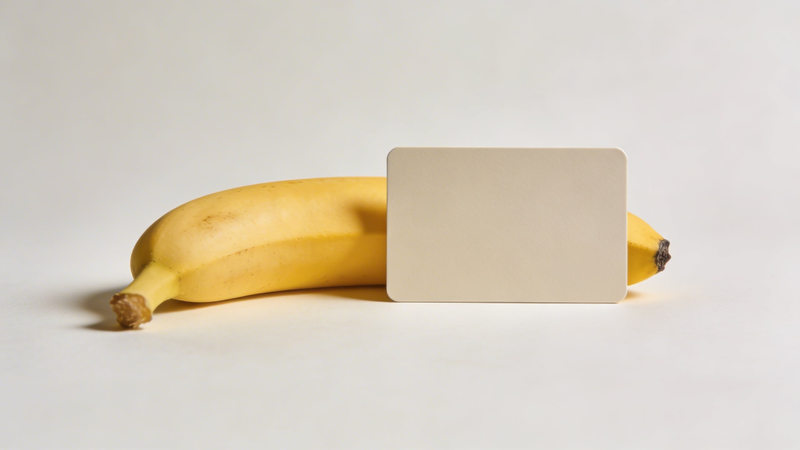
Yes, it’s silly. But “cost of groceries” and “inflation” blog posts love this kind of metaphor shot.
Prompt: "clean editorial stock photo, banana beside a minimal smartphone silhouette with blank screen (no UI), on a pale blue desk surface, soft daylight, subtle shadow, modern tech vibe, copy space above, photoreal"
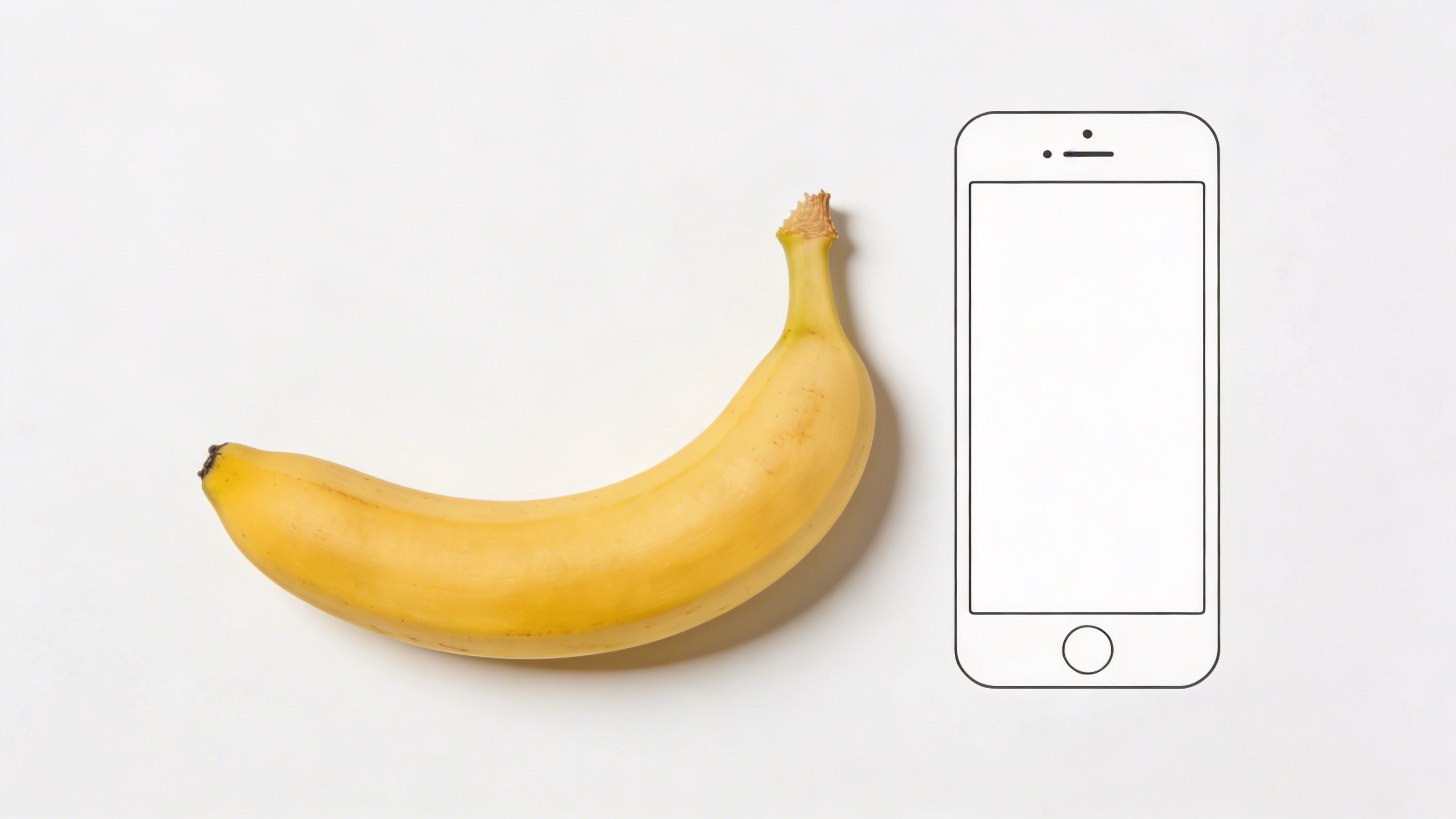
If the phone screen shows anything recognizable, it becomes unusable fast. Keep it blank; add UI later.
Prompt: "editorial stock photo, banana with a small paper crown (simple, no text) on top, pastel pink seamless background, softbox lighting, gentle shadow, playful but clean composition, copy space on left, photoreal"
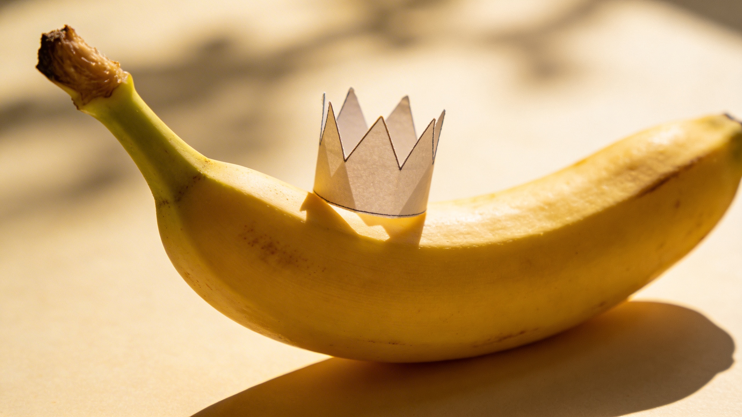
This one is “fun” without being chaotic. I’ve used similar concepts for “winner,” “top pick,” “employee of the month,” and once for a birthday email that absolutely did not need this much effort.
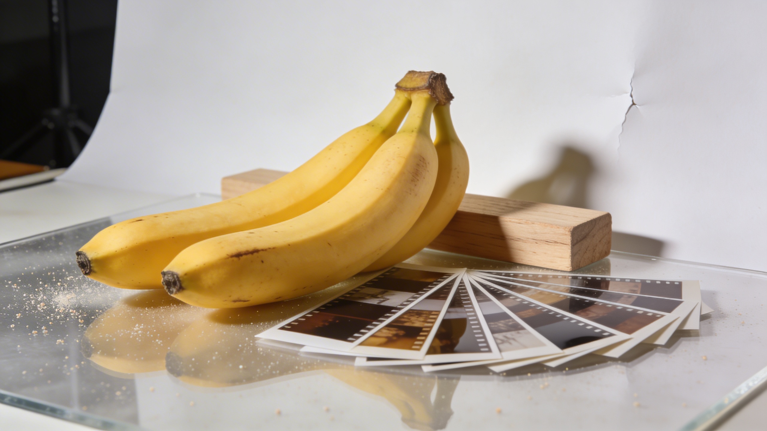
Prompt: "high-end commercial stock photo, bunch of bananas arranged neatly like a gradient from green to ripe yellow, on warm white seamless background, soft studio lighting, minimal shadows, top-down composition, copy space at bottom, photoreal, no text"
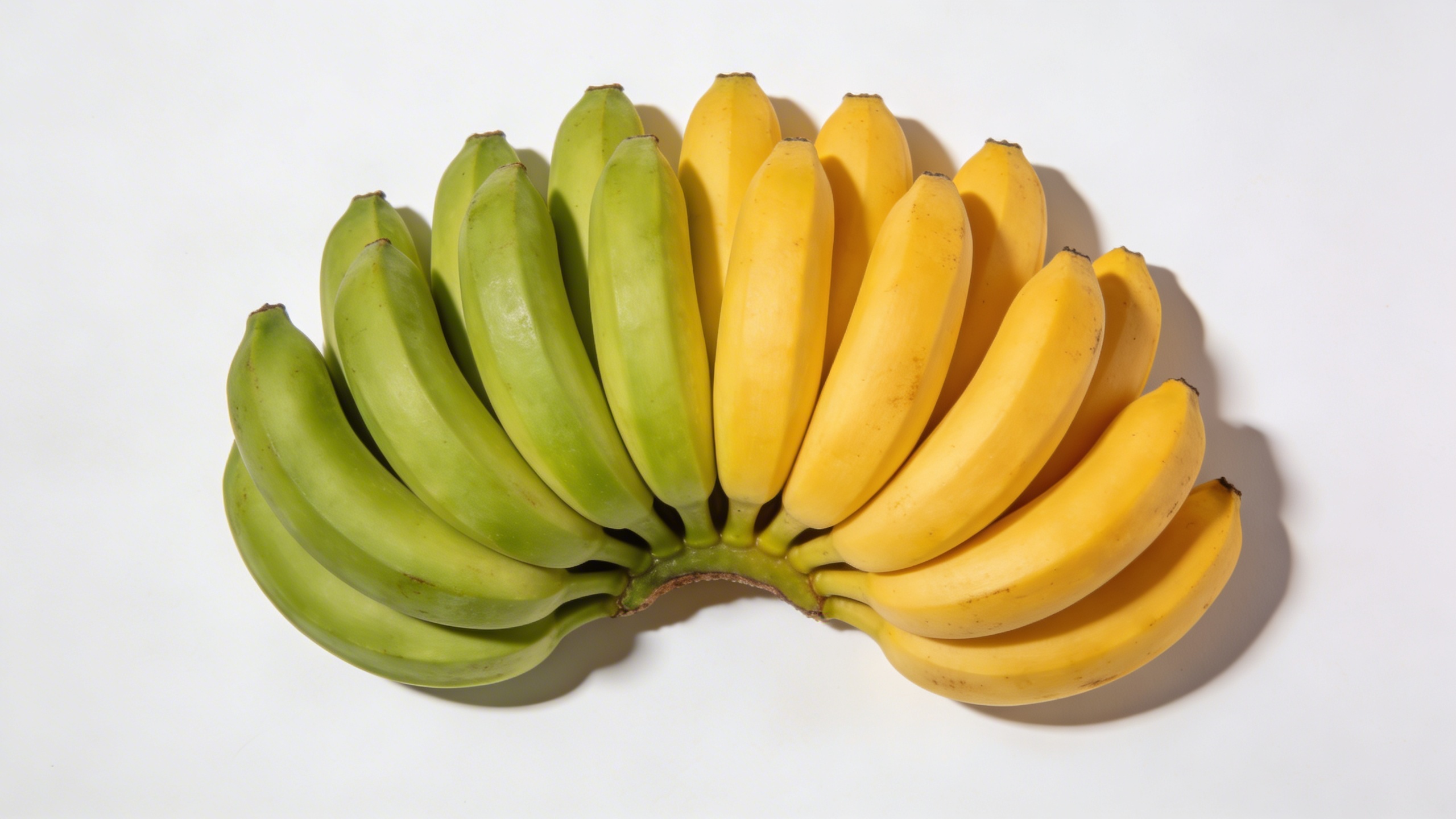
This gives you “progress,” “timeline,” “stages,” “maturity,” and a dozen other metaphors that slide decks won’t stop using.
Prompt: "conceptual stock photo, banana with a tiny minimalist flag toothpick blank (no writing) stuck in the peel, clean beige background, softbox lighting, gentle shadow, simple milestone concept, copy space above, photoreal"
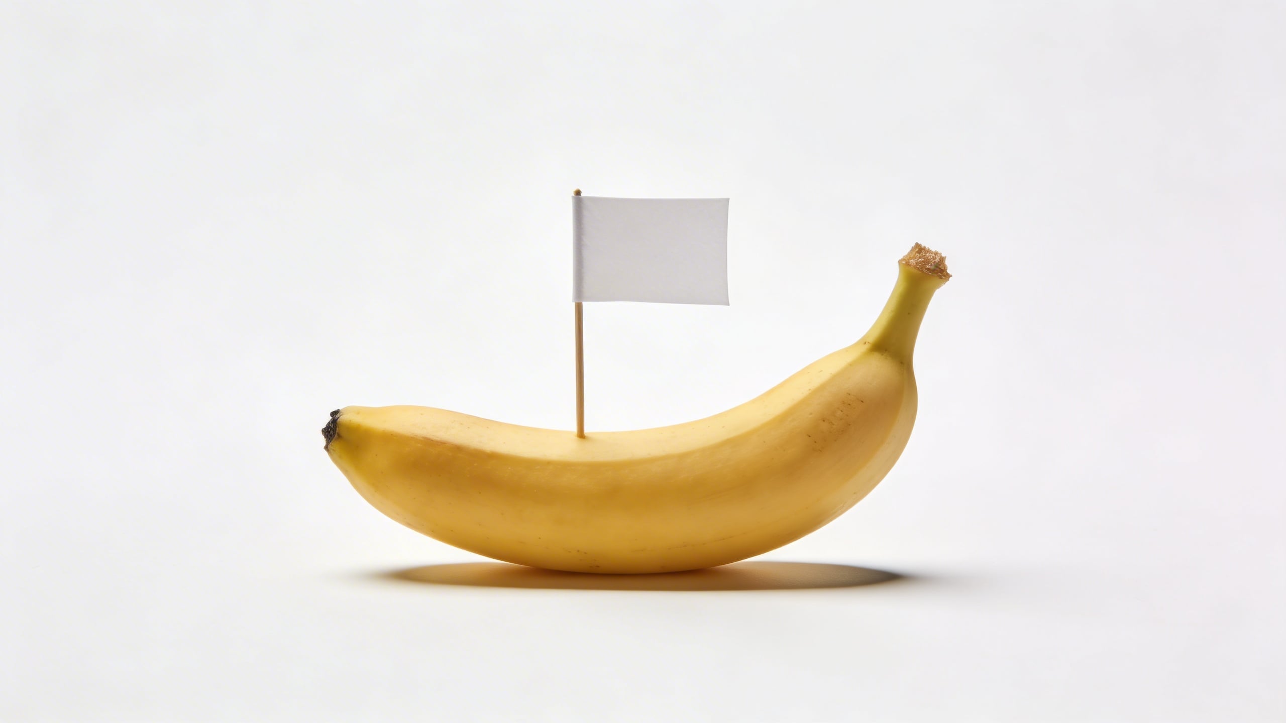
A blank flag is a weirdly effective symbol for “goal achieved.” Again: designers can add text later, but the photo stays clean.
Prompt: "editorial stock photo, banana and a simple empty shopping basket on neutral gray floor, soft diffused light, realistic shadow, minimal composition with copy space on right, photoreal, no logos"
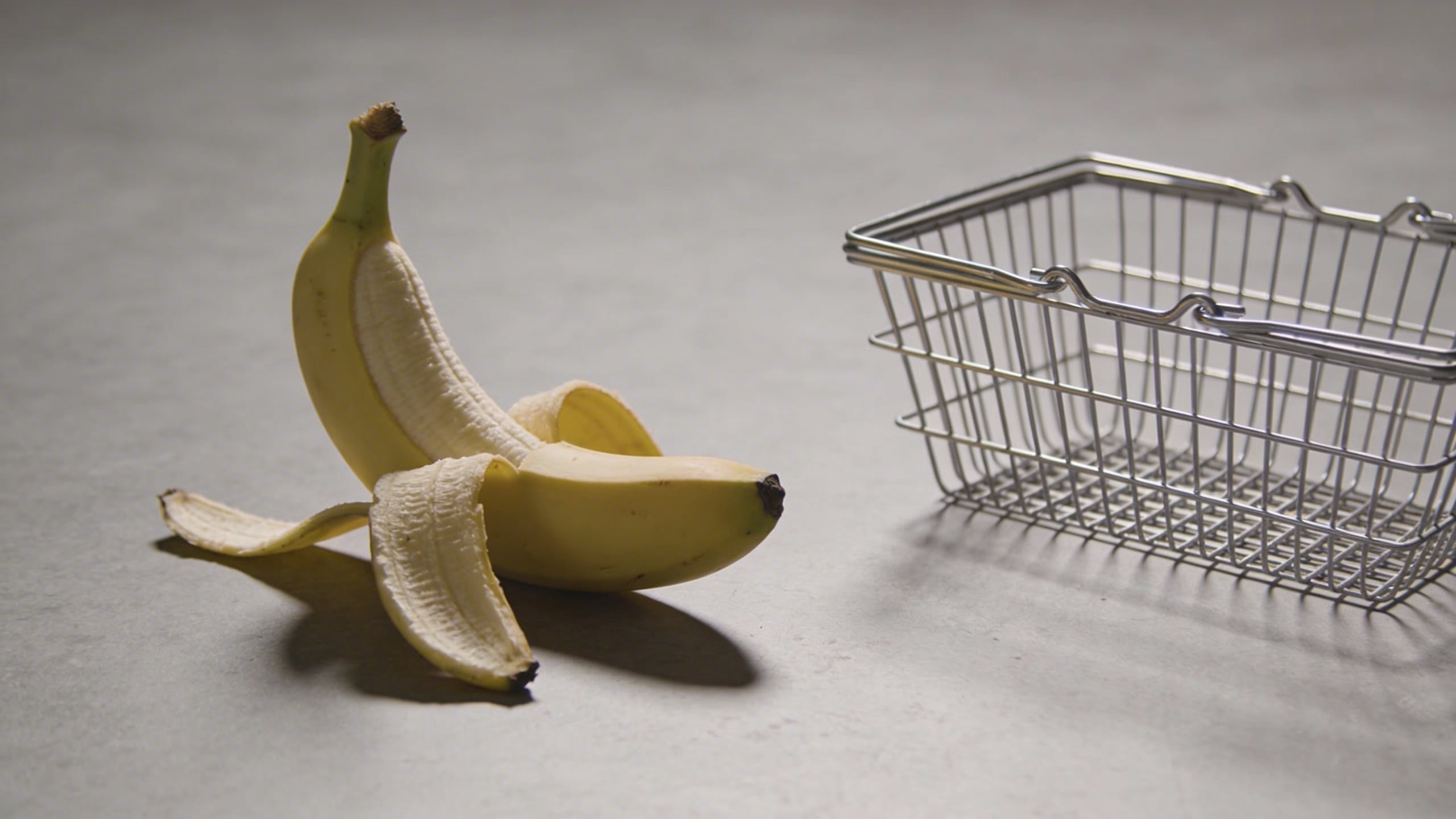
This is a good one if you’re trying to create “ready to use stock photos” for ecommerce blogs, grocery apps, meal planning, or “simple shopping habits” content.
Prompt: "commercial conceptual stock photo, banana with a small thermal receipt paper strip curling beside it (blank, no readable text), on clean white table, soft daylight, minimal finance budgeting concept, copy space top left, photoreal"
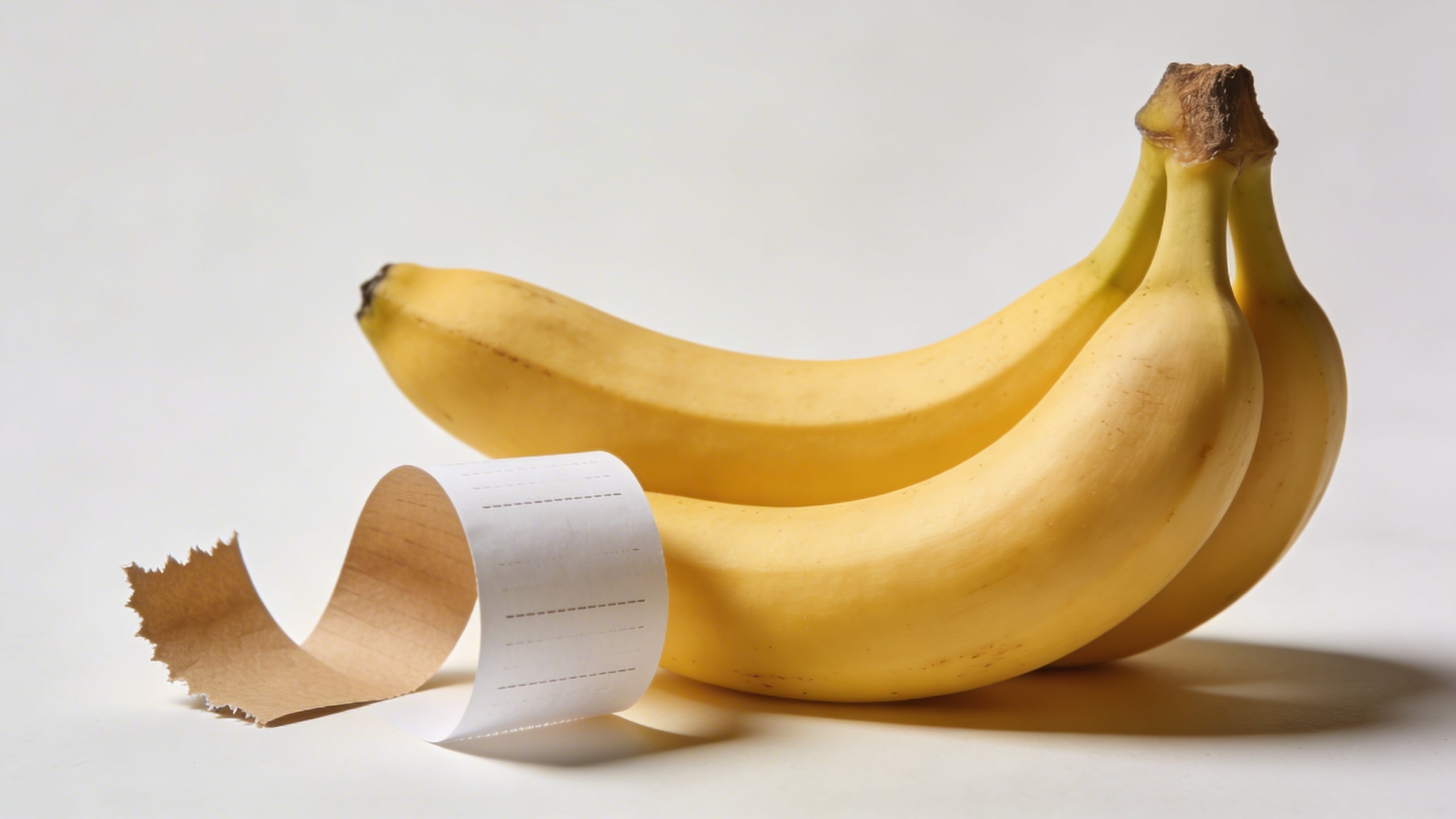
Receipt paper can go uncanny fast if it starts “printing” nonsense text. Keeping it blank saves you the headache.
Turning one good image into a whole “stock pack” (the part I still mess up)
If you only want one hero shot, you can stop here, paste a prompt into your favorite generator, and you’re done. But if you’re trying to build a library of nanobanana stock photos, the real work starts after you get your first usable image, because now you have to match it.
When I build a pack, I do something kind of dumb: I create a folder called SET RULES and I put one text file in it, and the file includes the exact lighting, lens, and background choices I used. I started doing this after I generated a perfect clean banana-on-cream shot, then spent 40 minutes trying to recreate it with “similar lighting,” which was not similar at all, and I ended up with 12 images that looked like they came from 12 different planets.
Here’s a loose process that actually works (and doesn’t feel like you’re doing homework):
- Pick 1 anchor prompt from above (like the seamless studio banana).
- Generate 6 variations that are almost identical. Save the best 2. You’re not looking for creativity yet. You’re looking for consistency.
- Change one variable at a time:
- switch background color only
- then switch composition only
- then switch prop only If you change all three, you’ll never know what broke the look.
- Force a consistent crop: decide if your set is 4:5, 16:9, or square. Crop consistency makes mixed images feel like a real set, even if the lighting is slightly off.
- Make “copy-space” versions on purpose. I used to treat copy space like an accident. It’s not. It’s the product.
This is also where Stockimg.ai has been handy for me, because when you’re iterating quickly, you want the loop to feel lightweight: tweak prompt, generate, keep, discard, repeat. You’re basically doing photography, just without the physical studio mess (which I miss sometimes, until I remember sweeping flour off the floor at 1am for a “rustic baking” shot I never used).
Stock photography tips for getting fewer “AI tells” in 2026
I’m not going to pretend there’s one magic “no AI artifacts” switch. But there are a few repeat offenders, and you can reduce them if you know what to look for.
1) Over-perfect symmetry
If everything is too aligned, the image reads as synthetic. Add a single controlled imperfection: a slightly crooked sticky note (blank), a small crease in the background paper, one banana slightly rotated.
2) Unnatural reflections
Glass, acrylic, phones, and shiny countertops can look “wrong” even when you can’t describe why. If reflections keep failing, swap surfaces to matte ceramic, linen, wood, or paper. You’ll lose some gloss, but your images will become more believable.
3) Food realism issues
With banana breakfasts especially, AI sometimes creates impossible textures: weird pancake pores, strange oats, or peanut butter that looks like paint. The fix is boring: ask for “natural food texture, realistic crumbs, minimal styling.” And if it’s still off, pivot to simpler food scenes (whole banana + bowl) instead of anything layered.
4) Hands and humans
If your goal is stock photo prompts that are safe and broadly usable, hands are optional. When hands are necessary, be direct: “realistic hand anatomy, five fingers, natural grip, no extra fingers.” If it still fails, cut the human out. Plenty of stock photos do.
5) Brand safety: keep it generic
Anything that looks like a real logo, real device UI, real packaging label, or identifiable brand can kill usability. The fix is not complicated: specify “blank screen,” “no text,” “no logos,” “generic packaging,” and check the outputs before you consider them “ready to use.”
How I’d actually use these prompts in Stockimg.ai (without turning it into a whole project)
If you want the quickest path from “prompt list” to “usable folder of images,” here’s what I’d do on a normal Monday (meaning: I’m impatient and I want results fast):
-
Start with your final use-case If you need blog headers, generate 16:9 with extra negative space. If you need Instagram carousel backgrounds, go 4:5. Don’t generate square images and hope they’ll fit everything later.
-
Pick 5 prompts that belong together For example: the warm-white seamless set, the peeled banana version, the banana slices flat lay, the banana with sticky note, and the banana in acrylic cube. Same overall minimal vibe, different concepts.
-
Generate in batches, not one-by-one In Stockimg.ai, I’ll run a few variations per prompt, then I’m ruthless. If a result has weird peel anatomy or ugly shadows, it goes in the trash immediately. Don’t keep “almost good” images. They’ll haunt your folder.
-
Do one “weird” image per set If you include too many surreal pieces, your set stops feeling like stock photography and starts feeling like an art project (which is fine, but it’s a different product). My ratio is usually 4 safe images for every 1 odd one.
-
Name your files like you’ll thank yourself later I use filenames like:
nb-seamless-cream-softbox-copyspace-left-01.jpg. It looks obsessive, but you only need to lose an image once to understand why it matters.
One unresolved opinion: I still don’t know if it’s better to generate everything in the exact same background color or to do two-color sets (cream + pastel). The two-color sets look more lively in a grid, but the single-color sets look like a “real shoot.” I keep flipping between them, and I’m sure I’ll flip again next week.
Frequently Asked Questions (FAQs)
Can I sell “Nanobanana” images as stock photos if they’re AI-generated?
Usually you can sell AI-generated images where platforms allow AI content, but each marketplace has its own rules and labeling requirements. Before uploading anything, read the specific site’s AI policy and make sure your images do not include logos, brand-like labels, or identifiable people.
What aspect ratio should I generate for stock photo usage?
If you want maximum reuse, generate both 16:9 (headers, ads) and 4:5 (social). If you only pick one, I’d pick 4:5 because it crops down to square and up to wide a lot more gracefully.
Why does the same prompt give me totally different banana photos every time?
Because the model is sampling new variations each generation. If you need consistency, keep the prompt stable, limit changes to one variable at a time (background or lighting or prop), and save your best “anchor” image so you can match its vibe.
How do I stop weird, deformed bananas from appearing?
Be annoyingly specific: “single ripe banana, natural anatomy, intact peel, no deformation, no melting, realistic texture.” If it still happens, simplify the scene (plain seamless background, soft light) and avoid surreal verbs like “morphing” or “glowing.”
What file format should I use when exporting for web and for print?
For web, export JPG (smaller) or PNG (if you need transparency, though photos usually don’t). For print, you want the highest-resolution export you can get, then keep it as a high-quality JPG or TIFF depending on your workflow.
How do I make a matching set instead of random one-off images?
Pick one anchor style (background + lighting + lens feel), generate 6-10 close variations first, then expand to concepts while keeping the same “set rules.” Consistency is the product.
Is it better to add props (sticky notes, phones, baskets) or keep it minimal?
Minimal sells more universally, props sell more specifically. When you’re building a usable pack, do mostly minimal, then sprinkle in props that create a clear concept without adding brand risk.
Where should I use Stockimg.ai in this process?
Use Stockimg.ai when you want to iterate fast, keep only the consistent shots, and build a small library in one sitting so your nanobanana images feel like they came from the same “shoot,” not five different weeks.