The 8 Amazon image prompts I keep coming back to (with examples)
Before the prompts, two quick guardrails so you do not accidentally generate pretty images that you cannot actually use:
First, be careful with claims. If your image screams “clinically proven” or shows a dramatic before/after, you might be asking for trouble in moderation or customer expectations. Keep your visuals persuasive, but don’t turn them into courtroom exhibits.
Second, consistency matters more than any single banger. Your main image can be clean, but if your second image looks like a totally different brand and your third image suddenly has different lighting, the shopper feels the mismatch even if they can’t name it. A set that looks like it belongs together is one of the sneaky Amazon product photography tips nobody posts because it sounds too basic.
When I’m building these, I usually start in Stockimg.ai because it’s fast for churning out variations and keeping a coherent style across a set, especially when I want to iterate prompts without feeling like I’m burning an afternoon. You can use any workflow you like, but I’m going to write prompts in a way that works well when you want repeatable outputs.
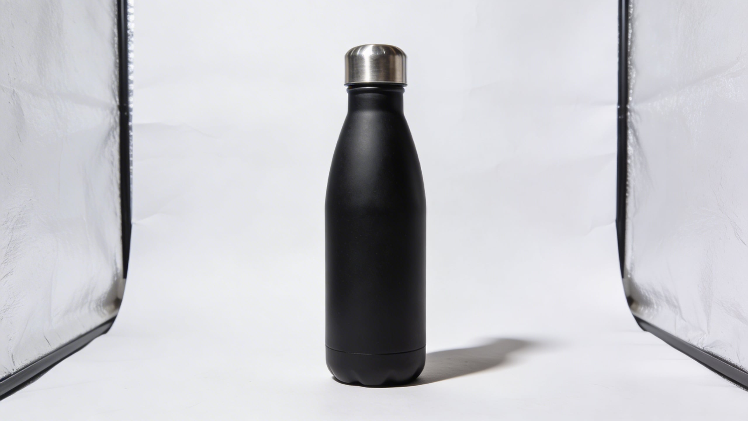
Prompt 1: “The clean hero shot that still looks expensive”
This is the boring one you still need. Amazon is a marketplace, not a lookbook, and shoppers expect a clean read. But the trick is making “clean” feel premium, not sterile.
What changes it for me is the lighting language: softbox, product shadow, subtle gradient backdrops. Those tiny details keep your hero image from looking like it came from a random factory catalog. I also like specifying a lens vibe (50mm, 85mm) because it tends to push the model toward that natural product-photo geometry.
Prompt: "ultra realistic studio hero shot of a bamboo cutting board with juice groove, centered on seamless white background with gentle light gray gradient, softbox lighting, subtle shadow, high-end e-commerce product photography, 85mm lens look, sharp focus, no text, no logos"
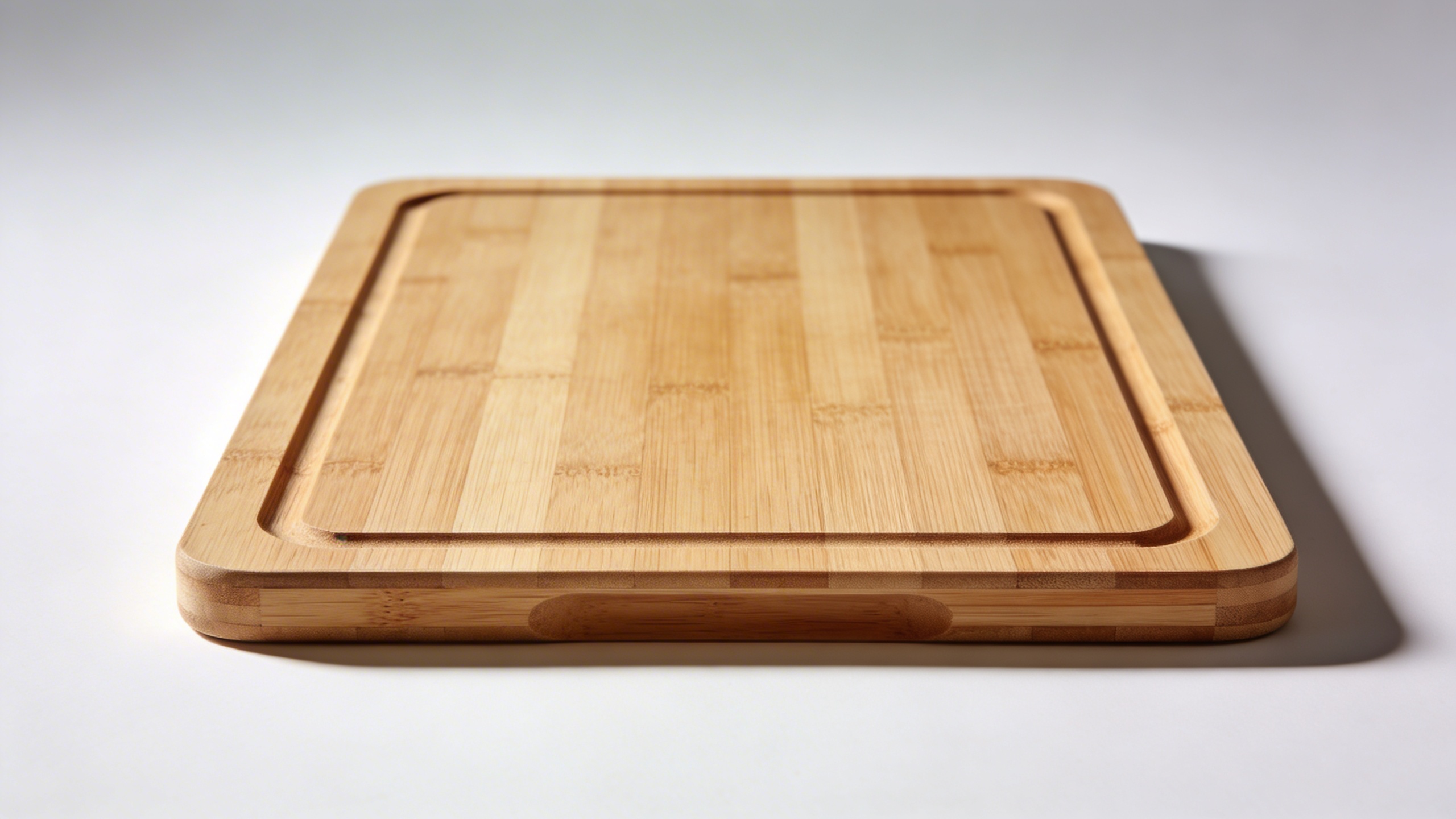
Why it works (and why it is still not “basic”): Shoppers don’t want to decode what your product is. A clean hero image lowers the cognitive load. The premium lighting cues make it feel less like a commodity, which matters even if you are selling a commodity because you are trying to earn trust in half a second.
What I still argue with myself about: Sometimes an “expensive” hero shot makes cheap products feel suspicious, like you’re compensating. If your product is genuinely budget, you might want clean and simple, but not overly glossy.
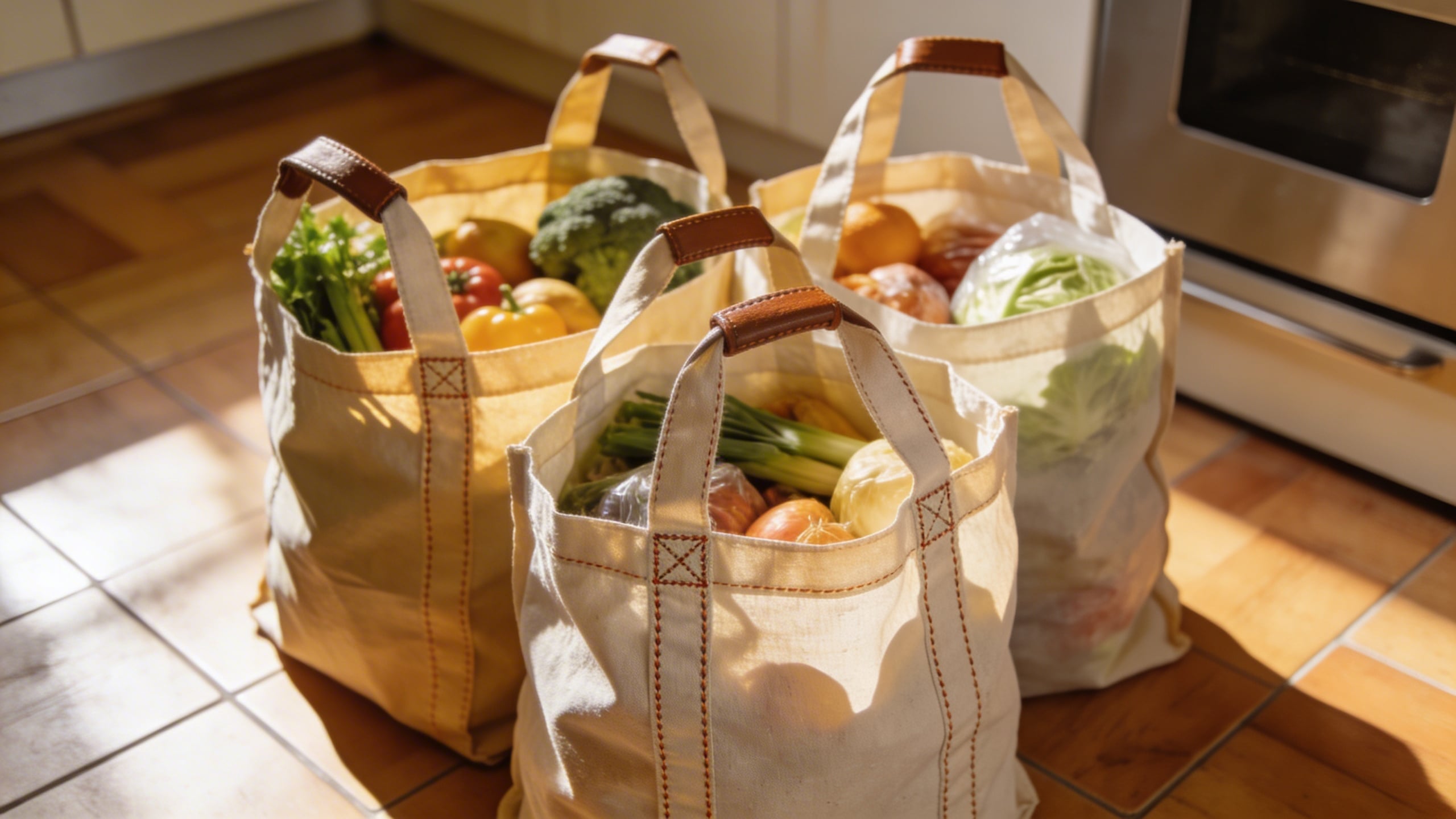
Prompt 2: “The hands-in-frame scale proof shot”
Scale is a liar on Amazon. Customers get something in the mail and immediately decide you tricked them, even when you didn’t. So I love adding hands, a kitchen counter, a desk, a sink, something recognizable.
I used to avoid hands because I thought it looked like influencer content. Now I’m convinced it converts because it solves real uncertainty. It is one of the most practical pieces of visual content for Amazon listings you can add.
Prompt: "realistic lifestyle product photo, hands holding a compact handheld milk frother over a ceramic mug, cozy kitchen counter, morning light, shallow depth of field, natural skin texture, product in sharp focus, no text, no watermark, e-commerce lifestyle style"
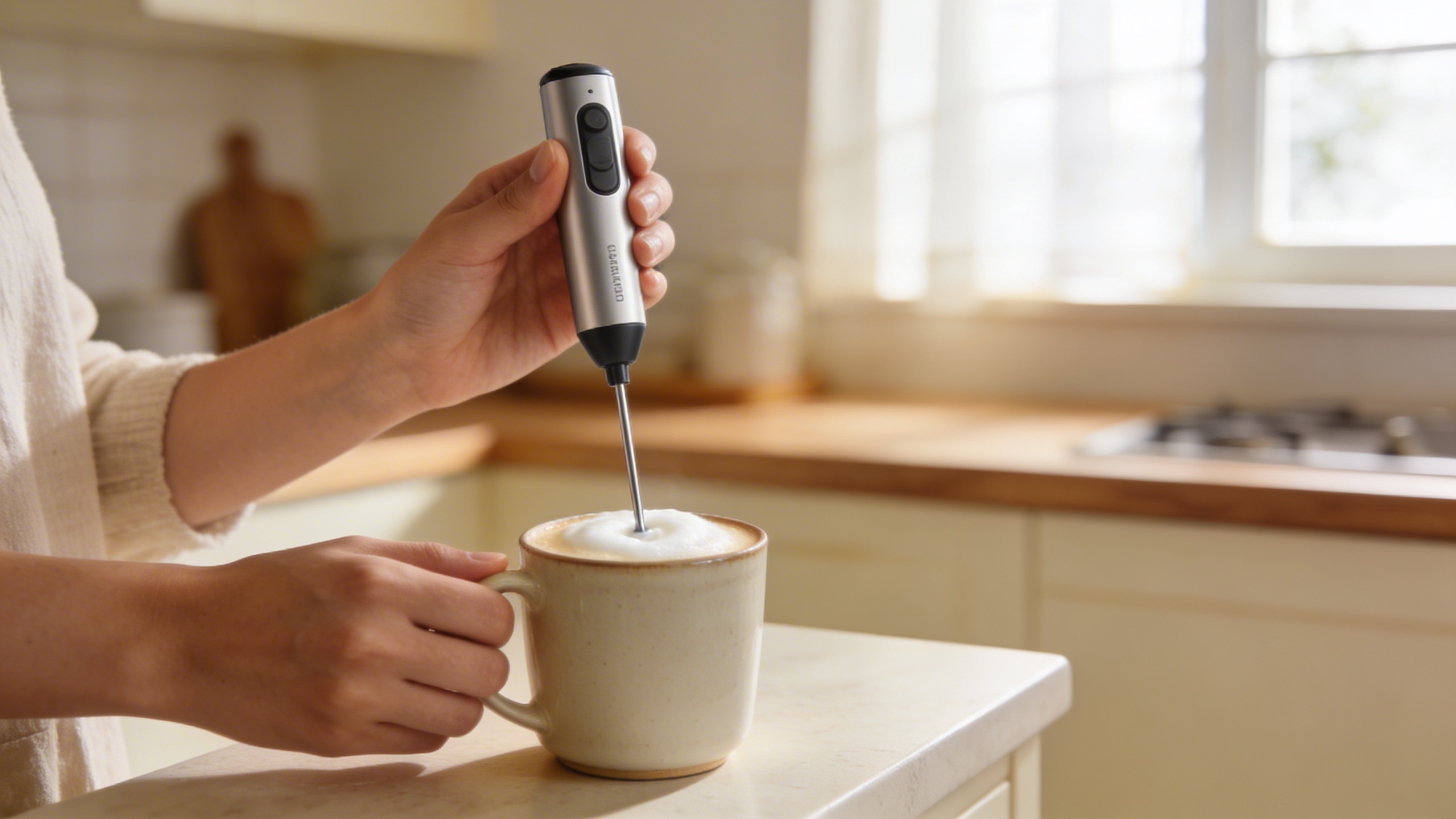
Pros of this prompt concept:
- Kills size confusion fast.
- Makes the product feel “already in someone’s home,” which is weirdly powerful.
- Works for both premium and budget items.
Cons:
- If the hands look uncanny, it can tank trust. Be picky.
- If your product has strict use instructions, an incorrect pose can create customer service headaches.
Prompt 3: “The 3-callout infographic (no fluff, just clarity)”
I resisted infographic-style images because I thought they were spammy. Then I started studying the listings that actually sell and, yeah, the good ones use infographics. The difference is restraint.
The best Amazon infographic images do not scream. They point. They label. They show one detail at a time. This is where “creative Amazon listing images” does not mean “busy,” it means “useful.”
If you are generating an infographic background image, I recommend making the base image clean (product + background) and then adding text in your design tool. Still, you can prompt the layout and leave area for text.
Prompt: "studio product image of a stainless steel lunch container on light gray background, with three minimal circular callout placeholders pointing to lid seal, compartment divider, and latch, clean modern layout, empty space for text, soft shadows, high resolution, no words"
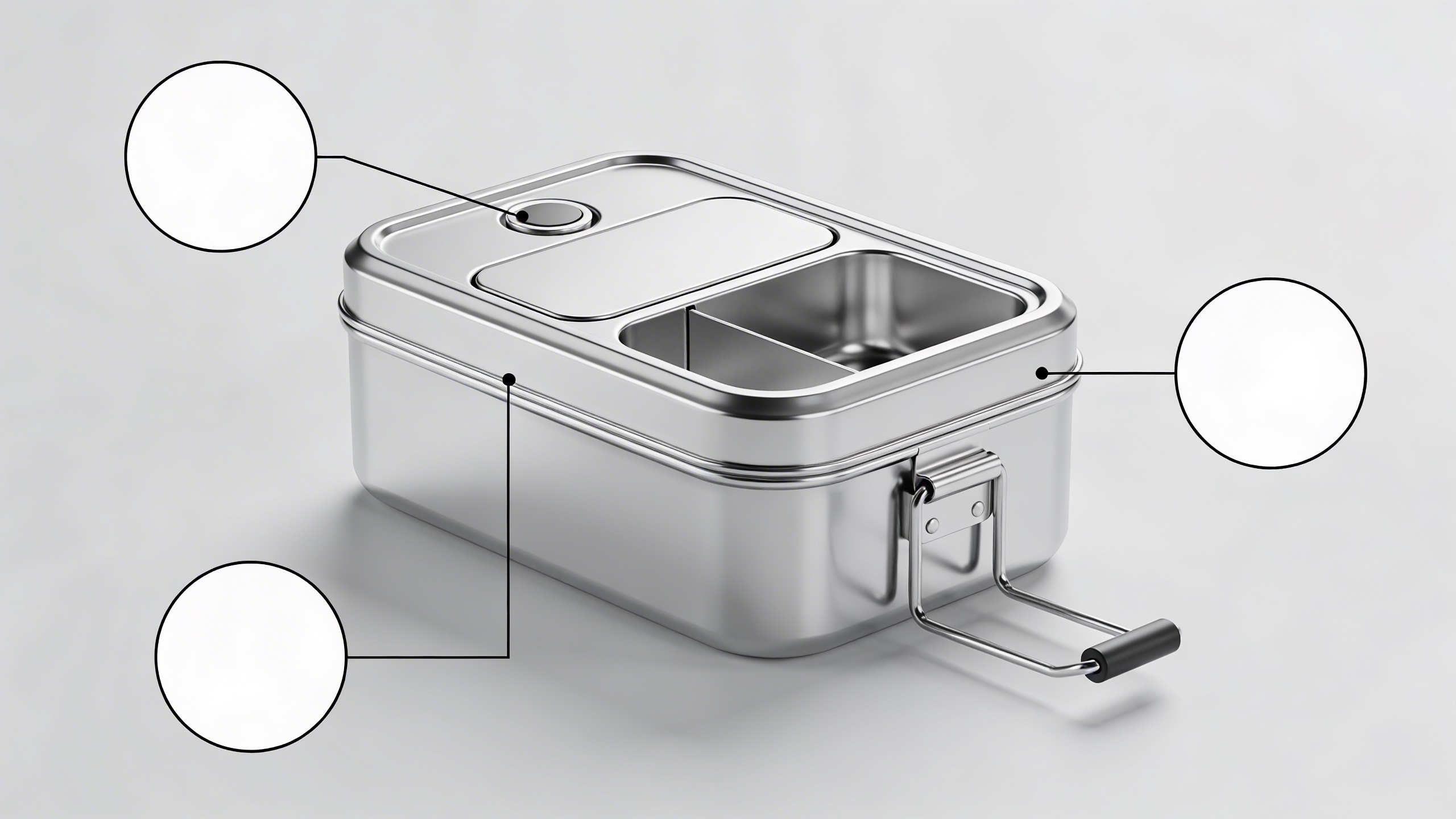
A small workflow note (because it saves time): In Stockimg.ai, I’ll generate 6 to 10 variations of this, pick the one where the callout placement feels natural, then do the typography in a separate step so I’m not fighting letter artifacts. That two-step routine is not glamorous, but it reduces “why is there random gibberish text” issues.
Prompt 4: “The messy, believable use-case scene”
Not everything needs to be perfect. Actually, perfection can make shoppers suspicious. I like one image that feels like real life, like it belongs in a phone camera roll: slightly imperfect, but still bright and readable.
One of my best-performing listing sets had an image that looked like I took it on a Tuesday while making a sandwich. It was staged, obviously, but it had crumbs. Not a lot. Just enough.
Prompt: "realistic lifestyle photo of a resealable snack bag organizer in a kitchen drawer, slightly messy drawer with a few crumbs and mixed packaging, natural daylight, candid composition, product clearly visible, no text, high resolution"
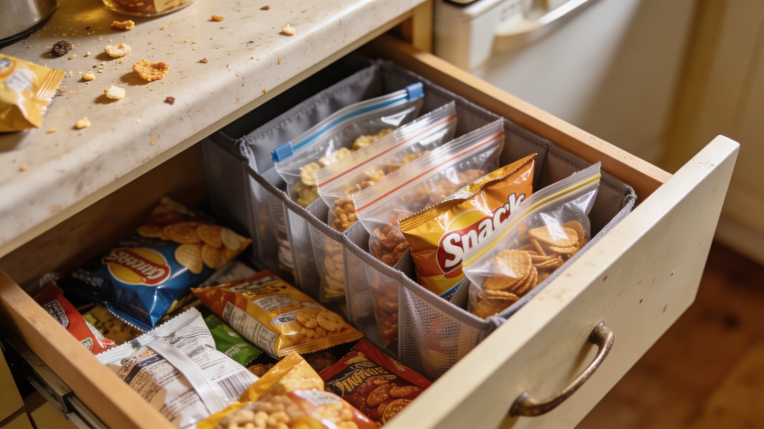
Why it works: It answers the question “Will this fit my life?” instead of “Is this pretty?” This is quietly one of the best 2026 Amazon marketing strategies for visual content: reduce “imagined friction.”
Prompt 5: “The competitive comparison… without naming competitors”
Sometimes you need a category education image. Like: “our bottle keeps cold longer,” “our brush is softer,” “our organizer saves space.” You can do that without trash-talking, and without showing other brand logos.
Create a neutral comparison visual: generic shapes, generic labels like “standard size” vs “XL size,” or “single wall” vs “double wall” (only if accurate). Again, I prefer generating a clean base and then adding the exact copy later.
Prompt: "clean comparison layout image, two generic matte black travel mugs side by side on white background, left mug labeled placeholder space, right mug labeled placeholder space, subtle measurement lines showing height difference, minimal modern design, empty space for text, soft shadows, high resolution, no words"
The thing I always double-check: If you imply a performance difference, make sure you can back it up. If it is “leakproof,” do you mean leak-resistant? If it is “BPA-free,” do you have documentation? Images feel like “proof” to customers.
Prompt 6: “The materials macro close-up (texture sells)”
Close-ups are underrated. Humans buy with their eyes, and texture cues are basically a cheat code. If you sell anything tactile (fabric, silicone, wood, brushed metal), a macro detail image makes it real.
This prompt is also great for “enhance Amazon product images” work because it adds visual variety without changing the product.
Prompt: "extreme macro photo of textured silicone grip on a kitchen utensil handle, soft studio lighting, crisp detail, shallow depth of field, clean neutral background, realistic product photography, no text"
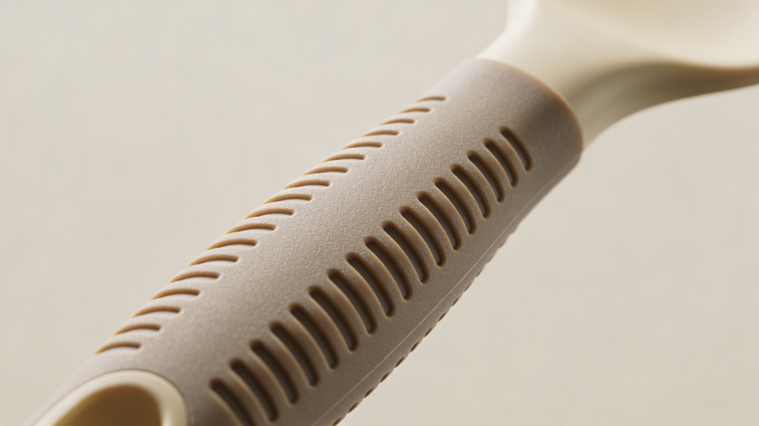
Where I’ve messed this up: If you go too macro, shoppers cannot tell what they are looking at and it becomes visual noise. Keep a hint of context: a curve, an edge, a recognizable material transition.
Prompt 7: “The packaging and unboxing expectation-setter”
Returns kill you in boring ways. Not dramatic ways. Just a steady drip. A packaging image can reduce one category of returns: “I thought it came with X” or “I thought it was bigger.”
I was stubborn about adding packaging because it felt like filler. Then I got a string of messages that were essentially “Where are the extra pieces?” even though the bullets were clear. Images are what people trust.
Prompt: "realistic unboxing scene on a clean table, kraft cardboard box open with neatly arranged product and accessories in eco-friendly tissue paper, soft natural light, overhead angle, clean composition, no text, no logos, high resolution e-commerce"
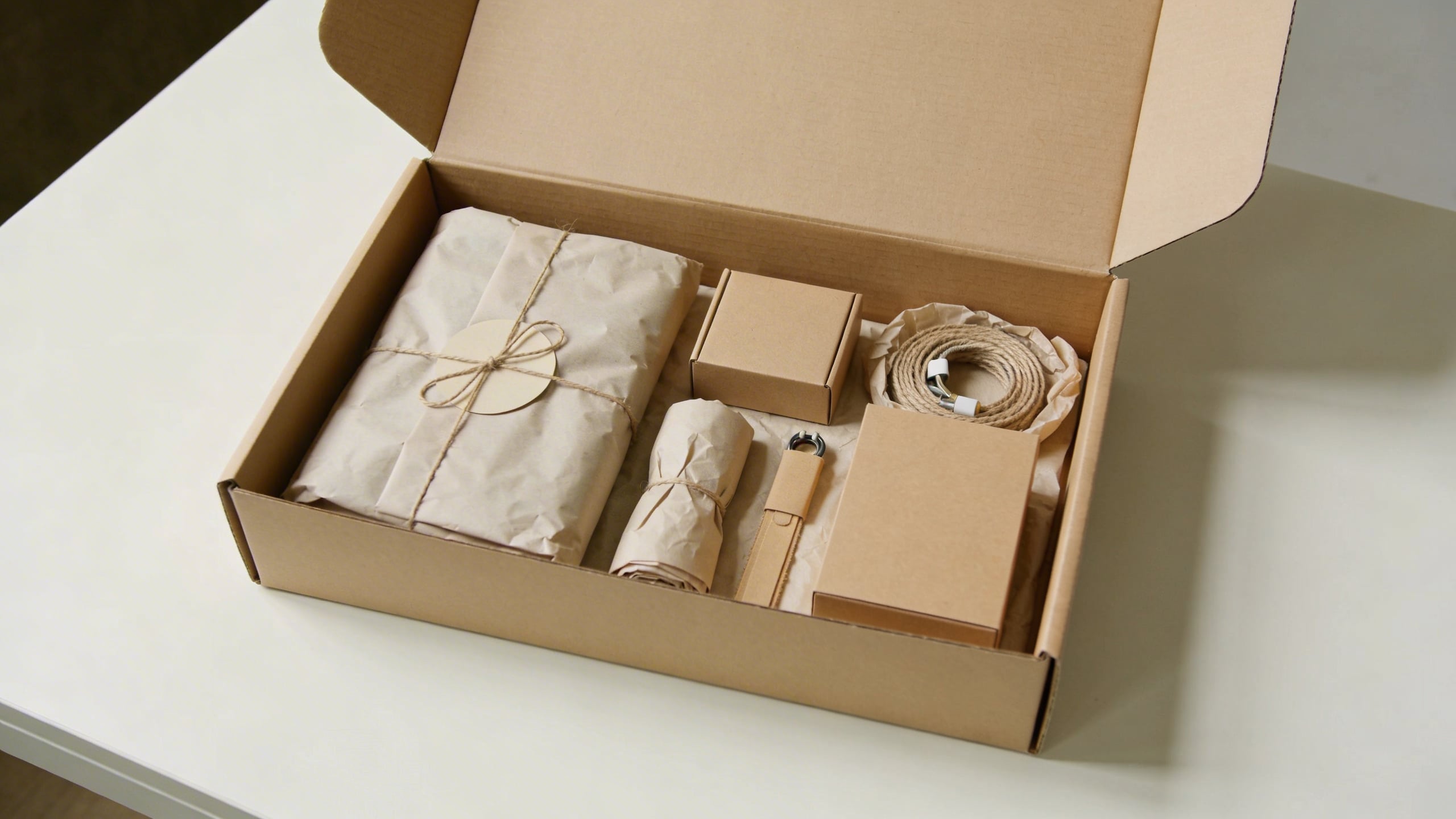
Small note: If your packaging actually changes (and it often does when suppliers switch), be careful not to lock yourself into a specific look you cannot deliver.
Prompt 8: “The seasonal refresh image that doesn’t break the listing”
This is the one people skip, and it is also where you can stand out without doing something risky. A subtle seasonal scene can make your images feel current, and 2026 shoppers can smell stale visuals.
You do not need Christmas trees or fireworks. Just a hint: spring kitchen herbs, summer picnic light, cozy fall tones. Keep the product unchanged and clearly visible.
Prompt: "realistic lifestyle product photo of a stainless steel water bottle on a picnic blanket with sliced oranges and sunglasses nearby, bright summer daylight, shallow depth of field, clean composition, product centered and sharp, no text, no logos"
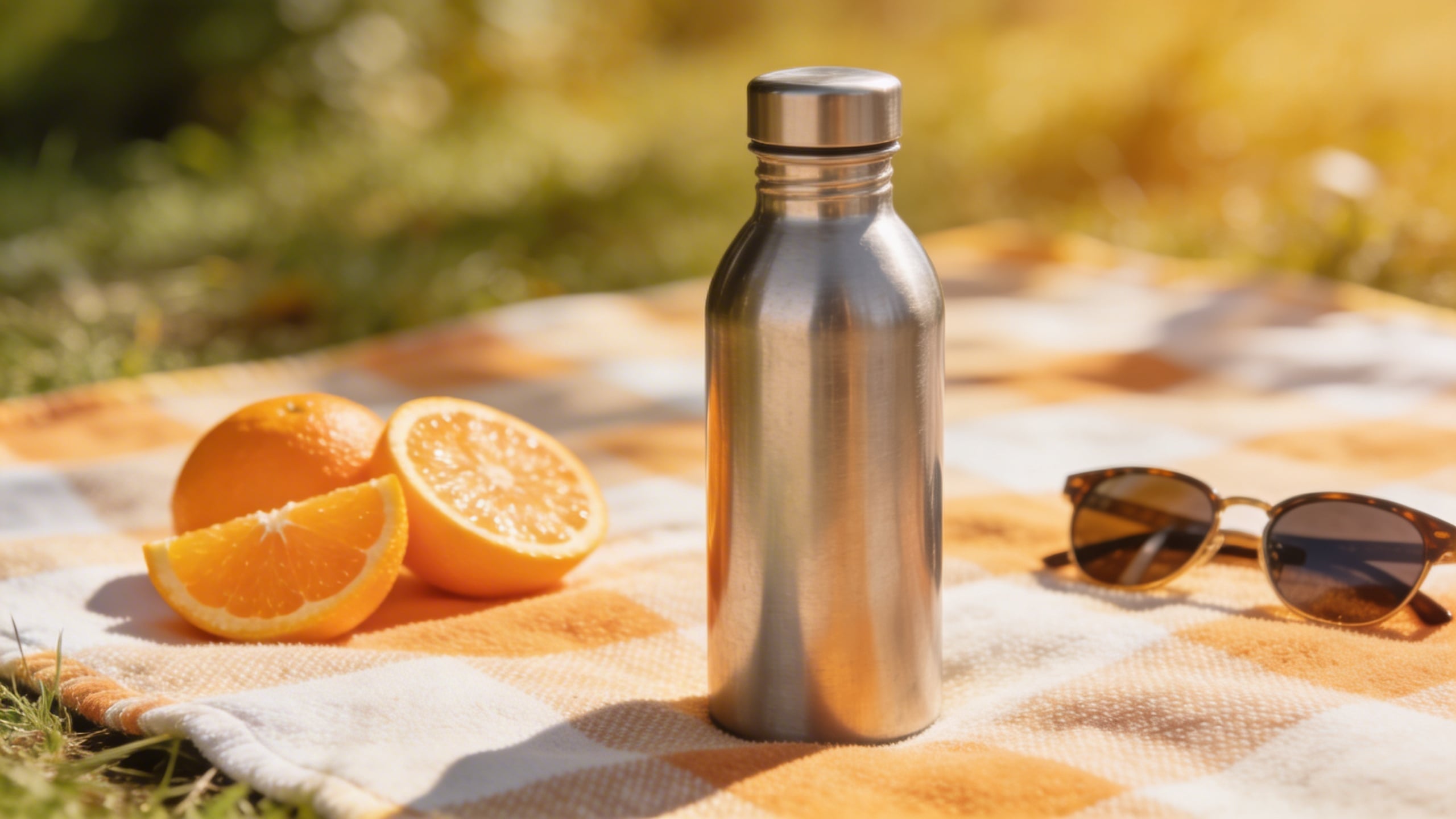
One unresolved opinion: Seasonal visuals can bump conversion, but they can also make your listing feel “off” in the opposite season. I still do it, I just keep it subtle enough that it reads like a nice scene, not a holiday campaign.
The actual way I generate these so they look like a set (not eight random images)
If you only take one thing from this post, make it this: the prompt matters, but the repeatability matters more. You want a system that can create a family of images with the same lighting, background style, and product color accuracy.
Here’s my messy workflow. It is not the only way, it is just the way I can do without getting annoyed.
1) Pick a “studio language” and stick to it
I decide early: is this listing bright white studio? Warm home lifestyle? Dark premium vibe? And then I write it down in a note so I stop reinventing it. Stuff like:
- “softbox lighting, subtle shadow, seamless paper background”
- “morning window light, cozy kitchen, shallow depth of field”
- “neutral gray backdrop, premium minimal style, crisp edge lighting”
It sounds silly, but if you do not choose, you end up with a gallery that looks like you sourced images from three different businesses.
2) Lock your product description with the unsexy details
AI gets confused when you are vague. So instead of “water bottle,” write:
- “matte black insulated stainless steel water bottle, smooth cylindrical body, silver screw cap, no logo”
Instead of “organizer,” write:
- “clear acrylic drawer organizer, 12-inch by 4-inch, rounded corners, transparent glossy finish”
The less the model improvises, the more consistent your outputs become.
3) Generate variations in batches, not one-by-one
This is where Stockimg.ai helps in a practical way. When I’m doing listing images, I do not want one “perfect” output. I want 12 acceptable ones so I can pick the best and keep moving. I’ll generate batches with tiny tweaks: background color from white to light gray, angle from straight-on to 15-degree, lighting from soft to slightly contrasty.
You are not searching for truth. You are searching for the one that looks like it belongs on Amazon and makes sense in your category.
4) Separate “image generation” from “text and compliance”
If you need text callouts, keep them off the generated image as much as you can. Generate clean layouts with whitespace and placeholders, then add your real copy with consistent typography. This avoids the dreaded AI text artifacts and keeps your claims precise.
5) Run a brutal “thumbnail test” on your own listing images
I shrink the images to tiny size (like a phone view) and ask:
- Can I tell what it is in one second?
- Do the images look like a set?
- Is there one image that feels suspiciously different?
- Do I have at least one image that proves scale?
If any answer is no, I go back and regenerate. Annoying, but faster than letting the listing bleed conversion for months.
17 more Amazon image prompt ideas (copy/paste), grouped by what they solve
You asked for “8” in the title, but if you are actually doing this, you will want a bigger bank. Below are extra best Amazon image ideas you can adapt. Some are variations of the eight above, some are niche.
Use them as starting points, not rules. If a prompt gives you a weird output, do not fight it for an hour. Rewrite it with more physical detail or switch the scene.
Clean studio and catalog style (when you need clarity)
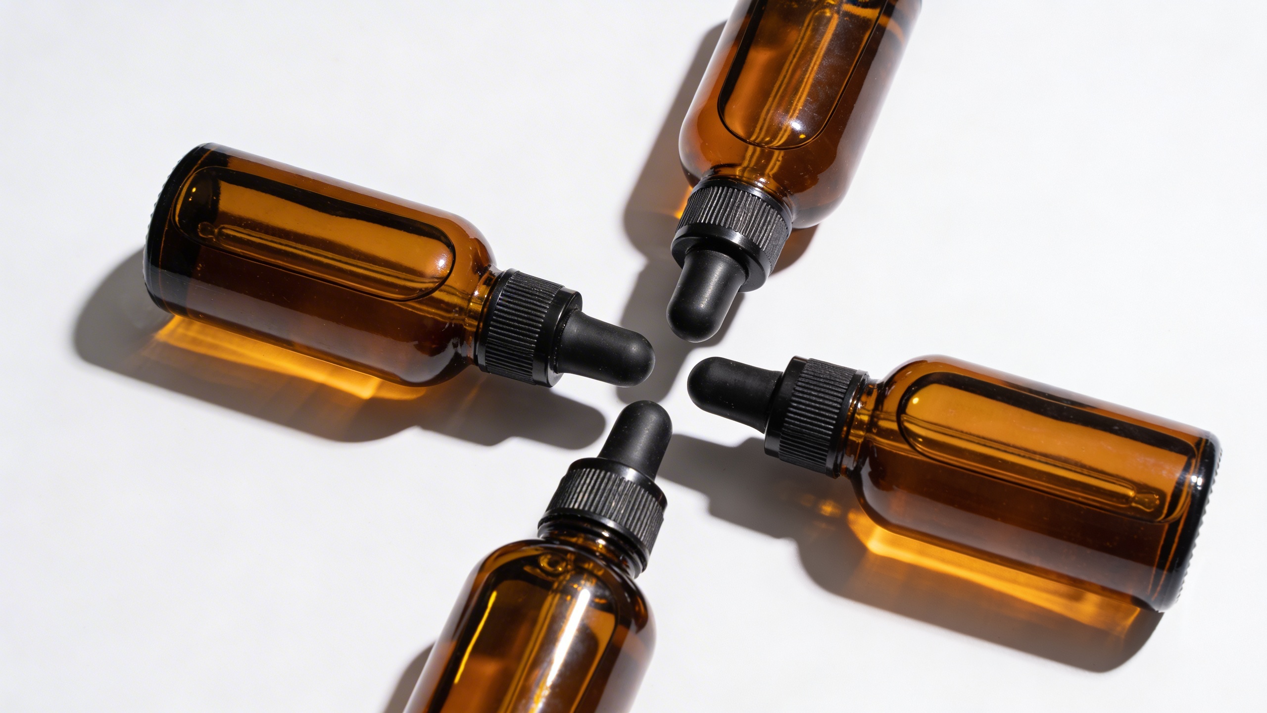
Prompt: "ultra realistic studio product photo of a set of three amber glass dropper bottles with white labels removed, arranged in a neat triangle composition on seamless white background, softbox lighting, subtle shadow, crisp focus, no text, no branding"
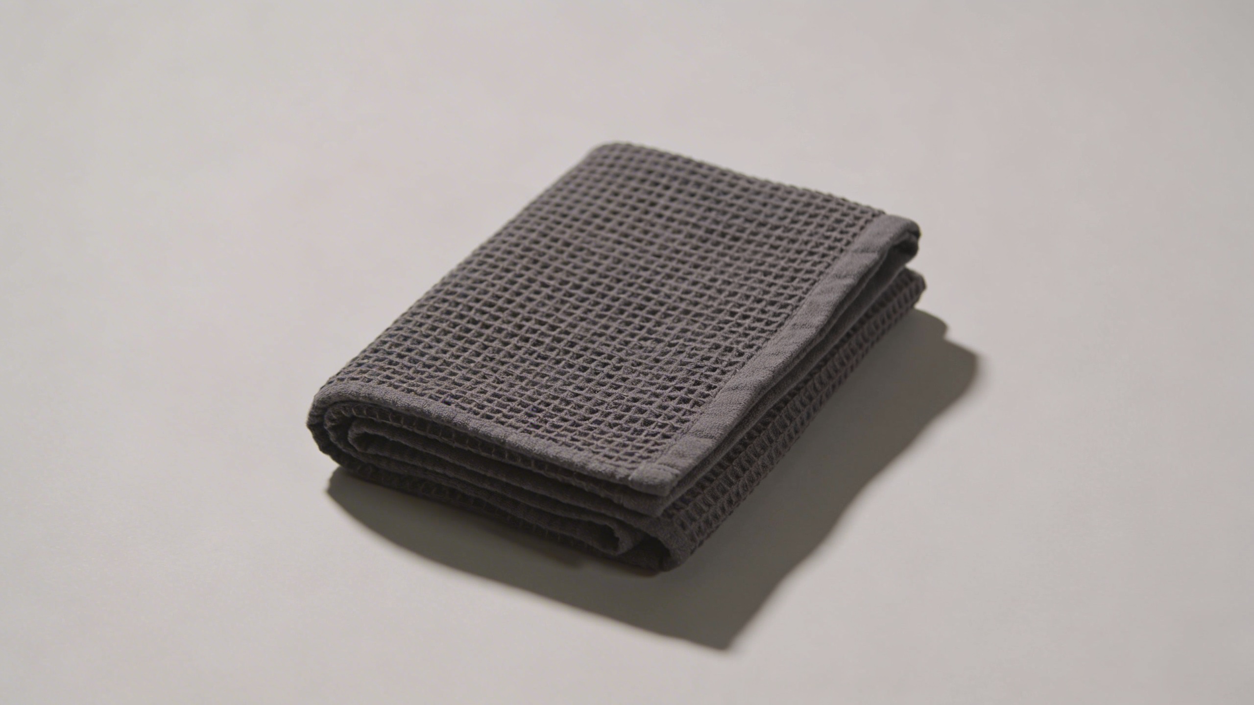
Prompt: "e-commerce packshot of a folded charcoal gray waffle knit towel, centered on pale gray seamless background, soft side lighting emphasizing texture, realistic shadow, 50mm lens look, no text"
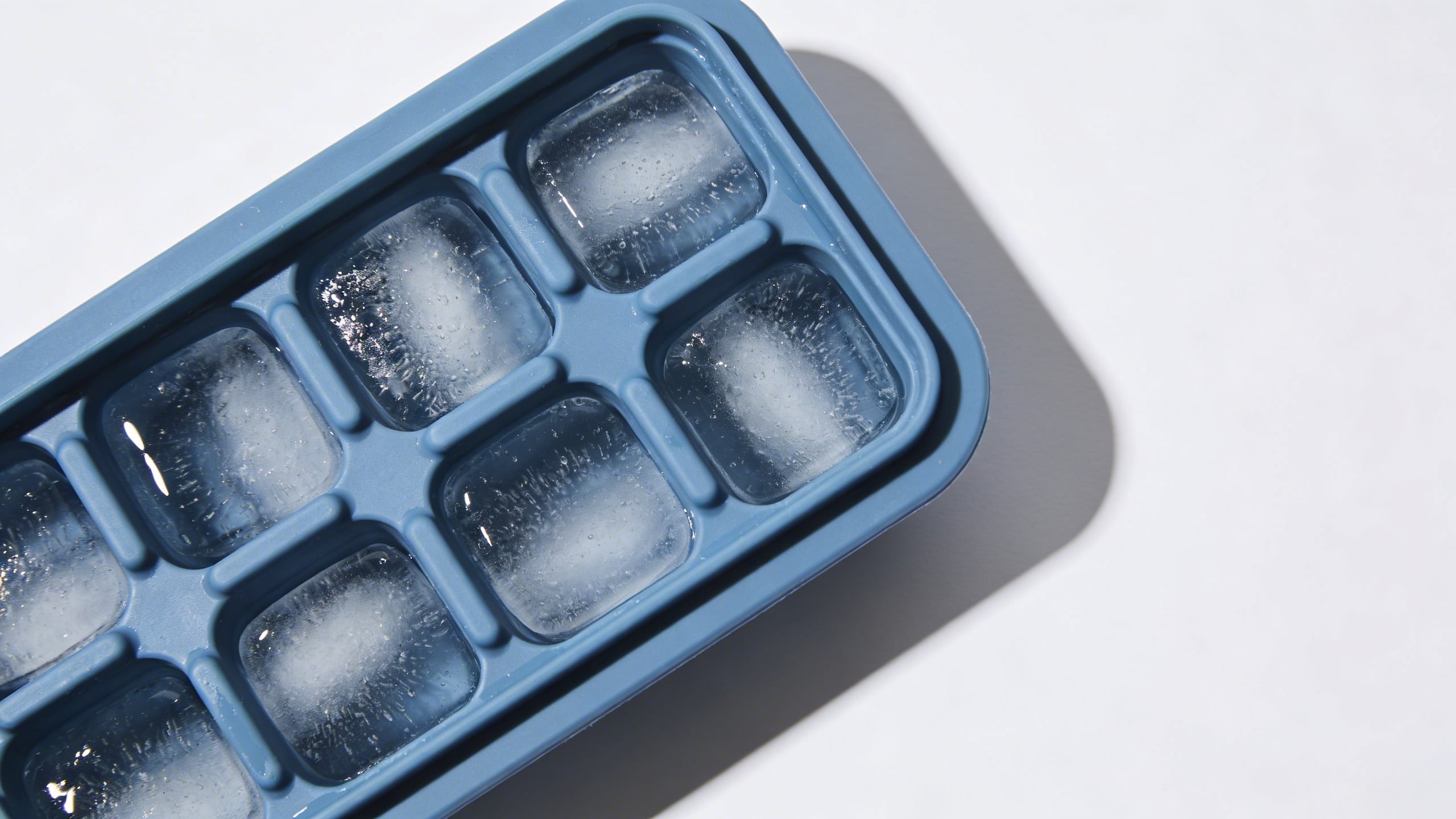
Prompt: "top-down studio product photo of a silicone ice cube tray in dusty blue on white background, minimal styling, crisp edges, clean soft shadow, high resolution, no text"
Lifestyle scenes that quietly answer objections (comfort, scale, context)
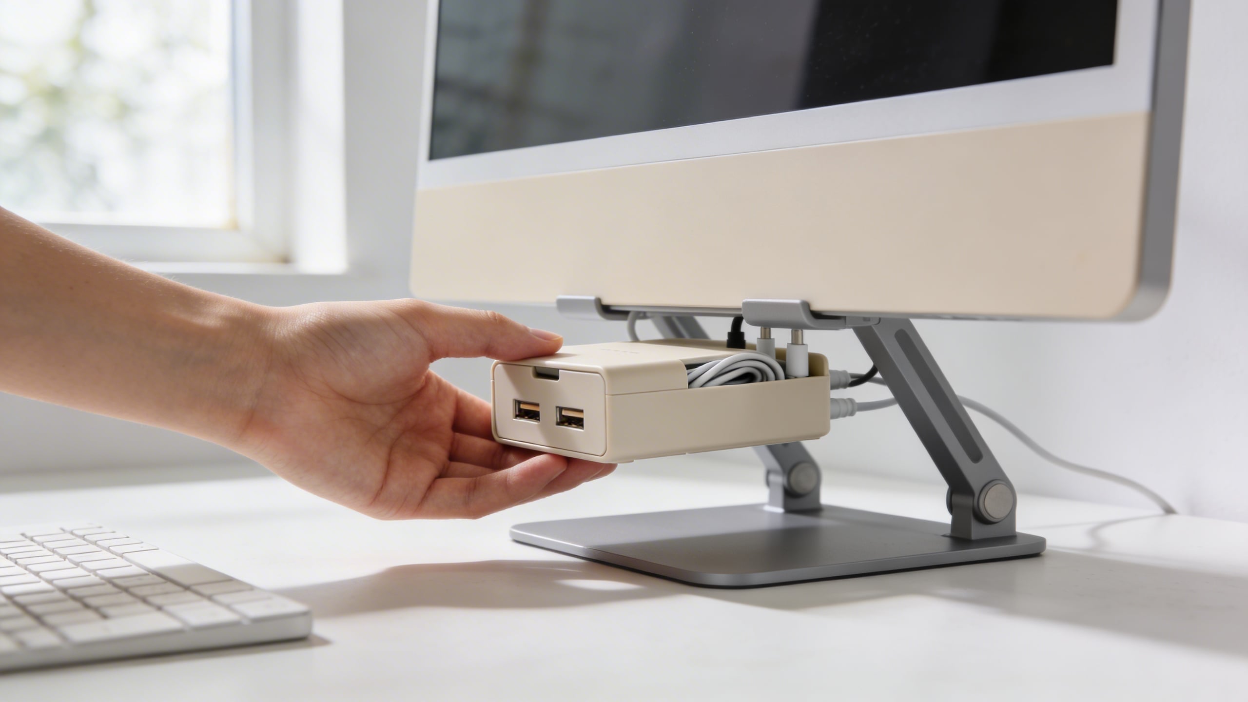
Prompt: "realistic photo of a minimalist desk setup, hand placing a compact cable organizer box under a monitor stand, natural daylight, neutral colors, shallow depth of field, product sharp, no text"
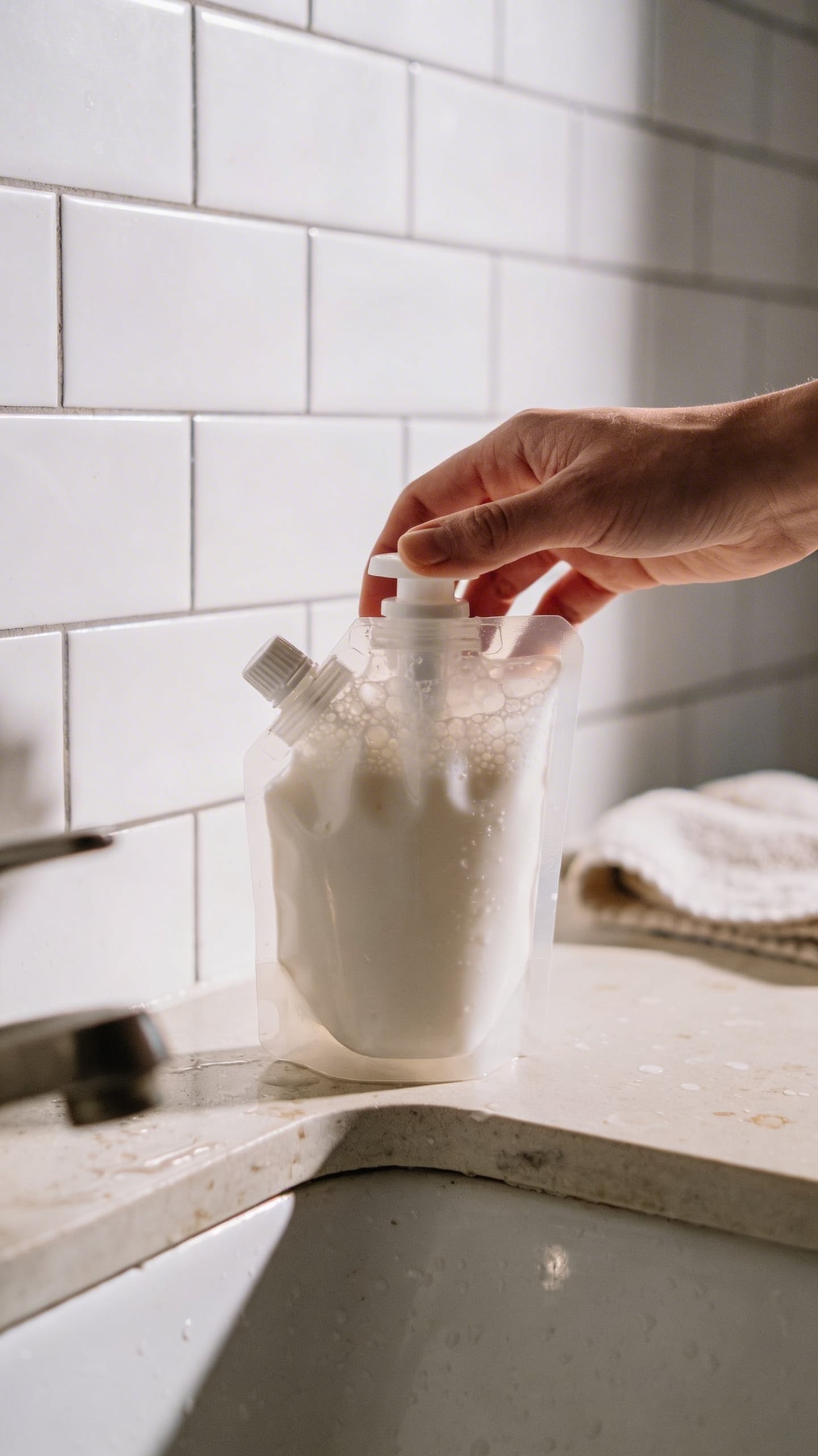
Prompt: "realistic bathroom counter scene, person holding a refillable foaming soap dispenser next to a sink, white tiles, soft morning light, clean but lived-in look, product in focus, no text"
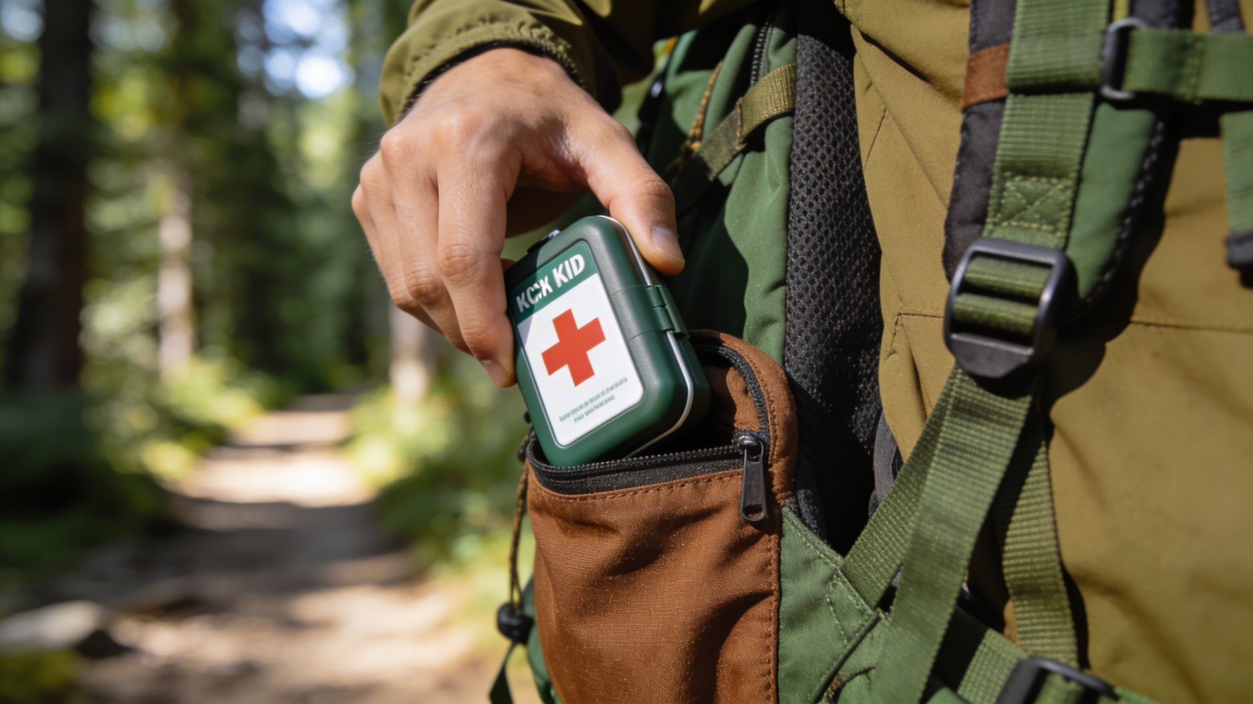
Prompt: "outdoor lifestyle photo of a compact first aid kit being placed into a hiking backpack side pocket, forest trail background blurred, natural light, realistic, no text"
Infographic layouts (generate the canvas, add your text later)
Prompt: "minimal infographic background image, product centered on light gray background, four empty icon circles aligned on the right side with thin connector lines pointing to product, clean modern style, soft shadow, no words, high resolution"

Prompt: "split-screen layout image: left side shows product close-up detail, right side shows full product, clean white background, subtle divider line, empty space at top for headline, no text, soft studio lighting"
Prompt: "step-by-step layout background image with three panels side-by-side, showing hands using a reusable lint roller on fabric, neutral background, consistent lighting, empty space for captions, no text"
Trust builders (materials, durability, “what you actually get”)
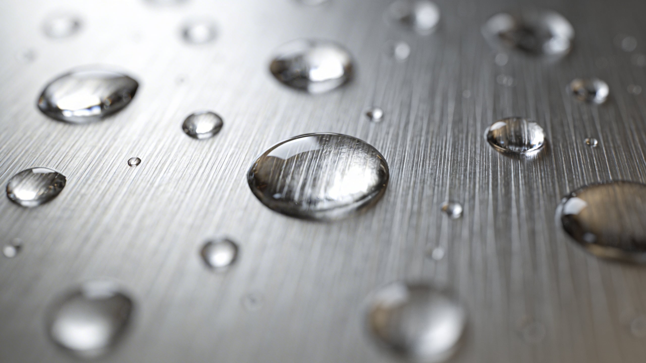
Prompt: "macro photo of brushed stainless steel surface with water droplets, crisp detail, soft diffused light, neutral background, no text"
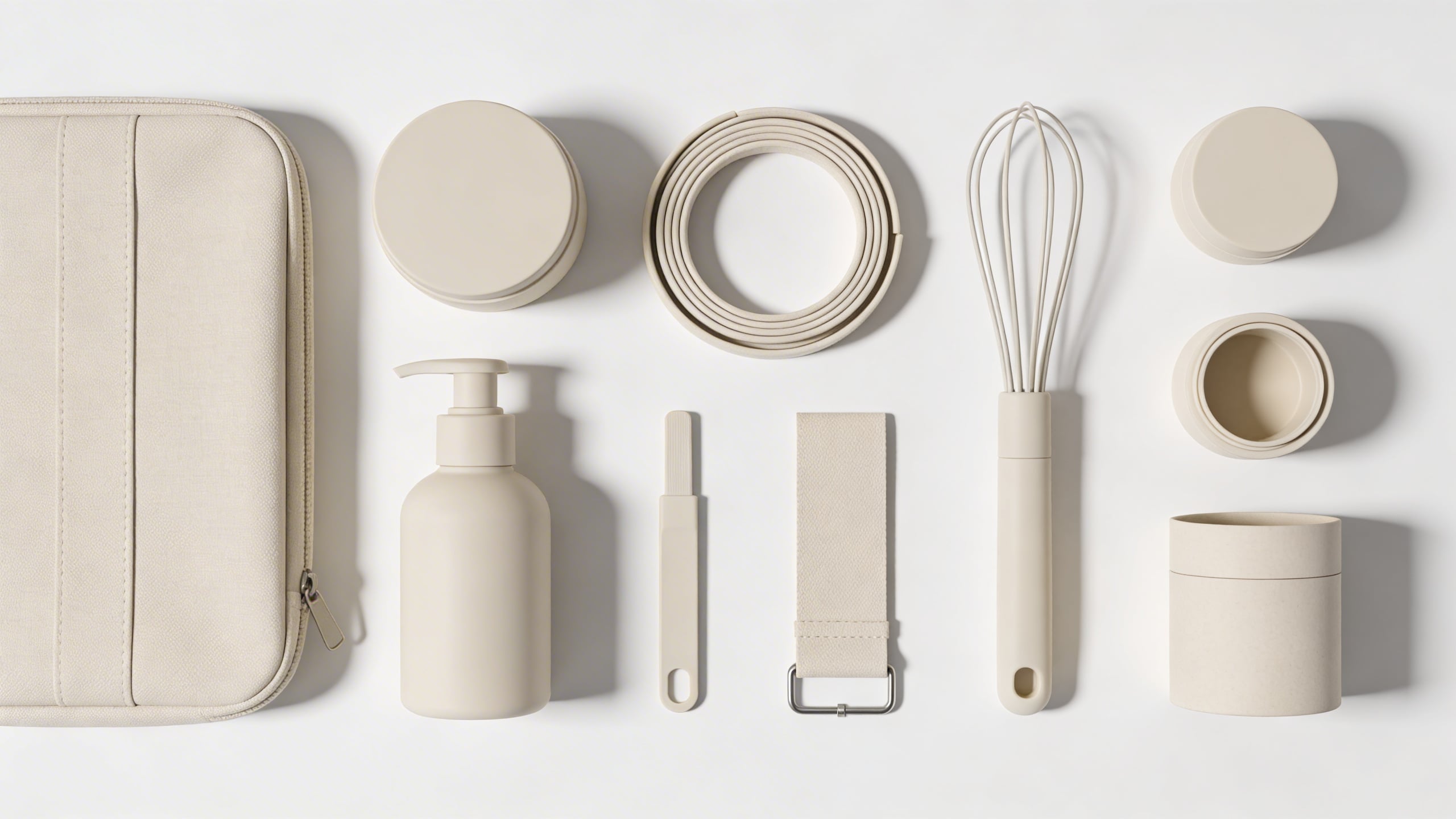
Prompt: "realistic flat-lay photo of product kit contents arranged neatly on a white tabletop, each component spaced evenly, soft overhead lighting, clean shadows, no text, no logos"
Prompt: "durability concept image, reusable grocery bags filled with groceries on a kitchen floor, focus on reinforced stitching and handles, natural light, realistic, no text"
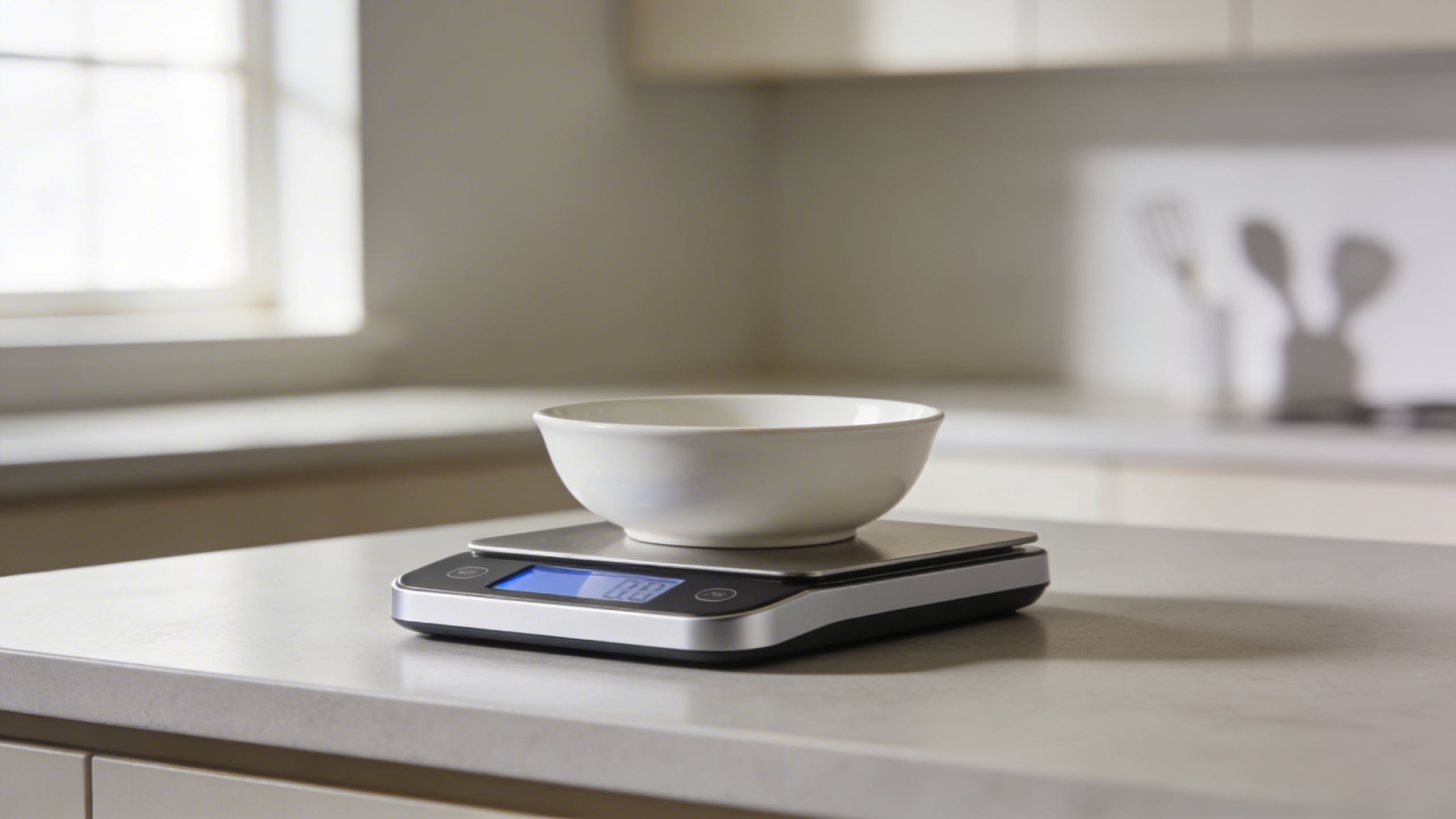
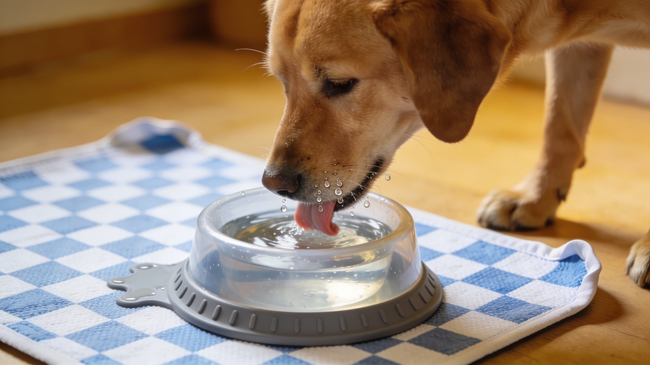
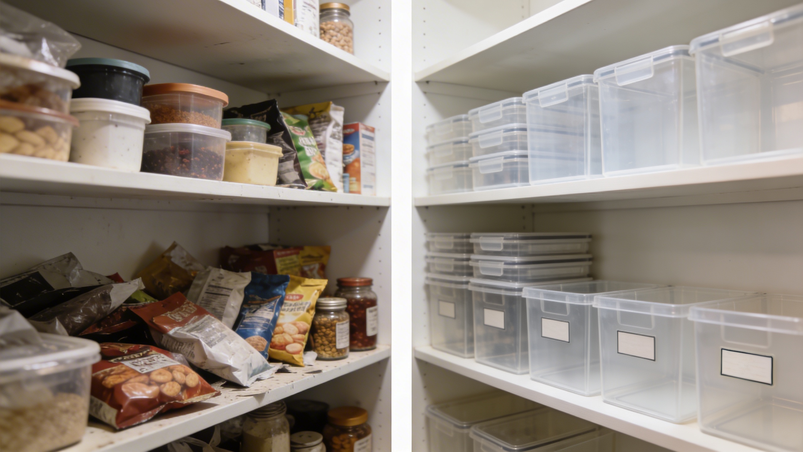
Category “proof” images (without making risky claims)
Prompt: "realistic photo of a digital kitchen scale on a counter with a bowl on top, calm neutral kitchen background, product in focus, soft natural light, no text"
Prompt: "realistic pet scene, dog drinking water next to a spill-resistant pet bowl on a washable mat, warm indoor light, candid moment, product clearly visible, no text"
Prompt: "organizational transformation scene, before-and-after style layout background with two pantry shelves, left shelf cluttered, right shelf neatly organized using clear bins, consistent lighting, empty space for labels, no text"
Seasonal and campaign-ready (subtle, so it does not age badly)
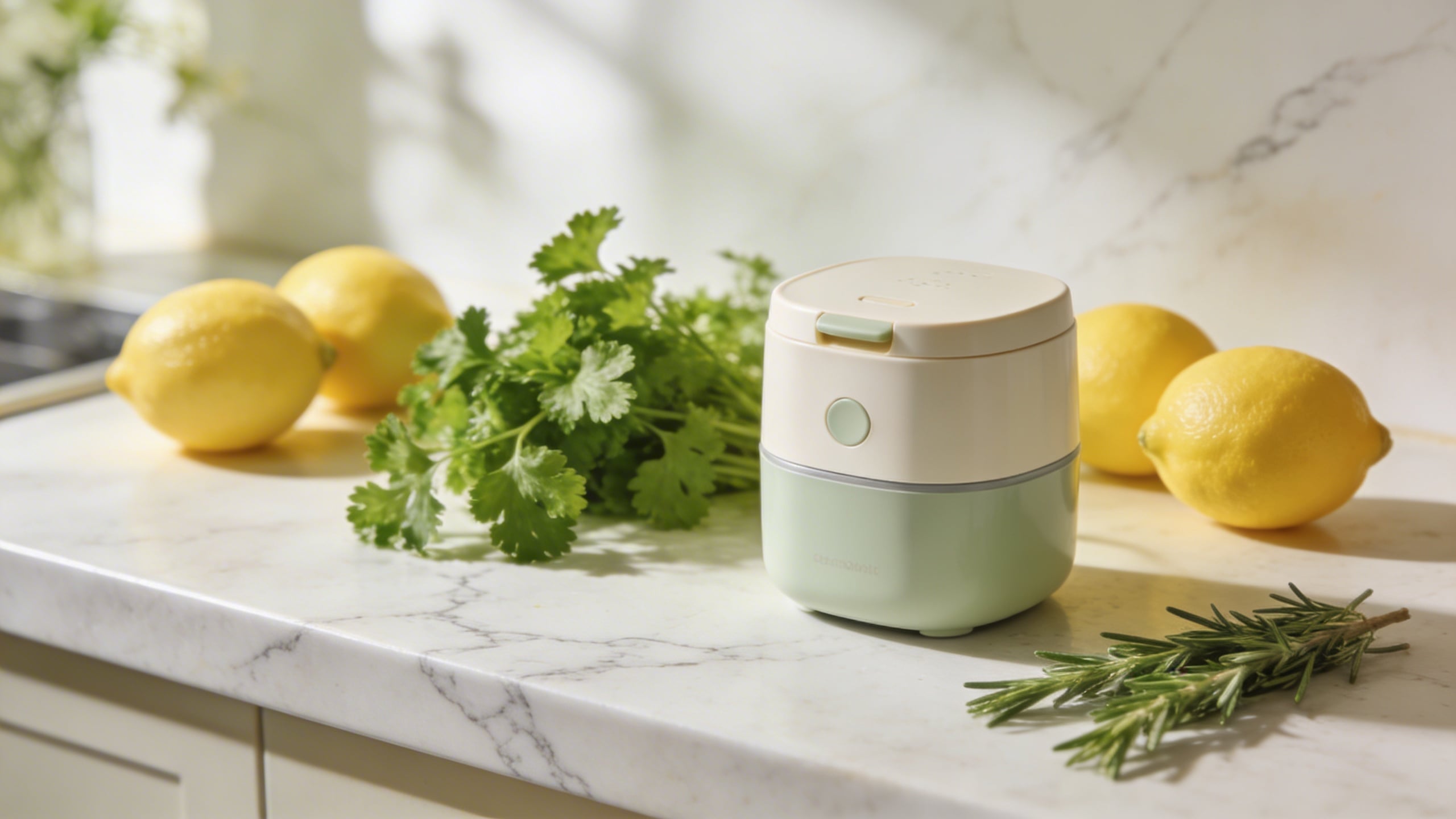
Prompt: "spring kitchen lifestyle photo, product on light marble counter with fresh herbs and lemons nearby, bright soft daylight, clean composition, product sharp, no text"
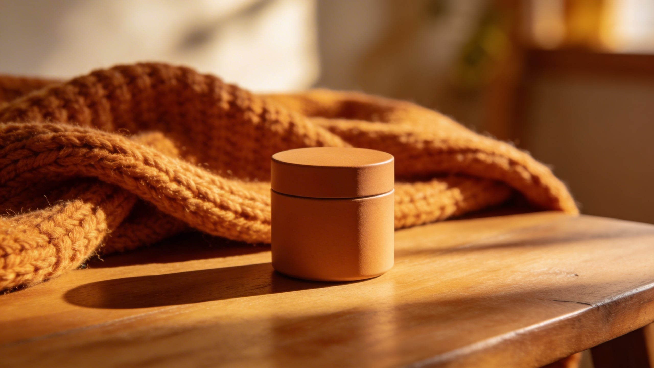
Prompt: "cozy autumn home scene, product on wooden table with warm knit blanket in background, soft golden light, shallow depth of field, realistic, no text"
That’s 17. Between those and the original eight, you should have enough Amazon image prompts to build a full set, test new angles, and not feel like you’re rebuilding your brand identity every time you add a variation.
A few Amazon product photography tips that matter more in 2026 than they used to
This section is going to sound picky because it is. The bar has moved. In 2026, a “decent” listing image set feels like the default, and defaults do not get clicked when you are sitting next to a dozen competitors who all have decent.
Your images should answer questions in this order
When I’m editing a set, I ask: what does a shopper need to know first, second, third?
- What is it?
- Will it fit the way I live (size, context, compatibility)?
- Why this one (a real differentiator, not fluff)?
- What exactly do I get in the box?
- Is it annoying to use (cleaning, storage, setup)?
If you already have that sequence, your text bullets almost matter less, because your visuals carry the certainty.
Don’t make every image “marketing”
One image can be a vibe. The rest should be information. The moment you crowd every frame with badges and icons and “PREMIUM” and “BEST VALUE,” you are basically telling a shopper you do not trust the product to speak.
I know sellers who are convinced more callouts always help. Sometimes they do. But usually, if performance moves up, it is because the set got clearer, not louder.
Be careful with humans, but do not avoid them
People add scale, warmth, relatability. They also add a dozen ways for an image to feel off: awkward fingers, wrong grip, weird facial expressions, too-perfect influencer energy.
I choose hands-only shots a lot because they keep the scene human without forcing the model to generate a face that might look like a wax museum on a bad day.
Color accuracy is the quiet conversion killer
If you sell in multiple colors, this is where things get irritating. You want consistent color across your hero, lifestyle, and detail shots. That’s hard even with real photography, and it is definitely hard with AI generation.
My boring fix is: pick one “reference” image you like, then push all prompts to match its lighting and environment. If you generate in Stockimg.ai, keep reusing the same descriptive anchor phrases so the outputs stay in the same family. You can still get drift, but less.
The uncomfortable part: creative images won’t save a weak offer, but they can save a fine one
I wish I could promise that creative listing images will fix everything. They won’t. If your offer is weak, a pretty image just makes people bounce faster because they expected more. But if your offer is fine and your listing is just not being read, better visuals can pull the lever that matters: getting the click, keeping attention long enough for customers to understand the product, and giving them enough confidence to stop scrolling.
I also think this is where a lot of sellers get stuck: they never test visuals. They test price, they test PPC keywords, they test coupons, but their image gallery stays basically the same for a year because changing images feels like a “big project.”
Making a prompt bank turns it into a small project. You can do one refresh image, one scale image, one macro texture image, and see if anything shifts. That’s the whole point.
Frequently Asked Questions (FAQs)
Do these Amazon image prompts replace real product photography?
Not completely. If you can shoot real photos that match your product exactly, you should. What these prompts do well is filling gaps: lifestyle context, clean infographic canvases, seasonal scenes, and quick concept testing before you commit to a full shoot.
Can I use AI-generated images on Amazon listing images without getting in trouble?
Amazon policies and enforcement can change, and you are responsible for compliance, but generally the bigger risk is misleading customers. If the image implies accessories, quantities, colors, or results you cannot deliver, you are asking for returns and complaints.
How many listing images should I aim for?
If your category allows it, I still like having a full set rather than stopping at the minimum. One clean hero, one scale-context, one detail/macro, one “what’s in the box,” and one clarifying infographic gets you most of the way there.
Why do I get inconsistent results when I reuse the same prompt?
Because generation is probabilistic, and small invisible differences in interpretation can change the output. Your best fix is to tighten the prompt with physical details (material, finish, shape), lock your lighting language, and generate in batches so you can pick the most consistent pairings.
What file specs should I think about when exporting images for Amazon?
Aim for crisp resolution so zoom looks good, keep the product centered and readable, and export in a standard format that preserves quality (JPEG is common, PNG if you need it). If your images look slightly soft on zoom, you will feel it in conversion even if you cannot measure it cleanly.
Should I add text overlays and icon badges on my Amazon images?
Yes, but less than you think. One or two infographic-style images with minimal callouts can be great, but if every image is screaming features, customers tune out and your gallery starts to look like a sponsored banner set.
What is the fastest way to generate a consistent set for one product?
Pick one style (studio or lifestyle), write a locked product description with materials and colors, then generate 10 to 20 variations per concept in Stockimg.ai so you can select a matching set instead of trying to force one perfect image.
What if my product has multiple variations (colors, sizes, bundles)?
Build one “master” image style first, then duplicate the prompts and only change the variation detail (like “navy blue” to “sage green”). The more you change at once, the more every variation starts to look like a different brand.