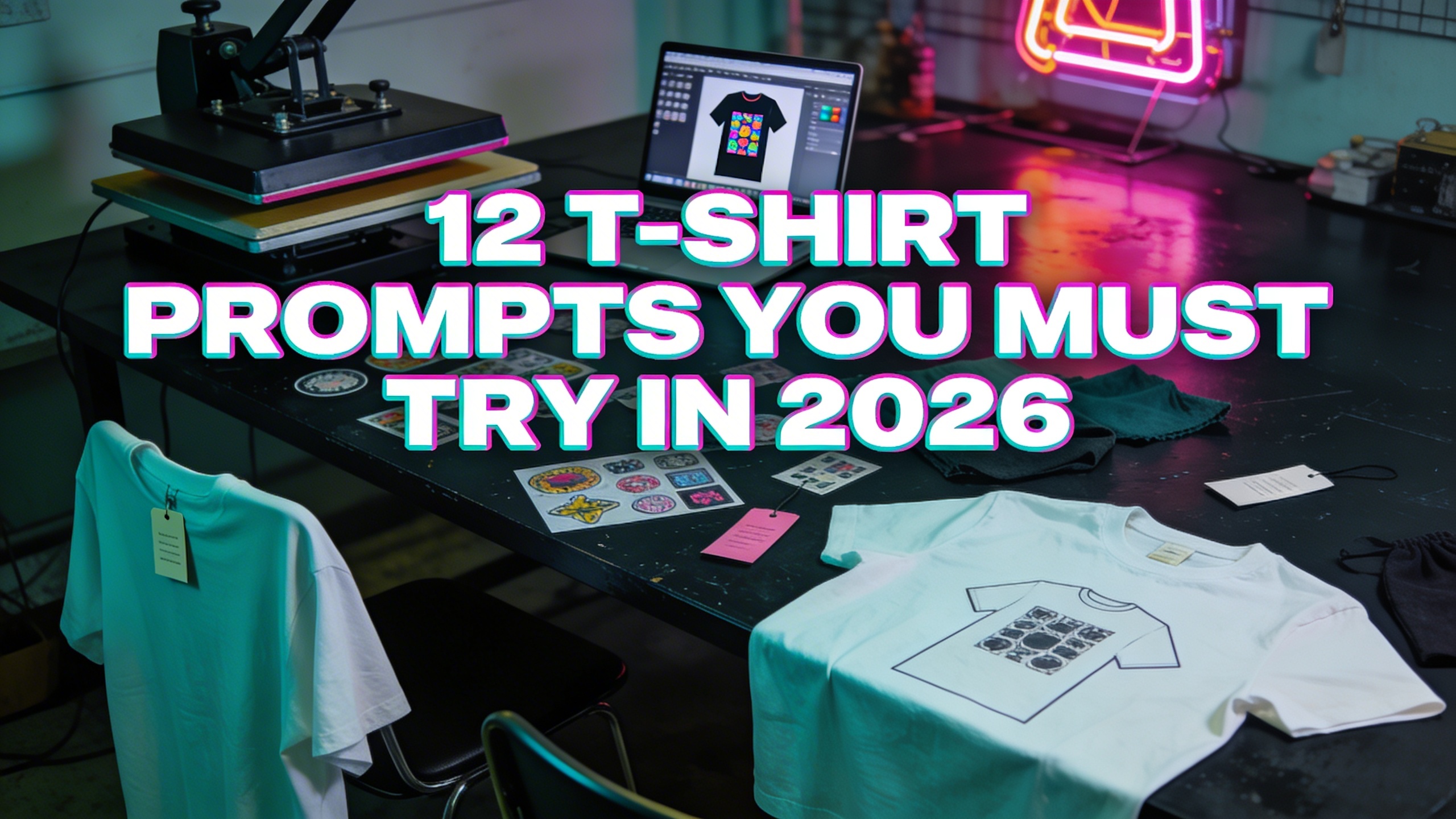
11 T-shirt prompts you must try in 2026
You can run these as-is in Stockimg.ai, then tweak your colors and add your brand tag later. Each prompt is written to be print-friendly, with a wearable layout in mind. After each one, I’ll tell you what I’d change, what product angle it fits (gift, streetwear, niche identity), and how I’d market it without being cringe.
1) The “Offline Club” clean badge (quiet flex merch energy)
Prompt: "minimal premium badge logo for a t-shirt, 'OFFLINE CLUB' text in small capitals, simple shield emblem with a crossed-out wifi symbol, 2-color screenprint style, black ink on cream background, clean vector lines, centered chest, lots of negative space, modern minimal streetwear aesthetic"
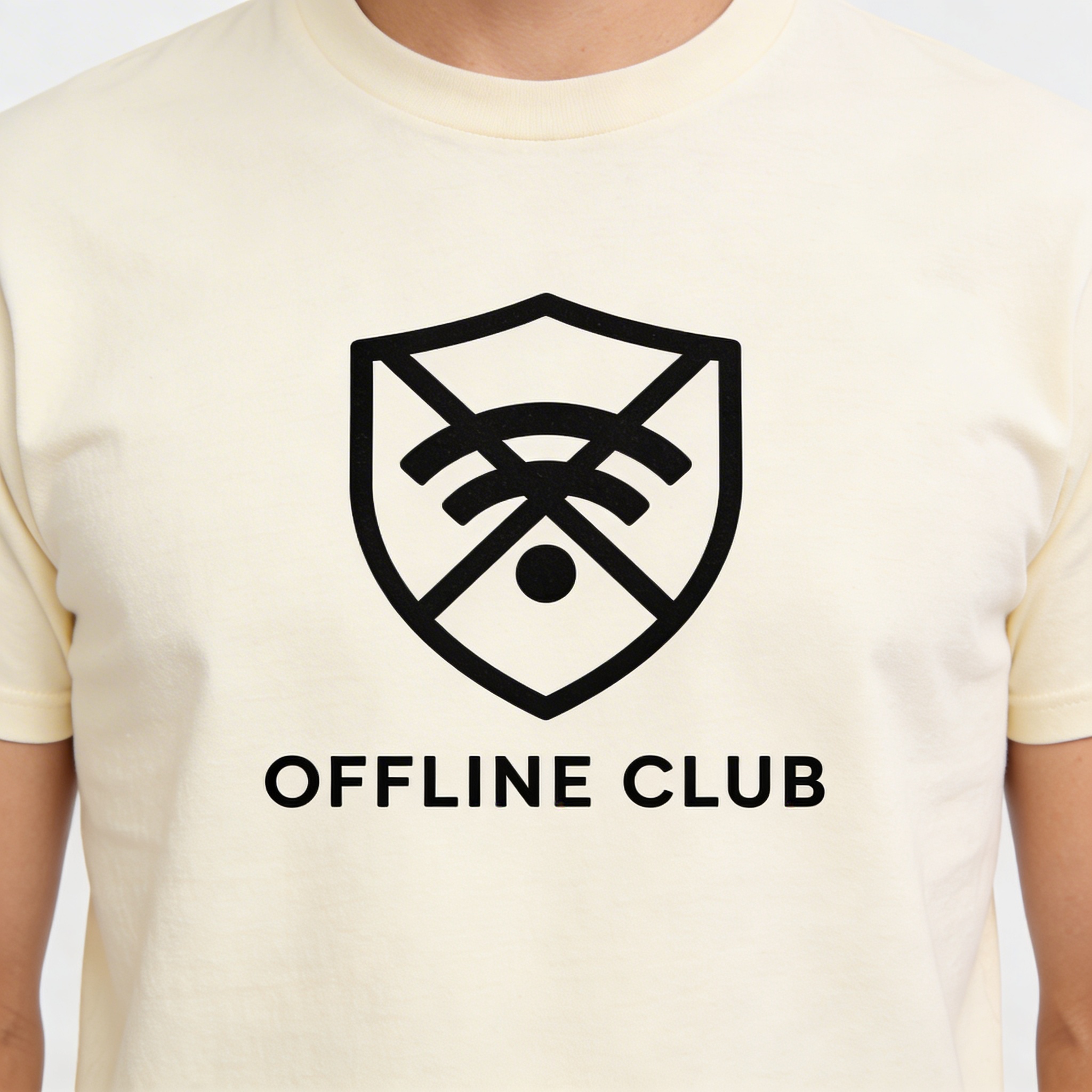
This is one of those graphic tee ideas that looks like it came from a real brand because it isn’t trying to be funny. It’s just a signal. If it feels too basic, that’s the point. When people wear “quiet” designs, they forgive you for not entertaining them.
What I’d tweak:
- Try “NO SIGNAL” or “AIRPLANE MODE SOCIETY”
- Make the emblem slightly imperfect, like a vintage stamp
- Spin variants by region: “OFFLINE CLUB - Austin” style micro drops
Marketing angle:
- Sell it as “weekend uniform”
- Use an unreasonably clean mockup and one messy real-life photo (laundry room mirror is fine)
2) Chaotic cute mascot with a short slogan (the gift-friendly winner)
Prompt: "cute grumpy raccoon character illustration holding a tiny coffee cup, bold thick outline, 4-color limited palette, retro cartoon style, big centered graphic for t-shirt print, caption in chunky hand-lettering: 'FUNCTIONAL (BARELY)', screenprint ready, high contrast"
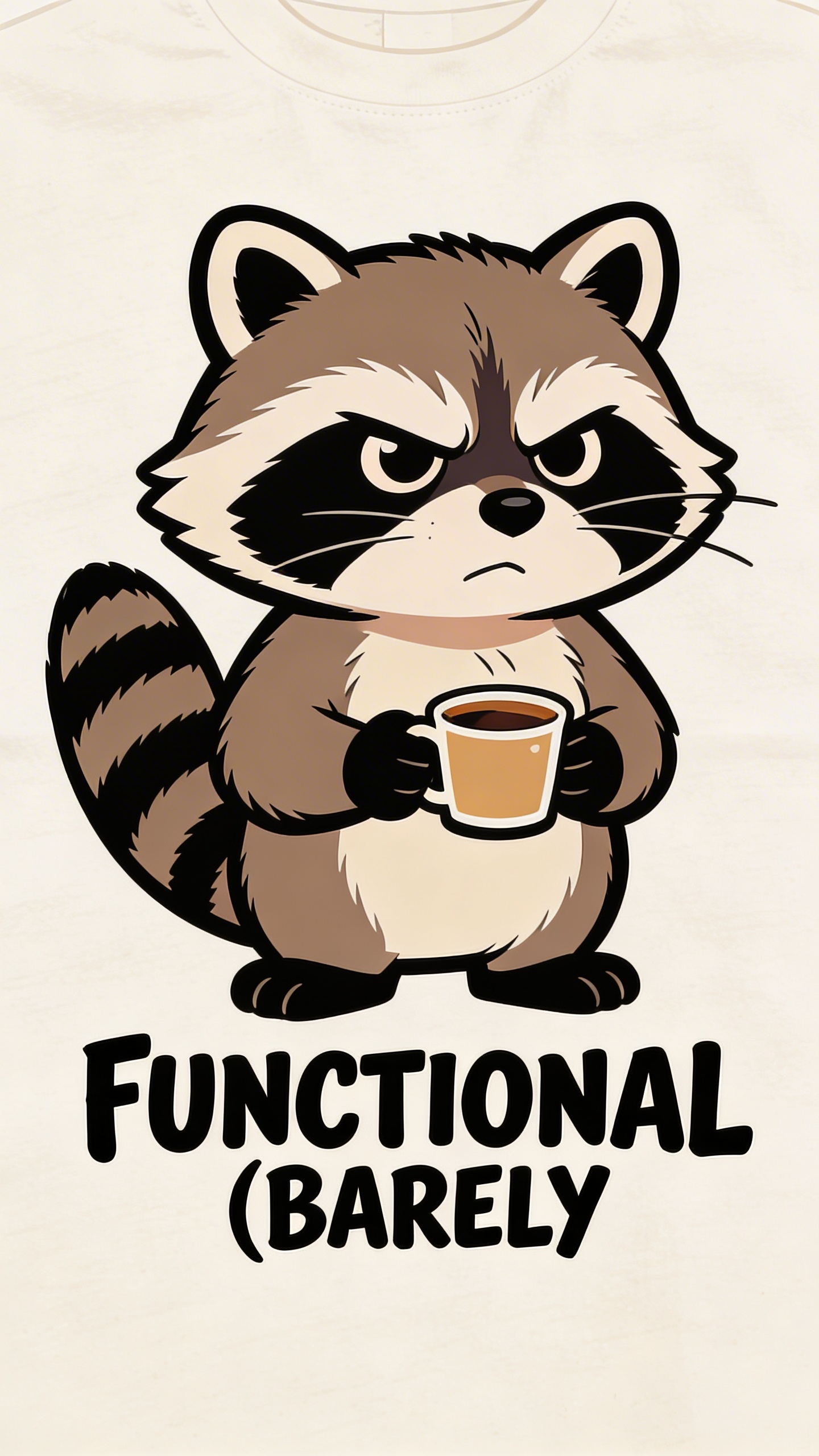
I’ve watched “barely functional” jokes refuse to die for like five years, and I can’t even be mad because they keep selling. The trick in 2026 is to stop using the exact same phrase everyone else uses and instead let the illustration carry some personality.
What I’d tweak:
- Change the animal depending on your target: possum, cat, pigeon, sloth
- Keep the text short enough to read at a distance
- Don’t use thin script fonts unless you want returns
Marketing angle:
- Make it a gift listing: “for your coworker who survives on iced coffee”
- On social, post it as a “Monday mood” reel with the graphic appearing at the end
3) Nostalgic “local video store” tee (retro merch that feels real)
Prompt: "retro 90s video rental store t-shirt design, circular logo with film reel and VHS tape icon, distressed vintage texture, 3-color print, text: 'LATE FEES BUILD CHARACTER', bold condensed sans-serif, centered chest, worn ink look"
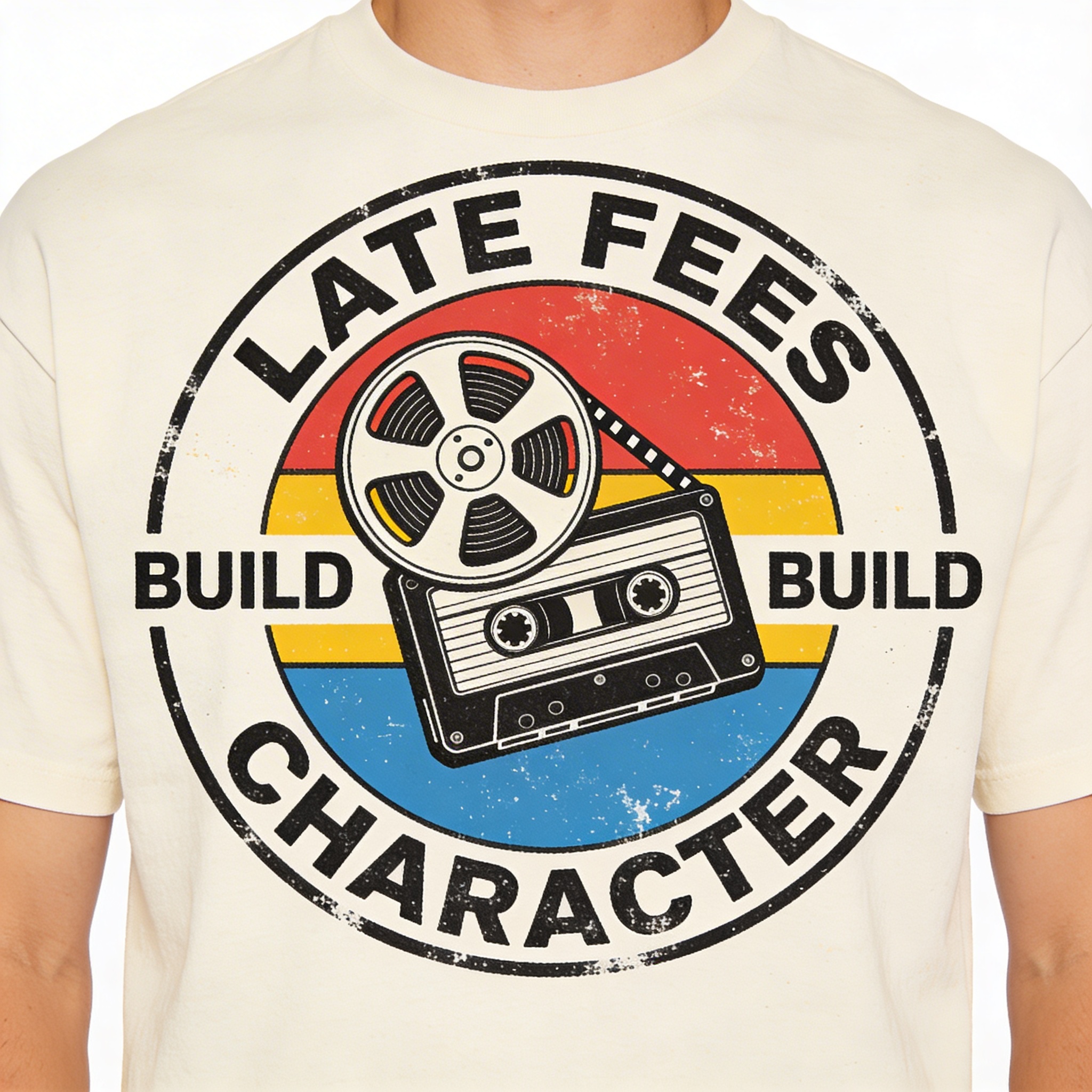
This is my personal weakness. I will buy fake merch for fictional places. It’s embarrassing, but it’s true. A lot of custom T-shirt inspiration in 2026 is basically “a thing that feels like it existed.”
What I’d tweak:
- Replace the copy with “BE KIND, REWIND” if you want safe
- Or go weirder: “WE WERE OPEN. YOU WERE JUST LATE.”
- Add a small “est. 1997” detail to make it feel legit
Marketing angle:
- Post three variants like they’re locations: “Downtown,” “Mall,” “Airport”
- Bundle with stickers later, because sticker buyers overlap hard with this vibe
4) “Your brain in tabs” minimal diagram tee (modern life anxiety, but aesthetic)
Prompt: "minimalist diagram style t-shirt graphic, simple line art of a browser window with multiple tabs, each tab labeled with small text: 'WORK', 'BILLS', 'LAUNDRY', 'TEXT THEM BACK', 'WHY AM I LIKE THIS', monochrome black ink, clean vector, centered chest, modern minimalist"
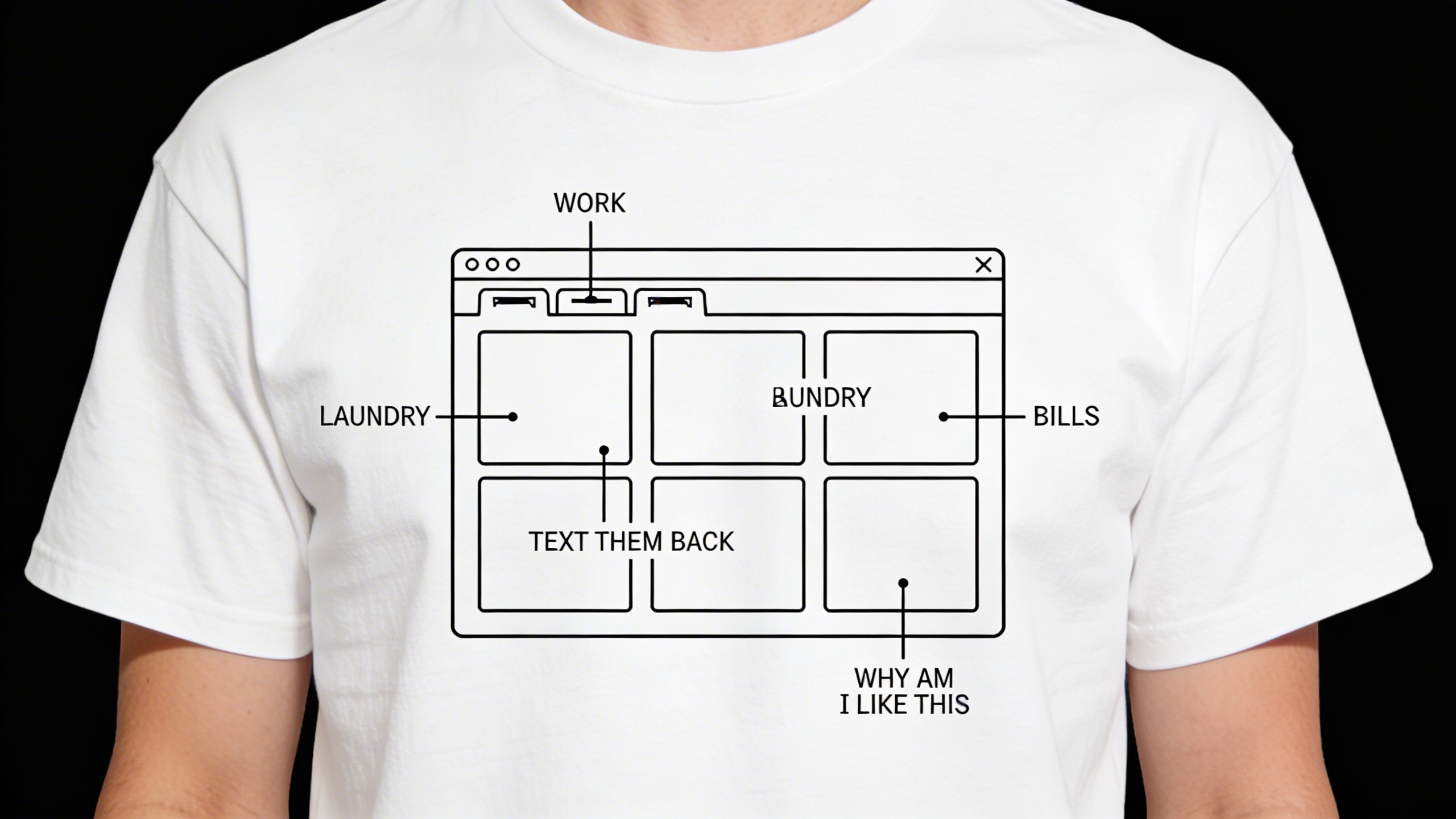
This is where creative T-shirt slogans meet “I’m not trying to be loud but I would like to be understood.” Also, it’s easy to iterate because you can swap the tab labels endlessly.
What I’d tweak:
- Make sure the small text stays readable when printed (test at actual size)
- Try a left-chest tiny version, then do the full tab list on the back
Marketing angle:
- Run a poll: “What tab are you stuck on?”
- Let comments become your next edition
5) Fantasy sports but for emotions (odd niche identity shirt)
Prompt: "vintage sports team mascot illustration for a fictional team, angry cartoon heart character wearing a jersey, athletic badge logo, text: 'THE OVERTHINKERS', secondary text: 'EST. 2004', 4-color screenprint style, bold outlines, centered chest, retro collegiate typography"
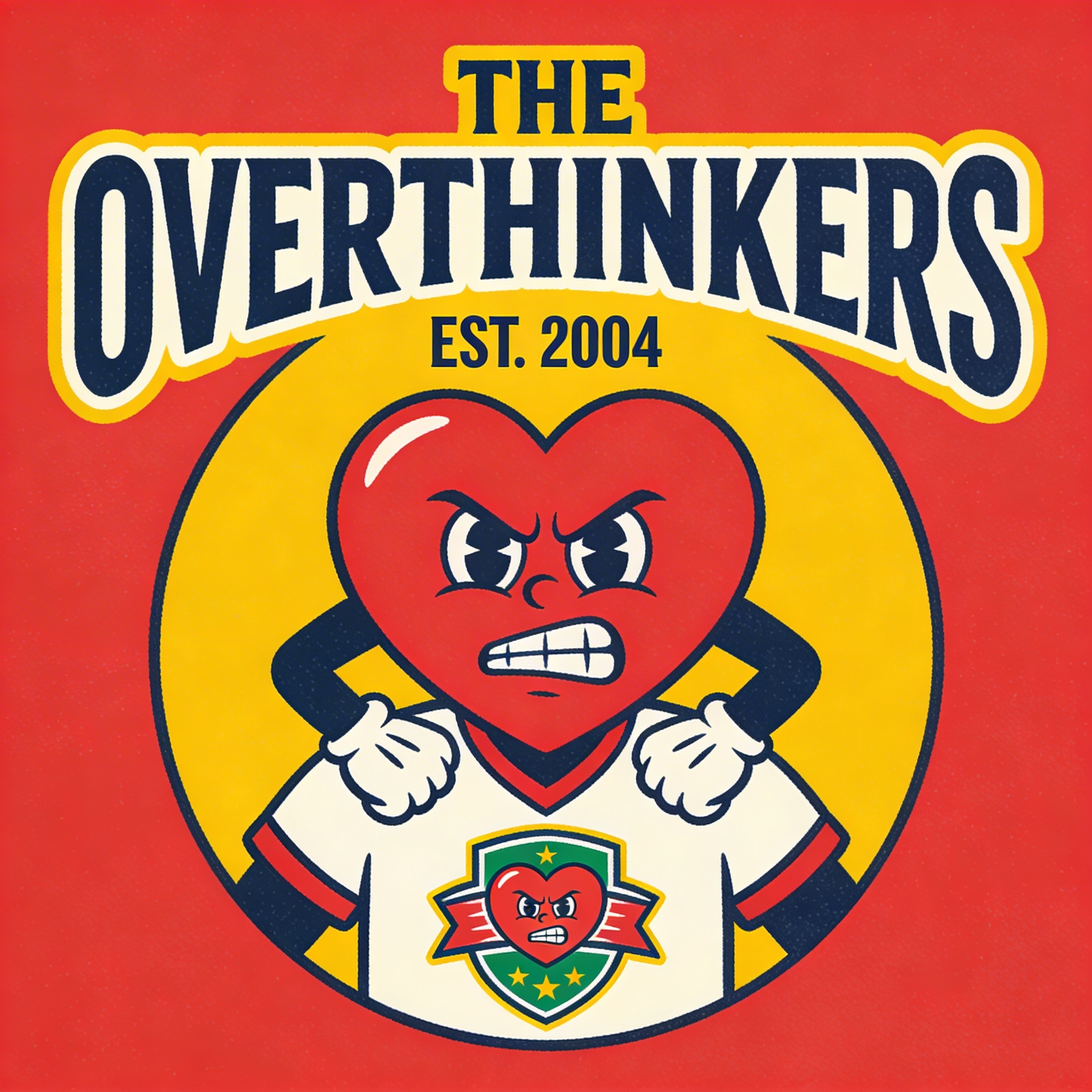
This is one of those unique T-shirt concepts that shouldn’t work, which is a good sign it might. The idea is “team merch” but the team is a personality problem.
What I’d tweak:
- Create a whole league: The Procrastinators, The People Pleasers, The Late Responders
- Keep the design athletic, not meme-y, or it becomes junk fast
Marketing angle:
- Drop it like it’s a sports season: “Roster updates every Friday”
- Works surprisingly well as a limited release, even if you don’t have a big audience
6) Minimal “ingredient label” tee (clean humor, very wearable)
Prompt: "minimal ingredient label t-shirt design, simple typographic layout like a nutrition label, bold header: 'INGREDIENTS', list: 'coffee, anxiety, good intentions, bad timing', clean black ink on white, modern sans-serif, high readability, centered chest, grid alignment"
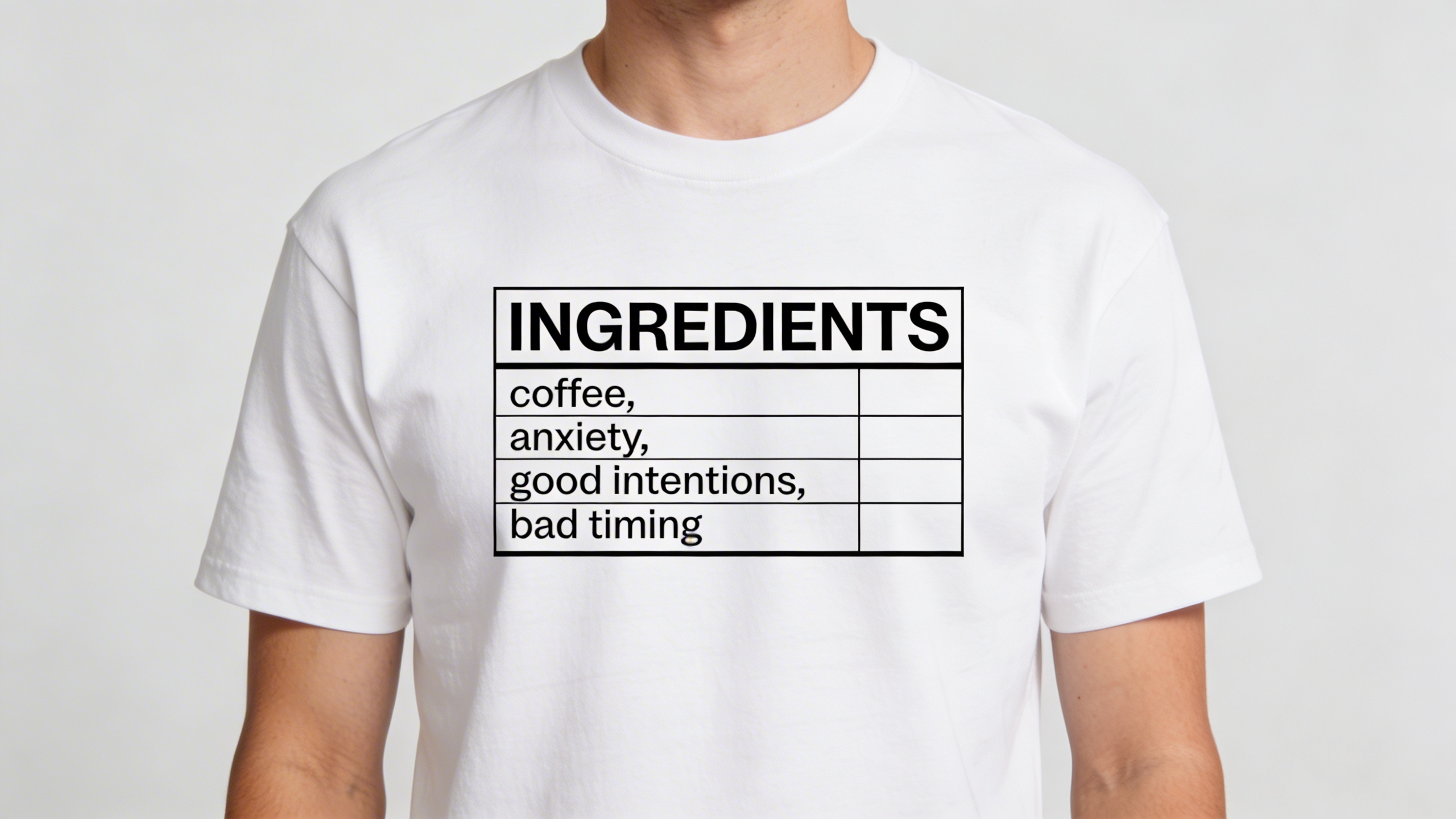
If you want trending T-shirt designs that don’t feel like trying too hard, minimal typography is a cheat code. I don’t always love it, but I respect it, and buyers love reading a shirt like it’s a cereal box.
What I’d tweak:
- Build it per niche: “ingredients” for nurses, students, gamers, new parents
- Make sure you don’t accidentally mimic a real label too closely. Keep it generic.
Marketing angle:
- This is pure gift territory. Make size charts and fabric info obvious so buyers feel safe.
7) “Micro-horror” cute poster graphic (tiny wrongness = big attention)
Prompt: "cute vintage children's book illustration style, smiling sun and happy clouds, but a tiny UFO abducts a cow in the corner, caption: 'EVERYTHING IS FINE', 5-color limited palette, bold outlines, centered t-shirt print, retro texture"
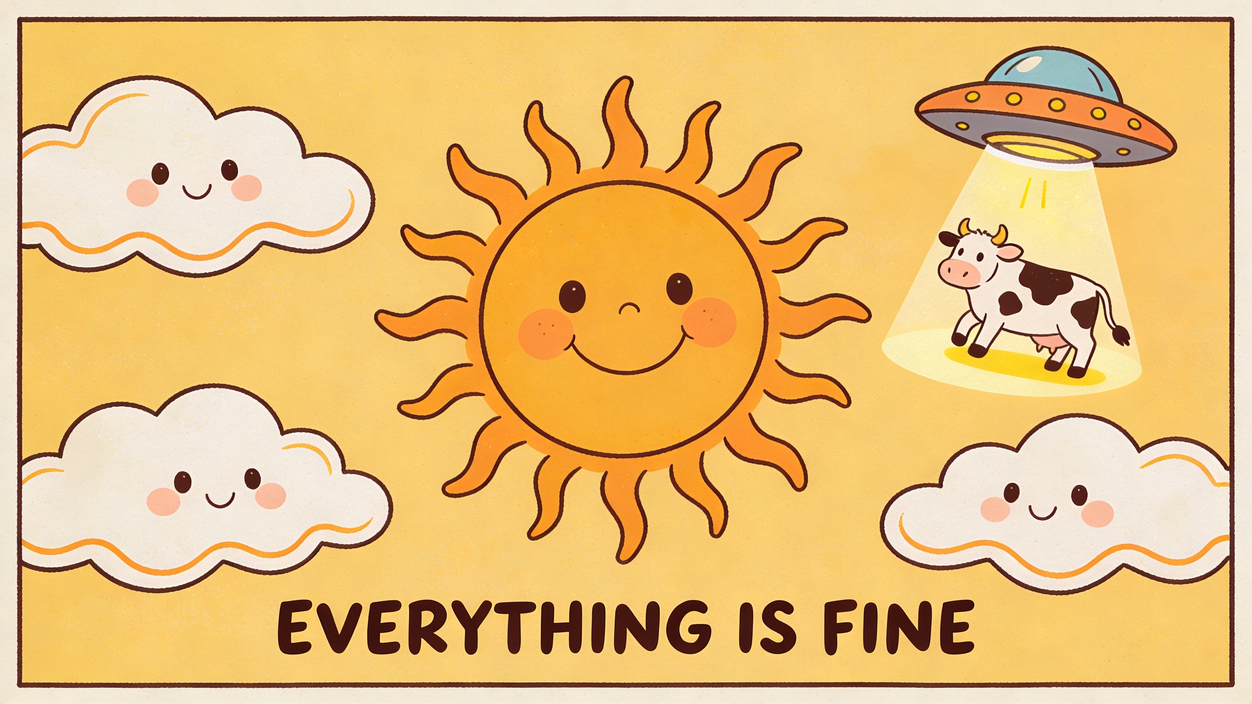
I like this category because it’s a conversation starter without being edgy. The “wrongness” is small, but it makes people look twice. That second look is half of what you’re buying with a graphic tee idea.
What I’d tweak:
- Keep the colors cheerful. That’s the contrast.
- Don’t drown the design in distress texture. One pass max.
Marketing angle:
- “Spot the detail” posts. Force people to zoom in.
8) Practical mantra but with a diagram (self-help aesthetic without the cringe)
Prompt: "simple line drawing diagram t-shirt design of a circle labeled 'what you can control' and outside the circle labeled 'everything else', clean minimal typography, monochrome, subtle zen design, centered chest, vector style, premium minimal"
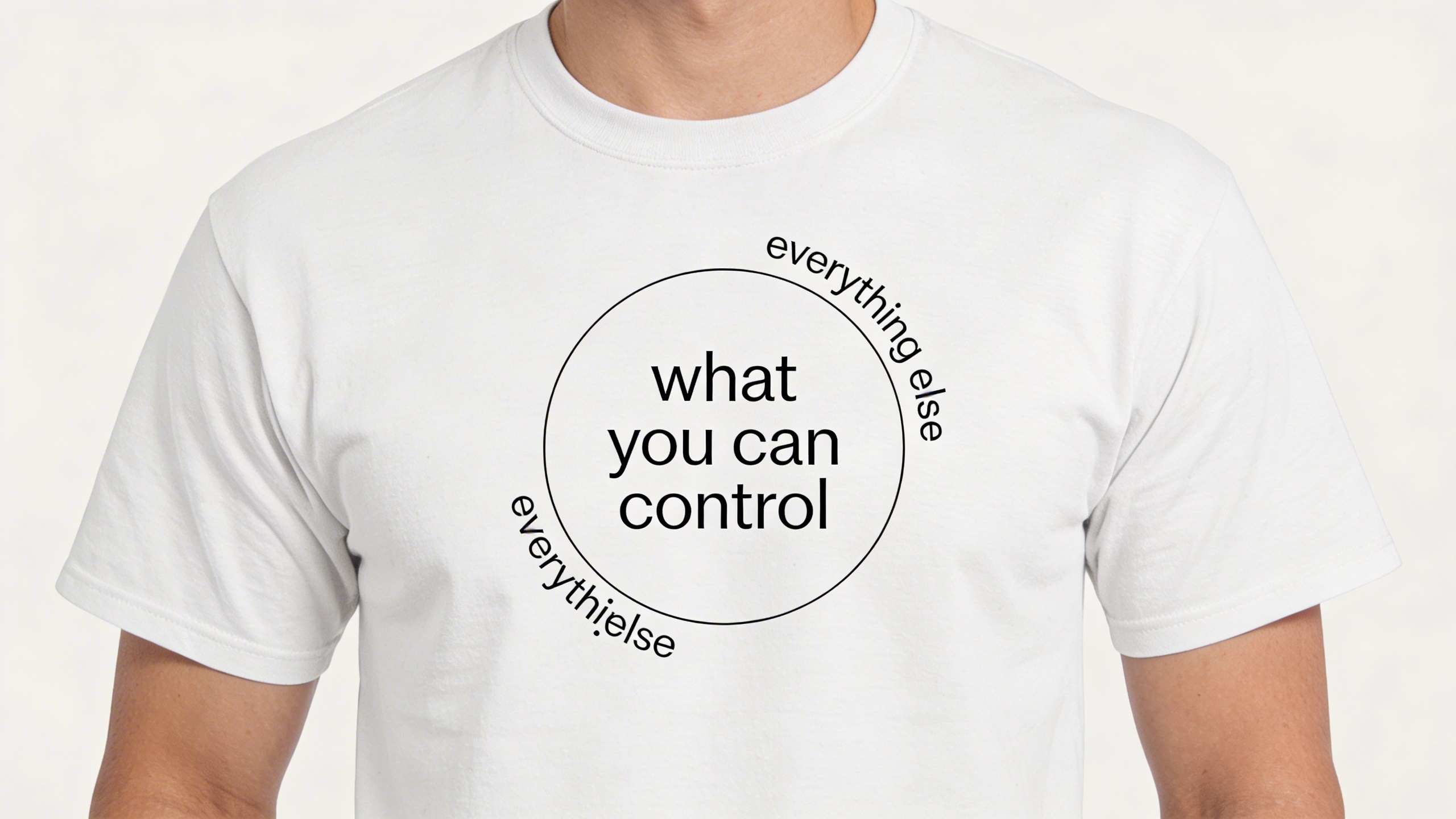
This sells because it’s almost office-appropriate. You could wear it to a coffee shop, gym, therapy appointment, whatever. It reads as “I’m trying,” which is relatable.
What I’d tweak:
- Add a tiny brand mark at the bottom of the circle (your label)
- Offer it in washed black and bone, not bright white
Marketing angle:
- Pair it with calm lifestyle photography. Don’t market it like a joke.
9) Retro instruction manual illustration (funny because it looks serious)
Prompt: "retro 1970s instruction manual illustration style for a t-shirt, diagram of a person charging like a battery, arrows and labels, headline: 'RECHARGING IN PROGRESS', clean limited palette, vintage paper texture, thick outlines, centered print"
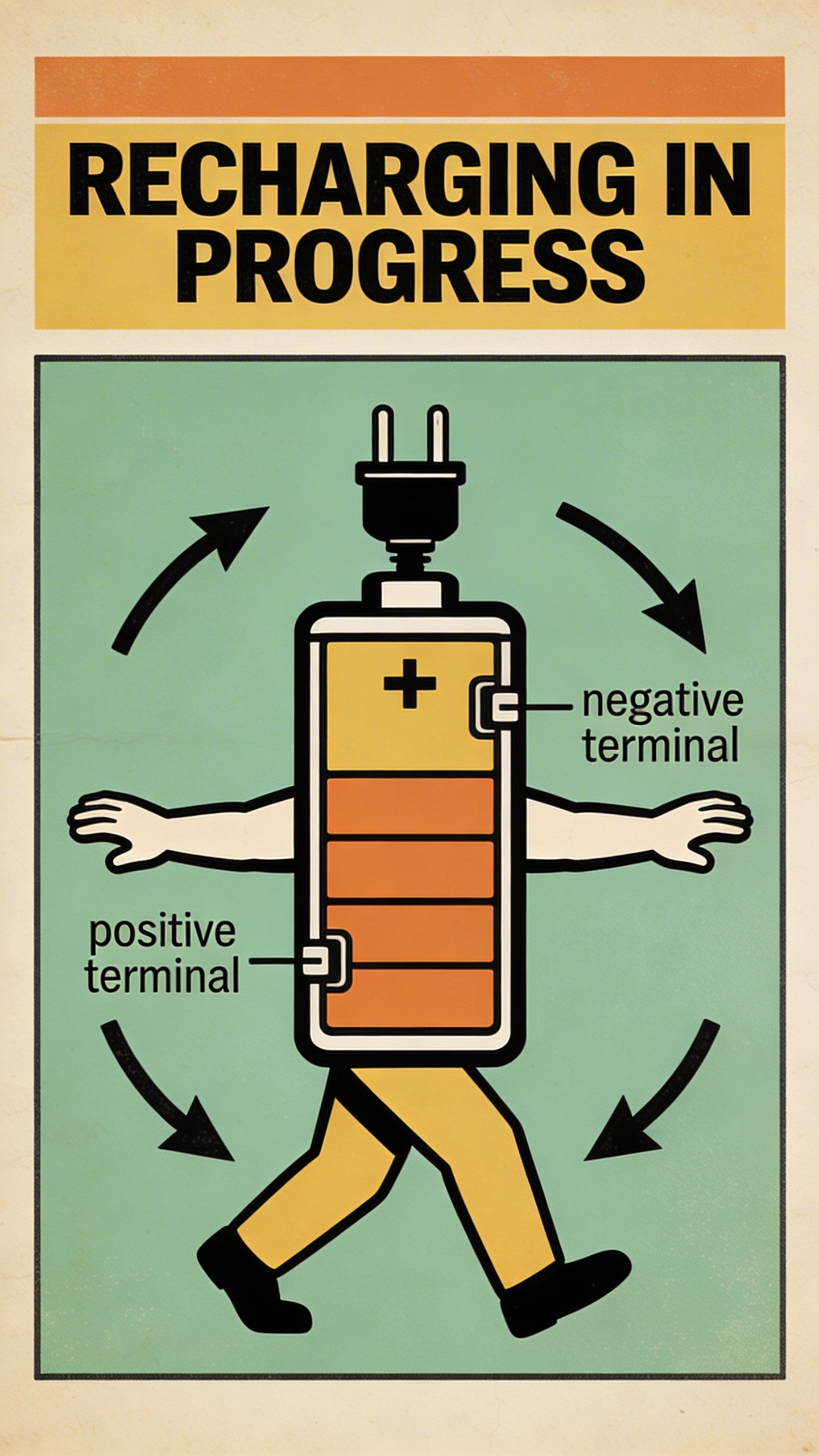
This is another gift-friendly design because it feels clever without being loud. Also, instruction-manual graphics naturally become structured layouts, which print well and don’t rely on ultra-detailed shading.
What I’d tweak:
- Make “in progress” smaller so it doesn’t dominate
- Maybe the battery has one bar left. That’s the joke.
Marketing angle:
- Post it with the caption “social battery” and let the internet do the rest.
10) The ultra-niche hobby shirt (tiny audience, strong conversion)
Prompt: "minimalist t-shirt design for a niche hobby, clean vector icon set arranged in a grid, subject: mushroom foraging tools, icons include basket, pocket knife, field guide, mushroom silhouettes, small caption: 'WEEKEND FOREAGER', earthy 3-color palette, centered chest"
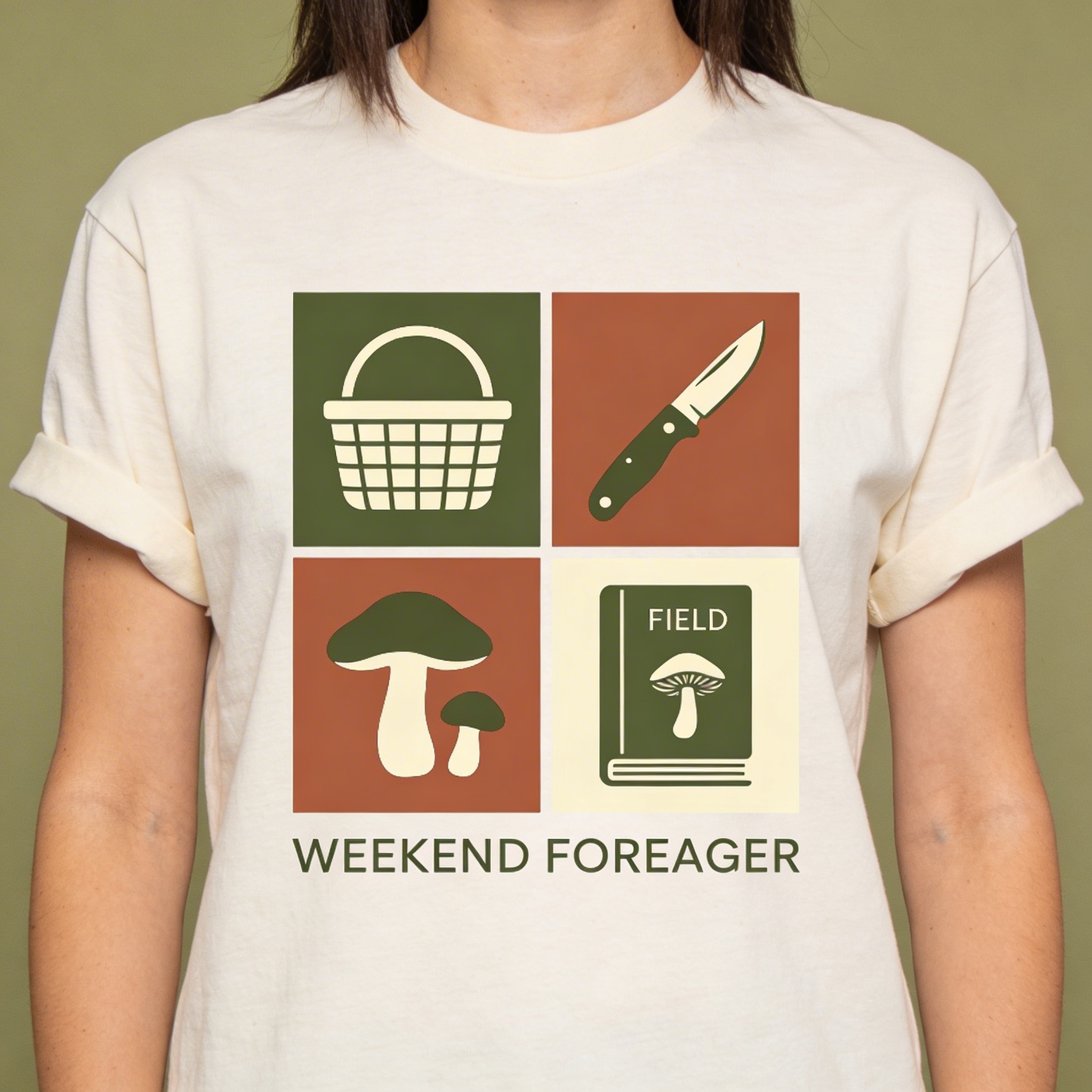
This one is pure “T-shirt design ideas as targeted identity.” If you’ve been trying to sell general funny shirts to everyone, this is the antidote. Niche shirts sometimes sell fewer units, but your conversion rate stops being depressing.
What I’d tweak:
- Replace mushroom foraging with your niche: fly fishing, climbing, pottery, birding, home roaster coffee nerds
- Keep the icon style consistent. That’s where AI outputs can get sloppy.
Marketing angle:
- Don’t market it to the whole internet. Market it to the niche corners: subreddits, groups, micro-influencers.
11) The “one sentence that feels like a lyric” tee (typography, but emotional)
Prompt: "typography-only t-shirt design, poetic sentence in bold serif and small sans mix, text: 'I’M LEARNING TO BE SOMEONE I CAN LIVE WITH', minimalist layout, high-end editorial style, black ink on washed cream, centered chest, clean margins"
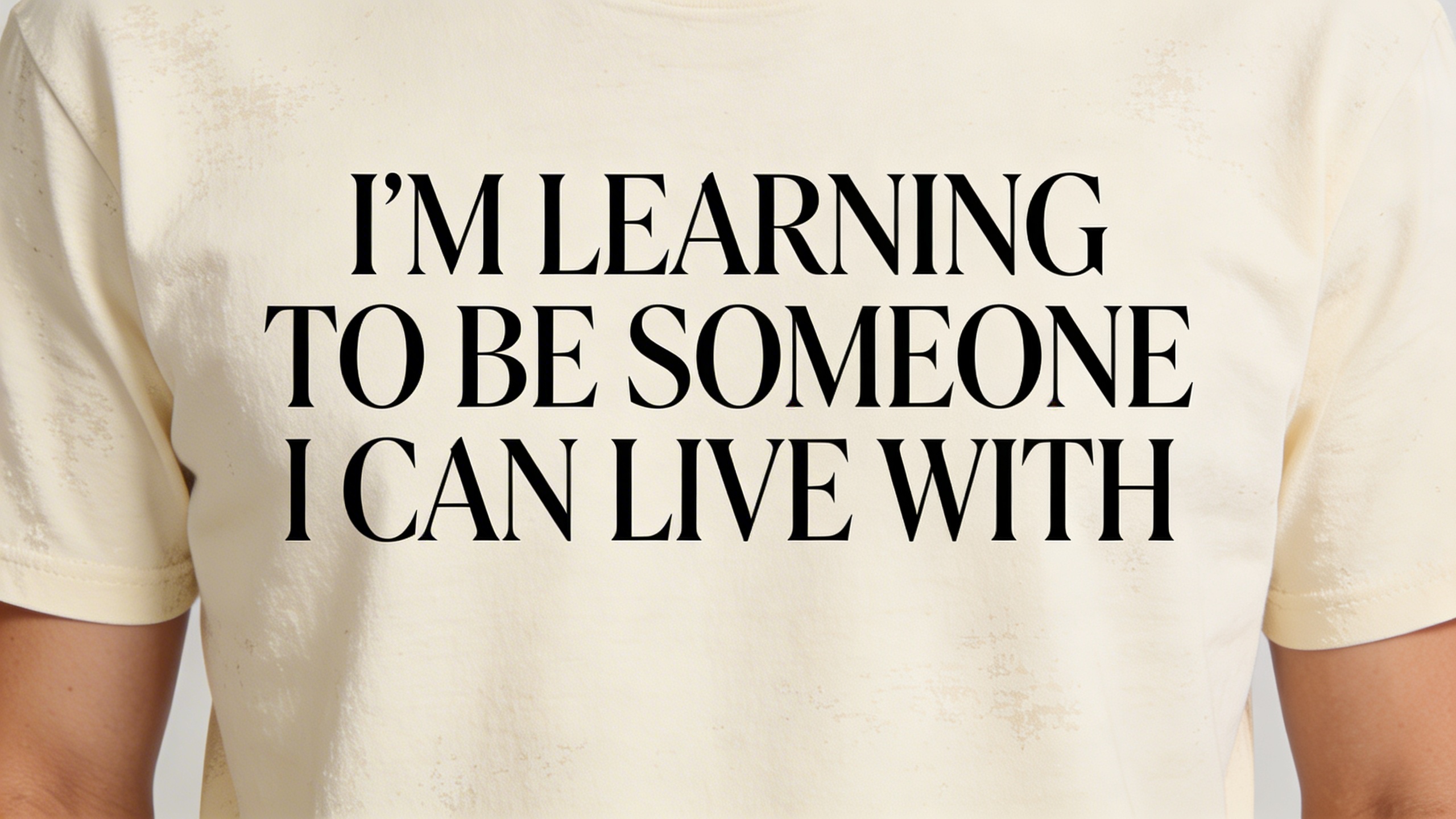
This is where you can get into creative T-shirt slogans that actually feel wearable. The mistake is making it corny, or using a font that screams “inspirational wall art.” It needs the editorial vibe to feel like clothing, not a quote page.
What I’d tweak:
- Keep it to 6 to 12 words if possible
- Test different casing (all caps can feel like shouting)
- Make the line breaks intentional
Marketing angle:
- Market it like a brand statement, not a joke. Photos matter more than copy here.
Bonus prompts (because you’ll want options when one idea prints weird)
You said “12,” but I’m adding extra prompts because in real life you’ll run into at least one of these:
- the text is too small
- the design is too tall for the print area
- the colors look different on fabric than on-screen
- you realize the idea is good but the execution looks like clipart
Pick a couple of these as “Plan B.”
13) The “tiny left chest, big back print” classic
Prompt: "t-shirt design layout, small left chest emblem of a simple compass icon, clean vector, 2-color, and a large back print with bold text: 'TAKE THE LONG WAY HOME', retro travel poster vibe, limited palette, screenprint style"
14) The “fake museum exhibit” tee for art nerds
Prompt: "minimal museum exhibition poster style t-shirt design, centered typographic layout, title: 'EXHIBITION OF SMALL FAILURES', subtext in tiny serif: 'a collection of near-misses, 2016-2026', black ink on white, clean grid, premium editorial vibe"
15) The “corporate memo” parody tee that still looks clean
Prompt: "minimal corporate memo style t-shirt typography, bold header: 'REMINDER', body text: 'YOUR WORTH IS NOT YOUR OUTPUT', small footer: 'THANK YOU', black ink, clean sans-serif, centered chest, high readability"
16) The “cartoon object with feelings” (always sells if it’s not ugly)
Prompt: "cute cartoon stapler character with a tired face, bold outline, 4-color palette, sticker style, caption in playful bold letters: 'HOLDING IT TOGETHER', centered t-shirt graphic, screenprint ready"
17) The “food remixed as a mascot” streetwear drop idea
Prompt: "streetwear mascot illustration of a spicy ramen bowl character wearing sneakers, dynamic pose, bold thick outlines, 5-color limited palette, japanese-inspired retro label style, no text, centered graphic, screenprint design"
18) The “simple icon + one word” minimal tee (the sleeper hit)
Prompt: "minimal t-shirt design, single bold icon of a small storm cloud with a tiny heart, clean vector, monochrome, small centered chest, one word below in lowercase serif: 'soft', premium minimalist aesthetic"
You can generate these quickly in Stockimg.ai, then do what I always do: pick one, overthink it for an hour, decide it’s “not you,” then come back the next day and realize it’s totally fine. That cycle is basically the creative process.
How to turn prompts into actual sellable designs (the print reality check)
A design can be a 10/10 image and still be a 4/10 shirt. The difference is nearly always technical.
Keep your lines thicker than you think
If it’s a screenprint vibe, thin lines either disappear or look fuzzy. Even with DTG printing, thin hairlines on fabric can look like accidental lint.
Decide your print method before you finalize
- DTG is great for complex color, gradients, and low upfront work. It can look slightly muted on darker tees unless pre-treated well.
- Screenprint is the king for bold spot colors and durability but needs separation and minimum quantities if you’re not doing it yourself.
I still go back and forth. Like, I love the look of screenprint, but I also love not dealing with screenprint setup when I’m testing a new idea. That’s why I often start with DTG for validation, then move bestsellers to screenprint.
Don’t trust the first mockup you like
Mockups are an emotional liar. They make everything feel premium. Put the design on:
- a light tee color
- a dark tee color
- a weird color you’d never pick but buyers love (sage, washed maroon, faded blue)
If it works on two of those three, you’re good.
Watch your “read distance”
A real-life rule: someone should understand the idea from six feet away.
- Big shapes: yes
- Simple words: yes
- A paragraph of text: no
That browser-tabs design? It can work, but only if you keep tab labels short or scale the whole window up. You can literally ruin a good concept with one “tiny funny detail” nobody can read.
T-shirt marketing strategies I’ve seen actually move units (without turning into a content machine)
You can have the best T-shirt prompts 2026 ever, and you’ll still sell zero if you treat marketing like posting a product photo and whispering “please.”
I’m not going to pretend I’ve solved marketing. I haven’t. But I have found a few moves that are repeatable.
Use “series” thinking, not “one design” thinking
Instead of one shirt, create three around the same idea:
- Offline Club: Offline Club, No Signal, Airplane Mode Society
- Overthinkers: Overthinkers, Procrastinators, People Pleasers
- Ingredient label: ingredients for different niches
When buyers see a series, they assume you’re a real brand, and that assumption does a lot of heavy lifting.
Make the listing title boring and the hangout content fun
Where you sell (Etsy, Shopify, TikTok Shop, Instagram) matters less than this pattern:
- Listing title: clear keywords, boring and accurate
- Social post: the vibe, the story, the micro joke
If you mix those up, you get a listing that no one can find and a post that feels like an ad.
One good lifestyle shot can outperform ten fancy mockups
Annoyingly, yes. The best photo I ever used for a shirt was taken in my kitchen. Bad light. Slightly crooked. My friend holding a mug and not knowing where to put his other hand. It outsold the “studio content” because it looked like life.
If you’re stuck, do this:
- Put on the tee
- Go outside for five minutes
- Face sideways
- Shoot three photos, done
Price like an adult
If you price at bargain level, you attract bargain level customers who complain like it’s their hobby.
You can still run discounts, but start with a price that makes sense for:
- your blank quality
- your printing method
- shipping and fees
- and the fact that you will have customers message you at 2 a.m. about where their shirt is
Use drops when you don’t have an audience
“Limited run” is not just scarcity theater. It’s a way to protect your attention span. If you do a two-week drop, you can market hard for two weeks, then stop. That is survivable.
What I’d do this week if I were starting from zero (and wanted fast feedback)
This is the part I wish someone told me earlier: you do not need 30 designs. You need 3 designs and a plan to learn from them.
- Pick 3 prompts from above that hit different motivations:
- one identity shirt (Weekend Foreager, Offline Club)
- one gift shirt (Functional (Barely), Ingredient label)
- one art shirt (Statue with headphones)
-
Generate 5 variations each in Stockimg.ai, then pick the least embarrassing one, not the “perfect” one.
-
Make mockups and one real photo per design. Yes, one. You can do more later.
-
Post 3 times in a week:
- Post the design alone
- Post the mockup on a person
- Post a short “this is for people who…” caption
- Watch what people comment, not what they like. Likes are cheap. Comments tell you what to make next.
If that sounds too simple, it is. This business rewards boring repetition, which is why so many talented designers quit. The process is not romantic.
Frequently Asked Questions (FAQs)
Can I sell T-shirts made from AI-generated designs?
Usually yes, but you need to follow the AI tool’s license terms, avoid copyrighted characters/logos, and be careful with anything that resembles a well-known brand identity too closely.
What file type should I export for printing?
For DTG, a high-resolution PNG with a transparent background is the common path. For screenprint, you’ll often want vector (SVG, PDF, AI) or at least separated spot-color files, depending on your printer.
Why do these prompts sometimes produce wildly different results?
Most AI generators have some level of randomness, and tiny wording changes change the composition. If you want consistency, keep the prompt structure stable and only tweak one variable at a time (like palette or mascot).
How do I keep small text readable on a shirt?
Make it bigger than you think, use high contrast, avoid thin fonts, and print a test at actual size on paper before you pay for a sample. If you can’t read it in two seconds, your customer won’t either.
Do I need a niche, or can I sell “general funny shirts”?
You can sell general humor, but it’s harder to target and harder to build repeat buyers. A niche makes your marketing cheaper because you know exactly who you’re talking to.
What’s a realistic first goal for a new T-shirt shop?
A realistic first goal is getting 1-5 real sales from strangers, because that tells you your product page, price, and design are functional outside of your friend group.
How many designs should I launch with?
Three good designs beat twenty mediocre ones, especially if they form a small series that makes your shop look intentional.
If a design flops, should I delete it?
Not immediately. Change the mockups, rewrite the title and description, try a different shirt color, and give it a week or two before you decide it’s dead.
Should I trademark my slogan before I sell it?
If it’s a short, generic phrase (“Everything is fine”), no. You can’t really own air.
If it’s a unique brand line that you plan to build a whole shop around, then maybe later—after you confirm it actually sells. Trademarking too early is the creative entrepreneur version of buying a treadmill before you’ve ever gone for a walk.
A better early move:
- Google the phrase + “t-shirt”
- Search it on Etsy
- Search it on the USPTO database (or your country’s equivalent)
- If it’s crowded, rewrite it. If it’s empty, still rewrite it once to make it more yours.
If the phrase becomes your top seller and people start copying it, then you can decide if the business case is real.
Fixing the “18 prompts but only 15 images” problem (and why it matters)
Right now you’ve got 18 prompts, but only 15 images. That’s not just a formatting issue—visually, it makes readers trust the first part more than the bonus section, and that’s where half the fun ideas live.
So here are the missing images for prompts 13–18. Same format, print-friendly, and consistent with the rest of the post.
13) The “tiny left chest, big back print” classic
Prompt: "t-shirt design layout, small left chest emblem of a simple compass icon, clean vector, 2-color, and a large back print with bold text: 'TAKE THE LONG WAY HOME', retro travel poster vibe, limited palette, screenprint style"
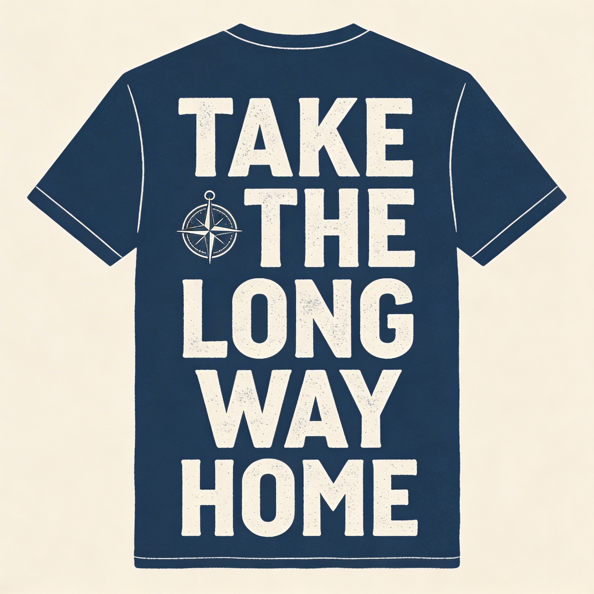
This layout is a cheat code because it feels like “real merch.” Left chest makes it wearable. Back print makes it worth the price.
What I’d tweak:
- Add tiny coordinates on the back to feel specific
- Offer one version with no text on the front at all (super clean)
Marketing angle:
- This is built for lifestyle photos. Back-print shirts sell when you show the back.
14) The “fake museum exhibit” tee for art nerds
Prompt: "minimal museum exhibition poster style t-shirt design, centered typographic layout, title: 'EXHIBITION OF SMALL FAILURES', subtext in tiny serif: 'a collection of near-misses, 2016-2026', black ink on white, clean grid, premium editorial vibe"
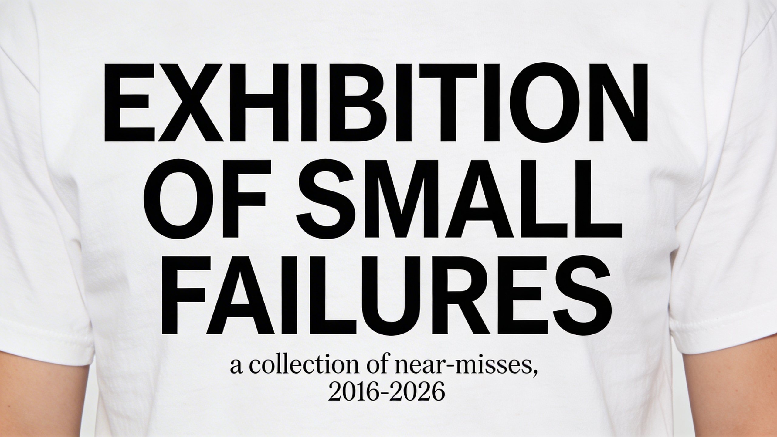
This is one of those creative T-shirt slogans that feels like you found it at an actual museum shop, which is exactly why it converts.
What I’d tweak:
- Make the year range personal (2011–2026 hits different for different people)
- Try “EXHIBITION OF BAD IDEAS (THAT ALMOST WORKED)”
Marketing angle:
- Style it like a gallery: stark wall, clean pants, minimal caption. Let it feel expensive.
15) The “corporate memo” parody tee that still looks clean
Prompt: "minimal corporate memo style t-shirt typography, bold header: 'REMINDER', body text: 'YOUR WORTH IS NOT YOUR OUTPUT', small footer: 'THANK YOU', black ink, clean sans-serif, centered chest, high readability"
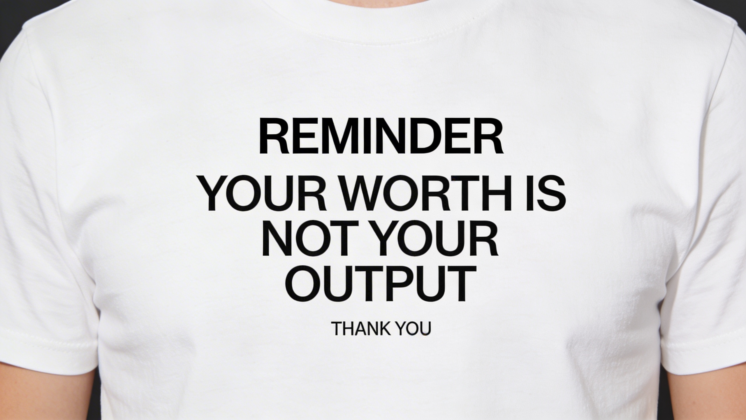
This one wins because it reads like a sign someone “forgot” to take down from the break room. It’s funny, but it’s also a wearable truth.
What I’d tweak:
- Make the footer tiny. The smaller the “THANK YOU,” the funnier it gets.
- Try an alternate version: “PER MY LAST EMAIL: PLEASE REST.”
Marketing angle:
- Perfect for office-adjacent audiences: project managers, designers, tech, teachers.
- Push it as a “low-key work friend gift.”
16) The “cartoon object with feelings” (always sells if it’s not ugly)
Prompt: "cute cartoon stapler character with a tired face, bold outline, 4-color palette, sticker style, caption in playful bold letters: 'HOLDING IT TOGETHER', centered t-shirt graphic, screenprint ready"
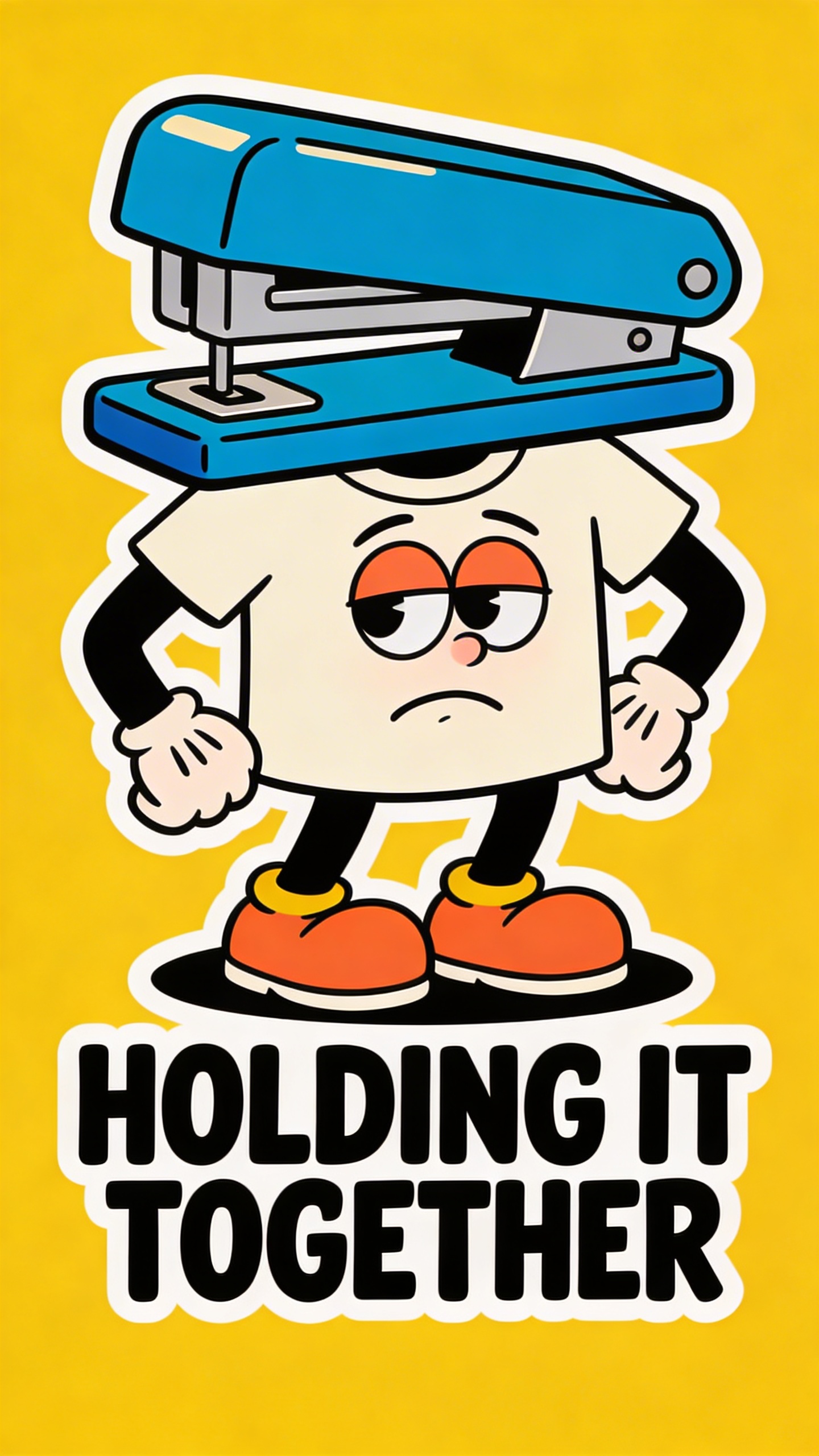
If you ever wonder why “cute object + mood” works, it’s because it’s emotional merch without feeling like therapy homework.
What I’d tweak:
- Keep the face simple. One eyebrow change can make it too weird.
- Give the stapler tiny band-aids if you want extra “barely surviving” energy.
Marketing angle:
- List it as a gift for coworkers. This one is basically a Secret Santa design.
17) The “food remixed as a mascot” streetwear drop idea
Prompt: "streetwear mascot illustration of a spicy ramen bowl character wearing sneakers, dynamic pose, bold thick outlines, 5-color limited palette, japanese-inspired retro label style, no text, centered graphic, screenprint design"
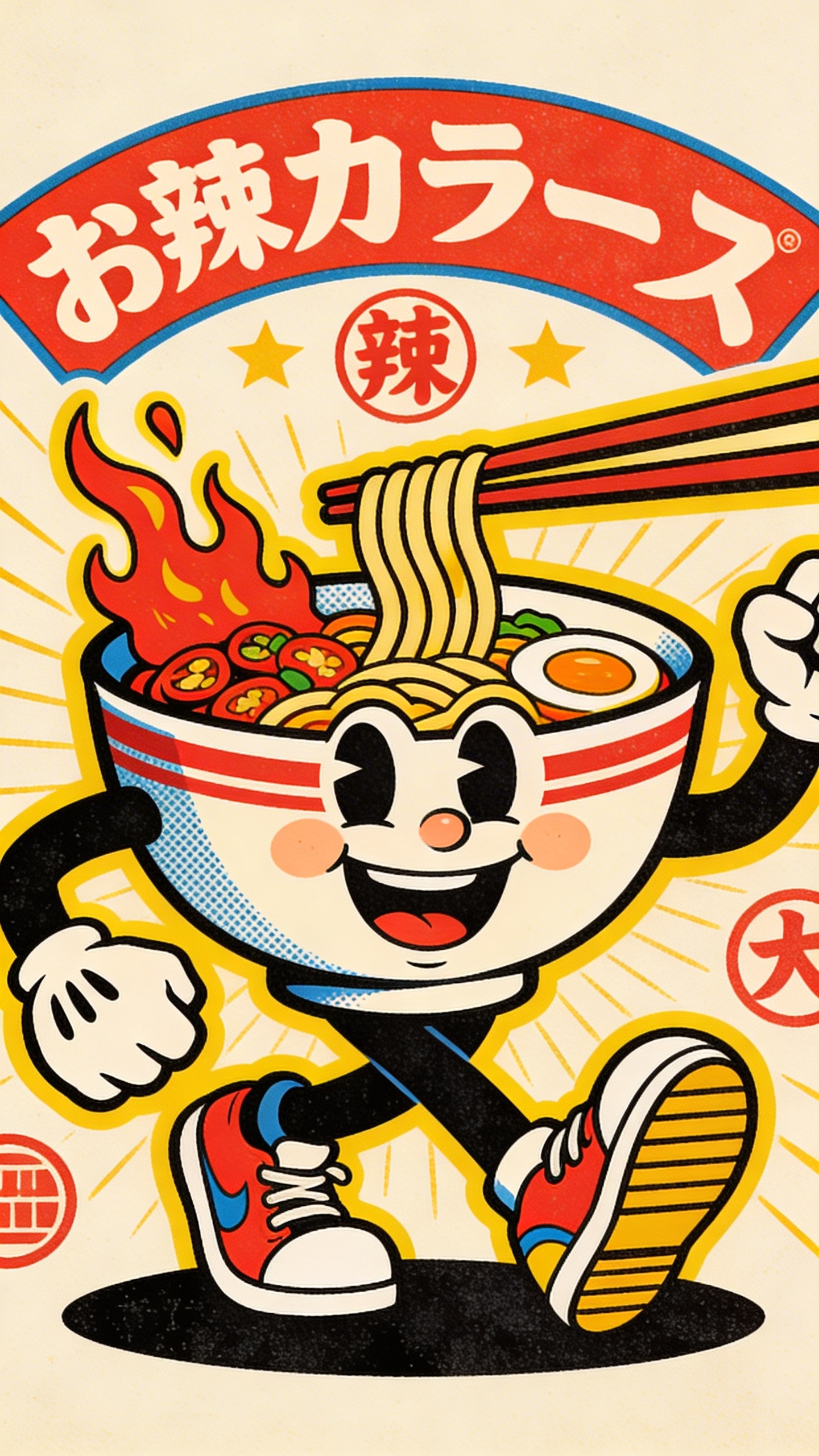
This is “streetwear without trying to cosplay a streetwear brand.” It’s fun, graphic, and it reads fast.
What I’d tweak:
- Make sure it doesn’t look like an existing packaging mascot
- Build a trio: ramen, boba, onigiri—same style, same palette
Marketing angle:
- Drop format. Two colorways. One week. Done.
- If you can shoot it near a neon ramen spot, it’s basically cheating.
18) The “simple icon + one word” minimal tee (the sleeper hit)
Prompt: "minimal t-shirt design, single bold icon of a small storm cloud with a tiny heart, clean vector, monochrome, small centered chest, one word below in lowercase serif: 'soft', premium minimalist aesthetic"
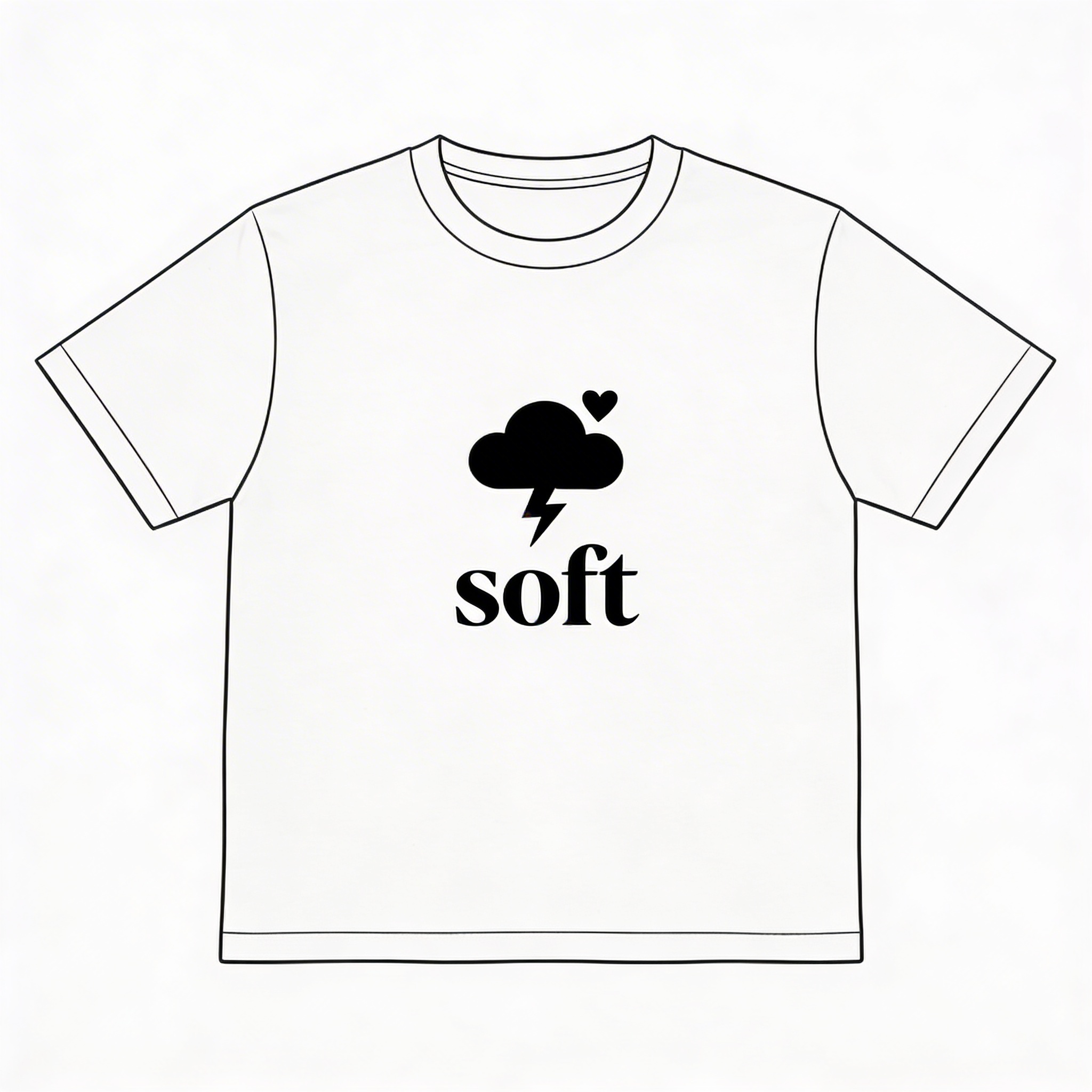
This is the definition of a sleeper hit. People underestimate how many buyers want something that feels like a whisper.
What I’d tweak:
- Test “soft,” “tender,” “fragile,” “okay”
- Offer embroidery for the icon if you want to go premium
Marketing angle:
- This is for clean product photography and calm captions.
- If you over-market it, you ruin it. Let it be quiet.
Tiny checklist before you click “publish” (so your shop doesn’t look like a hobby)
These are boring. They also matter more than your seventh redesign of the raccoon.
- Does the design read in 2 seconds? (Six feet away rule.)
- Is it printable? (No microscopic text, no tiny thin lines, no accidental gradients if you want screenprint.)
- Do you have at least 2 shirt colors mocked up? (Light + dark.)
- Do you have one “real” photo? (Even a mirror shot beats 12 perfect mockups sometimes.)
- Is the title searchable? (Keywords first, personality second.)
- Did you check for accidental trademarks/copyright vibes? (Especially for “retro logos.”)
If you do just that, you’re already ahead of most shops launching in 2026 with 40 designs and zero clarity.
The most remixable prompt formula (steal this, it’s fine)
When you hit a creative drought, don’t hunt for inspiration. Use a structure.
Formula: [Wearable motivation] + [layout] + [restriction] + [one detail that feels human]
Examples:
- Identity + badge logo + 2 colors + “est. 2012”
- Gift + cute mascot + thick outline + “one grumpy eyebrow”
- Conversation starter + diagram + monochrome + “one tiny label that’s too real”
If you can write your prompt like that, you can make endless variations that still feel cohesive—and cohesive collections sell faster than random one-offs.
Frequently Asked Questions (FAQs)
You already hit some FAQs earlier in the post, but readers scroll. They forget. And some of them land here from Google without reading anything above this line.
So here’s a tighter end-of-post FAQ that answers the stuff people actually ask right before (or right after) they try to launch their first set of designs.
Can I use these prompts commercially, or do I need to “make them mine” first?
You can use the prompts commercially, but you should make the outputs yours before you sell. Not because of morality—because of competition.
Everyone can generate “a raccoon with coffee.” What they can’t copy as easily is:
- your exact phrasing + layout rhythm
- your consistent palette across a collection
- your brand tag and secondary details (est. year, location, series name)
- your revision choices (thicker outlines, simplified textures, tighter spacing)
Treat the prompt as the starting sketch. The sellable product is the edited version.
What are the most common AI T-shirt design mistakes that cause bad prints?
The painful top five:
- Too many colors (or colors that are too close in value)
- Tiny text that looked “cute” on a screen and becomes ant-sized on fabric
- Ultra-thin lines that break up, especially on textured blanks
- Fake “distress texture” everywhere that turns into gray mush when printed
- Low-resolution exports (you want print-size resolution, not “looks fine on Etsy” resolution)
If you do nothing else: make shapes bigger, lines thicker, and palettes simpler.
How do I know if a design should be DTG or screenprint?
A quick rule that’s surprisingly accurate:
- If it relies on flat spot colors + bold shapes, it wants screenprint.
- If it relies on gradients, soft textures, lots of color, it wants DTG (or you simplify it until it doesn’t).
Also: start with DTG if you’re validating designs. Move to screenprint when you have proof something sells and you want better margins and a more premium feel.
What size should the front graphic be for a standard tee?
Most “center chest” designs land well around:
- Adult: ~10–12 inches wide (varies by blank and design)
- Left chest mark: ~3–4 inches wide
- Back print: ~11–13 inches wide
But don’t guess. Drop your design on a mockup at actual size and do the six-feet-away test. If it reads instantly from a distance, you’re in the safe zone.
How do I make a collection look cohesive (so it feels like a brand)?
Pick two anchors and stop negotiating with yourself:
- One type system: 1–2 font vibes (e.g., condensed sans + serif accent)
- One palette logic: always monochrome, or always earthy 3-color, etc.
- One layout habit: badge center chest, or left chest + back print, consistently
- One recurring motif: tiny “est.” date, a grid of icons, a stamp texture—whatever
Cohesion doesn’t mean everything looks the same. It means everything looks like it belongs in the same closet.
How many variations should I generate per prompt before I choose?
Five is the magic number for momentum.
- 1–2 are usually generic
- 3 is often the “okay, there it is”
- 4–5 give you options for little brand decisions (outline thickness, composition, attitude)
If you generate 40 versions you’re not “exploring,” you’re procrastinating.
Where should I sell first if I don’t have an audience?
Pick the platform that matches your personality, not the one someone yelled about on YouTube:
- Etsy: strong for giftable slogans + searchable niches (Ingredient Label, Memo Parody)
- Shopify: best when you have a clear brand vibe + can drive your own traffic (Statue streetwear drop)
- TikTok Shop: great when you can make simple repeatable content and you don’t mind being on camera or voiceover
- Instagram: good for brand-building, weaker for direct conversion unless your content is consistent
If you want the least friction: Etsy for demand + Instagram for vibe. Keep it boring. Let it work.
What if someone copies my best-selling design?
It will happen if you’re doing well. The best defense isn’t spiraling—it’s building:
- a series (so you’re never “one design away” from being wrecked)
- a recognizable style and naming system
- better photos and fit (copycats usually don’t invest there)
- a small backlog of new drops
If it becomes serious: document timestamps, listings, and decide if it’s worth filing a takedown. But most of the time, your fastest win is releasing the next better version and staying ahead.
Frequently Asked Questions (FAQs)
You don’t need three FAQ sections. You need one that catches:
- the practical “how do I do this” questions
- the legal-ish “am I allowed” concerns
- the “why isn’t this selling” reality checks
So this is the final one. Save it, reuse it, and update it as you learn.
What resolution do I need for a T-shirt print so it doesn’t look blurry?
Aim for 300 DPI at print size. If your front graphic will be 11 inches wide, export it at roughly 3300 px wide (or more). For DTG, a transparent PNG is the usual baseline. For screenprint, your printer may prefer vector or at least clean, flattened spot-color separations.
A quick self-test: zoom to 100% on your file and check edges. If outlines look fuzzy on your screen, it’ll look worse on fabric.
How do I force the AI to keep the design centered and not do weird compositions?
Add layout constraints directly into the prompt and keep repeating them:
- “centered chest composition”
- “t-shirt print placement”
- “symmetrical layout”
- “large central graphic with clean margins”
- “no background, transparent background”
Then don’t change five things at once. Change one variable, regenerate, compare.
Also: if you’re trying to do left chest + back print, yo